VUNIS logo review
3.6 / 5
Logo score
Logo review of

Vunis

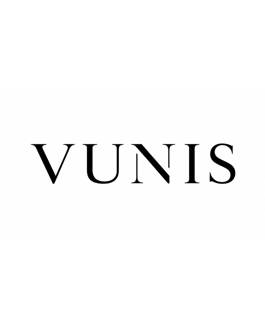
A clean and effective wordmark with a sophisticated feel, but currently too generic for strong brand differentiation.

Wordmark Minimalist, Modern Serif
5/5
Legibility
3/5
Originality
5/5
Misread
4/5
Balance
4/5
Scale
Action plan

What to fix first

The most important fixes to handle before polishing the full presentation.

1

Enhance uniqueness with a subtle custom touch in a letterform (e.g., a custom 'U' or 'N') to elevate brand distinctiveness.

High priority

The wordmark is elegant but currently generic; a unique accent would help it stand out among similar serif logos.

Impact: Increases Originality And Memorability. · Effort: Medium

Detailed review

Logo performance breakdown

5/5

Legibility

Checkmark icon Strong legibility with distinct spacing.
Checkmark icon Elegant, readable serif letters.

3/5

Originality

Checkmark icon Contemporary serif style is visually appealing.

Warning icon Standard serif execution; lacks a unique or ownable twist.

4/5

Balance alignment

Checkmark icon Consistent letter spacing.
Checkmark icon Balanced letterform proportions.

Warning icon The 'N' could feel slightly heavier due to its diagonal stroke.

logo 200x250 pixels scalability test alignment grid overlay
4/5

Scalability

Checkmark icon Simple, high-contrast letters scale well for most uses.

Warning icon Thin serifs may weaken at very small sizes.

logo 200x250 pixels scalability test

200x250 px

logo 100x125 pixels scalability test

100×125 px

logo 50x62 pixels scalability test

50×62 px

5/5

Misinterpretations

Checkmark icon No problematic shapes or dual meanings.

Try your own review

Wondering how your logo performs?

Get a clear logo score, key risks, and priority fix ideas before your client or audience sees it.

Review my logo