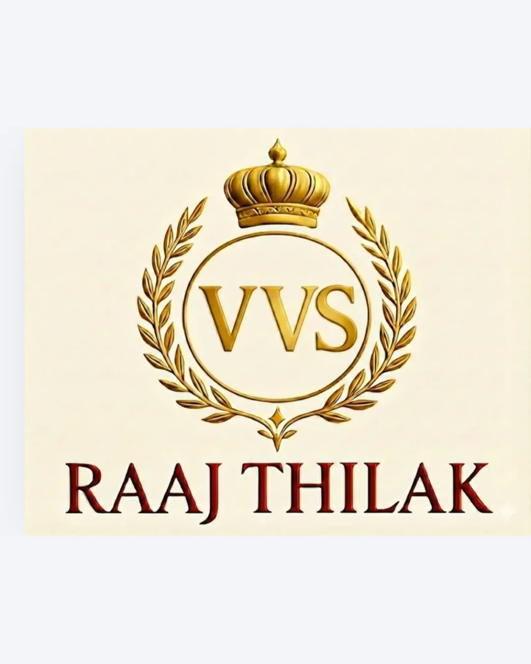
VVS RAAJ THILAK logo review
3/5
Logo score
Logo review of

Vvs Raaj Thilak

Serviceable as a generic premium logo, but too conventional and lacking in specific identity or unique style for strong enduring brand impact.

Combination Mark Classic, Regal, Gold-accented Food / Commodity
4/5
Legibility
2.5/5
Originality
4/5
Misread
4/5
Balance
3/5
Scale
Your next steps

What to fix first

Focus on the changes that matter. Keep what makes the logo work.

1

Develop a more original symbol with some visual link to tapioca/sago.

High priority Medium effort

Current crest is too generic and doesn't help with product recall.

Makes the logo memorable and relevant to the product category.
2

Optimize gold and shadow effects for adaptability on print and digital scales.

Medium priority Low effort

Current effects may not translate well in all reproduction scenarios.

Ensures the logo remains crisp and clear across all uses.

Detailed review

Logo performance breakdown

Not scored

Brief & logo match

From the original review
  • Product Association

    Regal motif loosely signals 'premium', but connection to tapioca/sago is weak.

  • Target Audience

    Classic style may appeal to traditional or premium market segments.

4/5

Legibility

  • Large and clear serif typeface with good contrast
  • Gold effect on 'VVS' slightly reduces clarity at small sizes
2.5/5

Originality

  • Regal style matches the 'Thilak' name
  • Crown and laurel crest is very common and generic; lacks unique twist
3.5/5

Color harmony

  • Gold, deep red, and white imply quality and tradition
  • Gold gradients may not reproduce well in all media
Gold#FFD700
DarkRed#8B0000
White#FFFFFF

Estimated colors. Use the original design file for exact values.

Create a full color palette using these colors

Create new palette

4/5

Balance alignment

  • Well-centered and symmetrical emblem
  • Wordmark sits solidly beneath the mark
  • Some visual tension between ornate crest and heavy wordmark
Uploaded logoAlignment guide overlay

Inspect spacing with the guide. Optical balance may differ from geometric centering.

3/5

Scalability

  • Simple, bold elements overall
  • Wreath and crown details may blur at small sizes; gold gradients lose effect when scaled down
Uploaded logo at 200 pixels wide
200 × 250 px
Uploaded logo at 100 pixels wide
100 × 125 px
Uploaded logo at 50 pixels wide
50 × 63 px

Compare the detail at different sizes. Labels show the full image dimensions.

4/5

Misinterpretations

  • No clear negative or confusing secondary meanings
3/5

Symbol & text fit

  • Both elements share regal, traditional tone
  • The styles compete in weight; integration feels formulaic

Black & white

Does the shape still work without color?

These tests are available only for logos uploaded in vector (SVG) format.

Background contrast

Find the surfaces where your logo stays clear.

These tests are available only for logos uploaded in vector (SVG) format.

Blur & silhouette

A 3px blur softens fine details so you can check whether the overall shape stays recognizable. If key gaps close or elements merge, the logo may rely too heavily on detail.

These tests are available only for logos uploaded in vector (SVG) format.

Try your own review

Wondering how your logo performs?

Get a clear logo score, key risks, and priority fix ideas before your client or audience sees it.

Review my logo