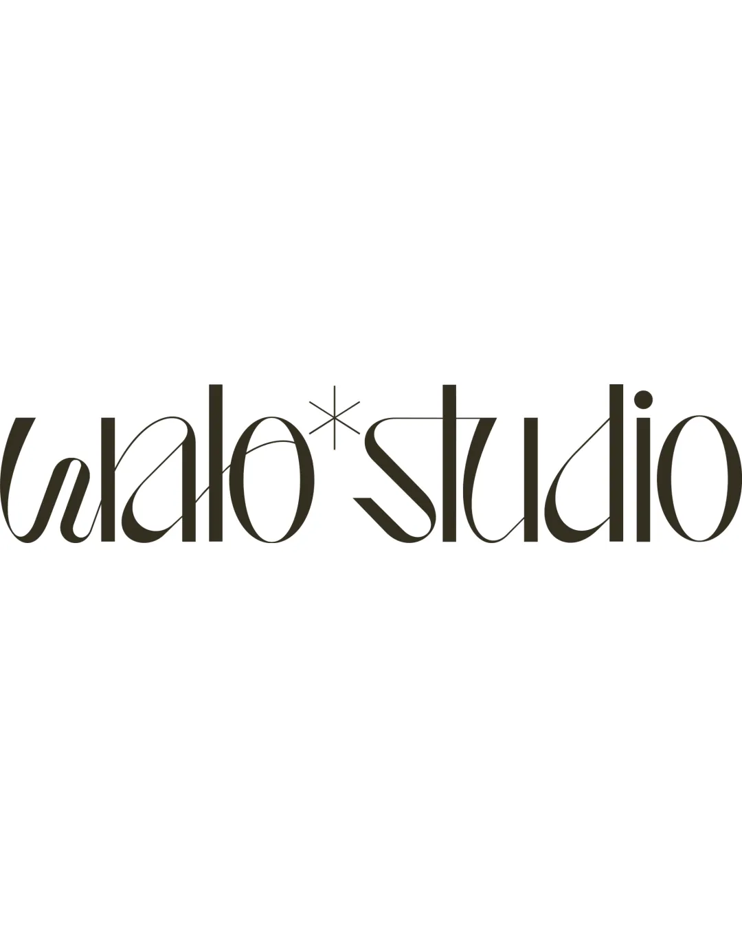
walo*studio logo review
3/5
Logo score
Logo review of

Walo*studio

A visually creative wordmark with significant legibility concerns and a possible naming mismatch.

Wordmark High-contrast, Stylized Modern Sans-serif Creative Agency / Branding
2.5/5
Legibility
4/5
Originality
4/5
Misread
4/5
Balance
3/5
Scale
Your next steps

What to fix first

Focus on the changes that matter. Keep what makes the logo work.

1

wordmark

Refine letterforms for clearer readability without sacrificing style.

Visible issue High priority Medium effort
Area to inspectApproximate location

The stylized letterforms, especially 'walo' and the asterisk, make the brand name hard to decipher at a glance, risking misreading by viewers.

How to check

Test readability with viewers unfamiliar with the logo.

See the category review
2

wordmark

Preserve unique letterform approach as a differentiator.

Optional refinement Medium priority Low effort

The custom style and ligature use present a distinctive personality despite familiar components.

How to check

Confirm distinctiveness with target audiences.

See the category review
Detailed review

Logo performance breakdown

2/5

Brief & logo match

Based on your brief
Compared with

BrADING STUDIo

Logo does not reflect the supplied brand name and risks confusing viewers.

  • Intended Brand Name

    Logo displays 'walo*studio', not the supplied 'BrADING STUDIo', suggesting a disconnect between the brief and artwork.

  • Visual Creativity

    The stylized letterforms and contemporary design align with creative industry expectations.

2.5/5

Legibility

  • Distinct and memorable character shapes.
  • The stylized letterforms, especially 'walo' and the asterisk, make the brand name hard to decipher at a glance, risking misreading by viewers.

    Visible issue wordmark

    Try: Refine letterforms for clearer readability without sacrificing style.

    Check: Test readability with viewers unfamiliar with the logo.

    Area to inspectApproximate location
4/5

Originality

  • Unusual styling and ligatures create a signature look.
  • The custom style and ligature use present a distinctive personality despite familiar components.

    Optional refinement wordmark

    Try: Preserve unique letterform approach as a differentiator.

    Check: Confirm distinctiveness with target audiences.

4/5

Balance alignment

  • Consistent vertical weight and spacing within the custom typeface.
Uploaded logoAlignment guide overlay

Inspect spacing with the guide. Optical balance may differ from geometric centering.

3/5

Scalability

  • Monochrome and simple enough for varied reproduction.
Uploaded logo at 200 pixels wide
200 × 250 px
Uploaded logo at 100 pixels wide
100 × 125 px
Uploaded logo at 50 pixels wide
50 × 63 px

Compare the detail at different sizes. Labels show the full image dimensions.

4/5

Misinterpretations

  • No clear alternative readings.

Black & white

Does the shape still work without color?

These tests are available only for logos uploaded in vector (SVG) format.

Background contrast

Find the surfaces where your logo stays clear.

These tests are available only for logos uploaded in vector (SVG) format.

Blur & silhouette

A 3px blur softens fine details so you can check whether the overall shape stays recognizable. If key gaps close or elements merge, the logo may rely too heavily on detail.

These tests are available only for logos uploaded in vector (SVG) format.

Try your own review

Wondering how your logo performs?

Get a clear logo score, key risks, and priority fix ideas before your client or audience sees it.

Review my logo