WAR logo review
3.4 / 5
Logo score
Logo review of

War

Review the detailed scores below to see what is working and what should be refined first.

Objective AI feedback. Your creative decision.

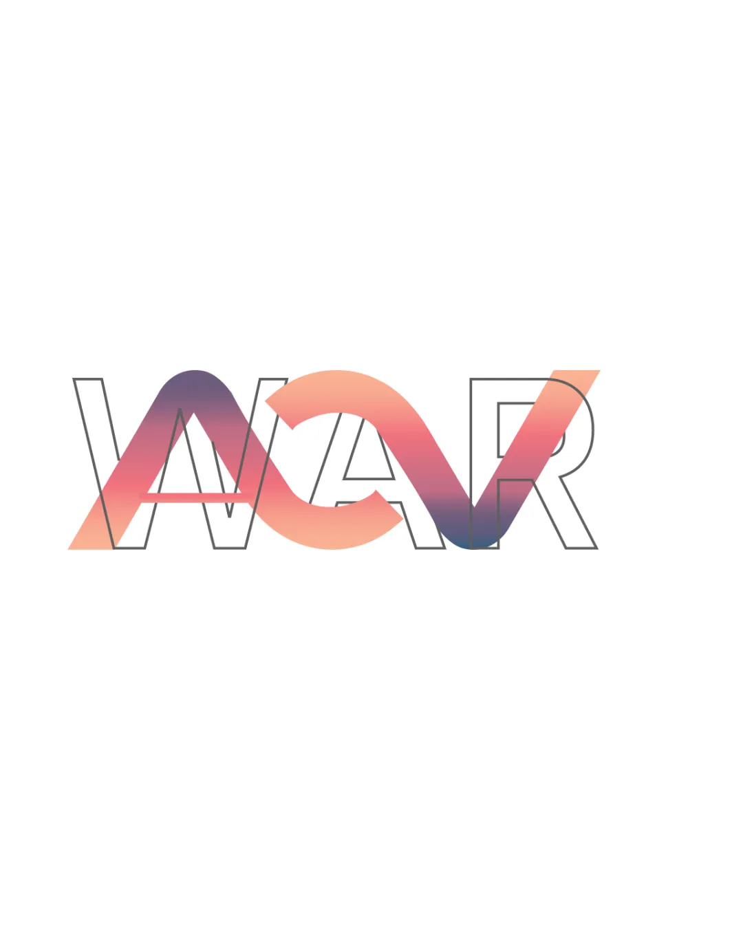
Wordmark With Abstract Element Modern, Gradient, Overlapping Creative
2/5
Legibility
4/5
Originality
5/5
Misread
4/5
Balance
2/5
Scale
Detailed review

Logo performance breakdown

2/5

Legibility

Checkmark icon Distinct outline helps recognize the letters 'W', 'A', and 'R'.

Warning icon The gradient ribbon overlaps and distorts the letter 'A', making it harder to read at a glance.
Warning icon The complex visuals create potential confusion, especially at smaller sizes.
4/5

Originality

Checkmark icon Creative use of a gradient ribbon integrated into the letter structure.
Checkmark icon Visually distinctive and not overtly generic.

Warning icon The ribbon + word approach is trending and not entirely unique in the creative sector.

4/5

Color harmony

Checkmark icon Gradient utilizes hues that blend smoothly and are easy on the eyes.
Checkmark icon Limited palette ensures visual focus.

Warning icon Gradient could pose challenges for monochrome or flat applications.

light coral
#F5AD97

dark mauve
#8A588D

white
#FFFFFF

Your palette is close. Refine the color roles and combinations before updating the logo.

Build brand colors
4/5

Balance alignment

Checkmark icon Central alignment creates a strong horizontal presence.
Checkmark icon The ribbon is well integrated into the overall composition.

Warning icon The left side feels visually heavier due to thicker ribbon, causing minor imbalance.

logo 200x250 pixels scalability test alignment grid overlay
2/5

Scalability

Checkmark icon Clean outlines work decently on larger formats such as posters or branding banners.

Warning icon Intricate overlapping gradient results in loss of clarity in small-scale applications like favicons or badges.
Warning icon Gradient effect may not render well in embroidery or single-color applications.

logo 200x250 pixels scalability test

200x250 px

logo 100x125 pixels scalability test

100×125 px

logo 50x62 pixels scalability test

50×62 px

5/5

Misinterpretations

Checkmark icon No obvious inappropriate shapes or problematic symbolic meanings in the composition.

Try your own review

Wondering how your logo performs?

Get a clear logo score, key risks, and priority fix ideas before your client or audience sees it.

Review my logo




