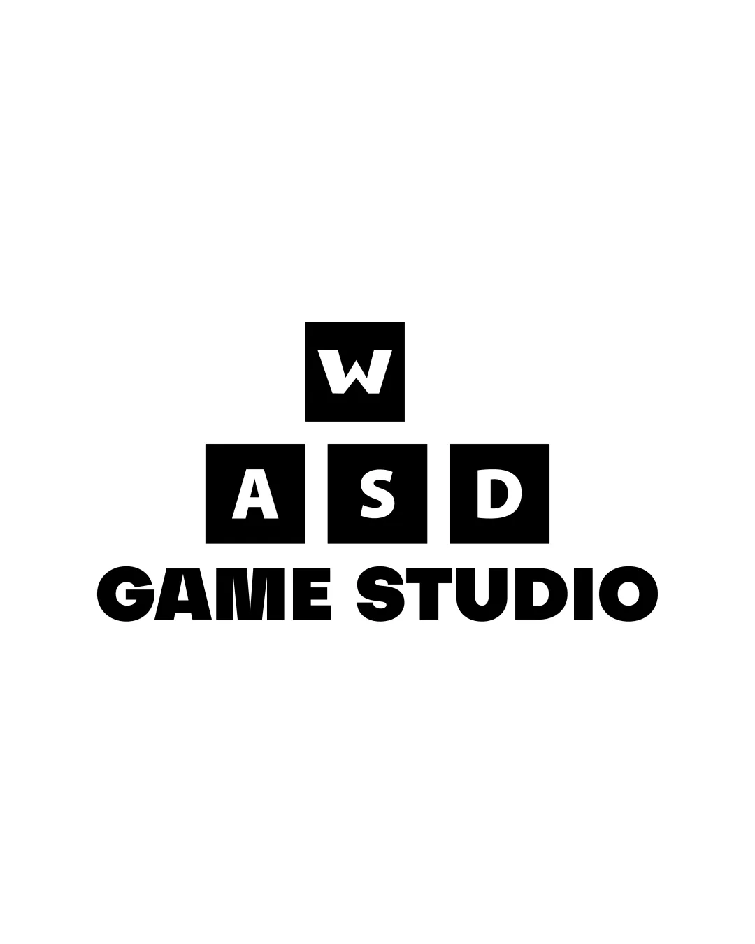
WASD GAME STUDIO logo review
4.3 / 5
Logo score
Logo review of

Wasd Game Studio

Review the detailed scores below to see what is working and what should be refined first.

Combination Mark Bold, Geometric, Minimalistic Gaming
5/5
Legibility
3/5
Originality
5/5
Misread
4/5
Balance
4/5
Scale
Detailed review

Logo performance breakdown

5/5

Legibility

Checkmark icon Typeface is bold and clear, ensuring that all letters are easy to read at any size.
Checkmark icon High contrast between white text and black background enhances readability.
3/5

Originality

Checkmark icon The concept leverages familiar gaming keyboard keys, which will resonate with the target audience.
Checkmark icon Directly references key controls important in gaming culture.

Warning icon Block letter style and keyboard theme are very common in gaming logos and lack distinctive flair.
Warning icon Arrangement doesn't introduce any novel interpretation of the WASD motif, making it less memorable.

5/5

Color harmony

Checkmark icon Limited palette ensures clarity and high contrast, working well for gaming branding.
Checkmark icon Black and white color scheme is professional and highly legible.

Black
#000000

White
#FFFFFF

4/5

Balance alignment

Checkmark icon Central alignment of blocks and text creates a visually coherent, grounded appearance.
Checkmark icon Solid horizontal base provided by 'GAME STUDIO' supports the structure above.

Warning icon Top-heavy design due to the lone 'W' block above the larger word blocks slightly disrupts flow.
Warning icon Negative space between the 'W' block and the 'A S D' block row could be adjusted for better proportionality.

logo 200x250 pixels scalability test alignment grid overlay
4/5

Scalability

Checkmark icon Simple, bold forms ensure the logo holds up well in small formats like favicons, app icons, and embroidery.
Checkmark icon Works strongly in single-color applications, suitable for both digital and print media.

Warning icon Stacked composition with three rows may feel cramped on ultra-narrow formats such as ultra-thin vertical signage or compact app splash screens.
Warning icon Block arrangement may make it harder to adapt horizontally for some merchandise or website headers.

logo 200x250 pixels scalability test

200x250 px

logo 100x125 pixels scalability test

100×125 px

logo 50x62 pixels scalability test

50×62 px

5/5

Misinterpretations

Checkmark icon No inappropriate or confusing dual meanings detected; iconography is clear and relevant to gaming.

Try your own review

Wondering how your logo performs?

Get a clear logo score, key risks, and priority fix ideas before your client or audience sees it.

Review my logo