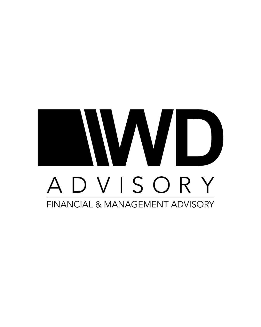
main icon and WD portion
Adjust secondary text size or weight to improve visual hierarchy and cohesion.
Logo preview unavailable. The written feedback is still available on this card.
Visual connection between the geometric icon and 'WD' is strong, but the thick, blocky style of the mark slightly overpowers the thin lines of the supporting wordmark and tagline, reducing overall harmony.
How to check
See the category review Evaluate legibility and presence at different sizes, especially compared to primary mark.