 View review
Logo score
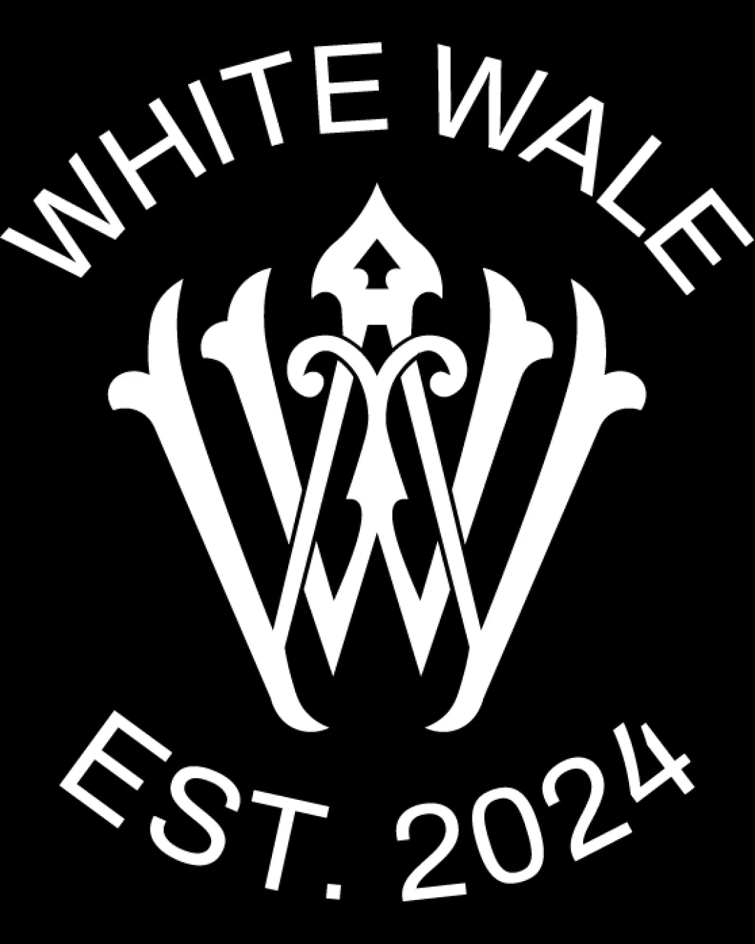
Logo review ofWhite Wale Est. 2024
Review the detailed scores below to see what is working and what should be refined first.
Legibility
Originality
Misread
Balance
Scale
Detailed review
Logo performance breakdown
Legibility
![]() Text is clear and easy to read
Text is clear and easy to read![]() Good contrast with background
Good contrast with background
![]() Slight curvature of text may challenge readability at small sizes
Slight curvature of text may challenge readability at small sizes
Originality
![]() Creative use of negative space
Creative use of negative space![]() Unique monogram style
Unique monogram style
![]() Ornate style may resemble existing designs slightly
Ornate style may resemble existing designs slightly
Color harmony
![]() Effective use of monochrome
Effective use of monochrome![]() Strong contrast
Strong contrast
Balance alignment
![]() Symmetrical design
Symmetrical design![]() Centrally aligned text
Centrally aligned text
![]() Top and bottom text create a busy feel
Top and bottom text create a busy feel

Scalability
![]() Bold design that stands out
Bold design that stands out![]() Monochrome simplifies resizing
Monochrome simplifies resizing
![]() Ornate details may lose clarity at smaller sizes
Ornate details may lose clarity at smaller sizes
200x250 px
100×125 px
50×62 px
Misinterpretations
![]() No inappropriate symbols
No inappropriate symbols
Try your own review
Review my logo
Wondering how your logo performs?
Get a clear logo score, key risks, and priority fix ideas before your client or audience sees it.
Keep exploring


