 View review
Logo score
Logo review ofZ
Review the detailed scores below to see what is working and what should be refined first.
Legibility
Originality
Misread
Balance
Scale
Detailed review
Logo performance breakdown
Legibility
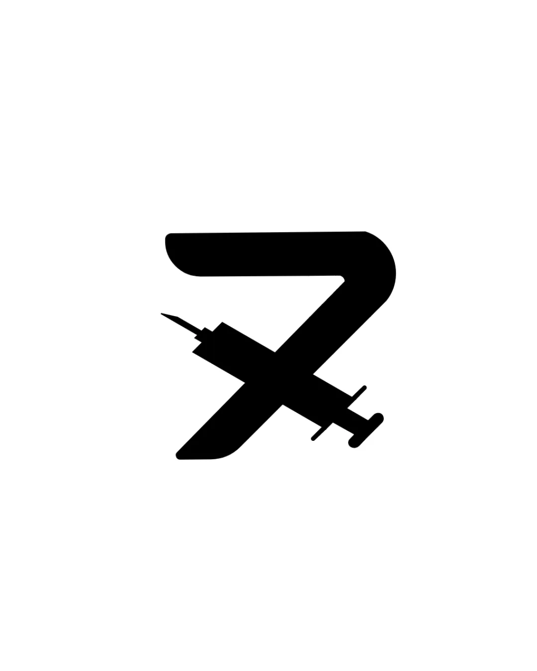
![]() The 'Z' is clearly identifiable despite the airplane overlay.
The 'Z' is clearly identifiable despite the airplane overlay.![]() Minimalistic approach keeps the central figure obvious.
Minimalistic approach keeps the central figure obvious.
![]() The intersection between the airplane and the 'Z' may cause minor confusion at first glance, especially at smaller scales.
The intersection between the airplane and the 'Z' may cause minor confusion at first glance, especially at smaller scales.
Originality
![]() Combining a bold 'Z' with an intersecting airplane creates a relevant and custom mark for the travel/airline sector.
Combining a bold 'Z' with an intersecting airplane creates a relevant and custom mark for the travel/airline sector.![]() Not a common approach for the letter 'Z', granting it uniqueness.
Not a common approach for the letter 'Z', granting it uniqueness.
![]() The airplane-by-letter motif is moderately common in travel branding.
The airplane-by-letter motif is moderately common in travel branding.
Color harmony
![]() Monochrome approach ensures maximal versatility and timelessness.
Monochrome approach ensures maximal versatility and timelessness.![]() Strong contrast with white background makes the logo pop.
Strong contrast with white background makes the logo pop.
Black
#000000
White
#FFFFFF
Balance alignment
![]() Central alignment of the airplane with the 'Z' achieves visual balance.
Central alignment of the airplane with the 'Z' achieves visual balance.![]() Symmetry gives a professional and stable look.
Symmetry gives a professional and stable look.
![]() The angle and placement of the airplane create tension where it crosses the 'Z' stroke, slightly disrupting harmony.
The angle and placement of the airplane create tension where it crosses the 'Z' stroke, slightly disrupting harmony.

Scalability
![]() Bold shapes and simple color scheme ensure strong visibility across different sizes and backgrounds.
Bold shapes and simple color scheme ensure strong visibility across different sizes and backgrounds.![]() Icon works well for app icons, signage, or business cards.
Icon works well for app icons, signage, or business cards.
![]() Fine details of the airplane, particularly the tail and nose, could blend into the 'Z' or become illegible at very small scale (e.g., embroidery or narrow favicons).
Fine details of the airplane, particularly the tail and nose, could blend into the 'Z' or become illegible at very small scale (e.g., embroidery or narrow favicons).
200x250 px
100×125 px
50×62 px
Misinterpretations
![]() The imagery is straightforward, with no accidental suggestive or inappropriate icons.
The imagery is straightforward, with no accidental suggestive or inappropriate icons.
Try your own review
Review my logo
Wondering how your logo performs?
Get a clear logo score, key risks, and priority fix ideas before your client or audience sees it.
Keep exploring


