Wondering how your logo performs? 🧐
Get professional logo reviews in seconds and catch design issues in time.
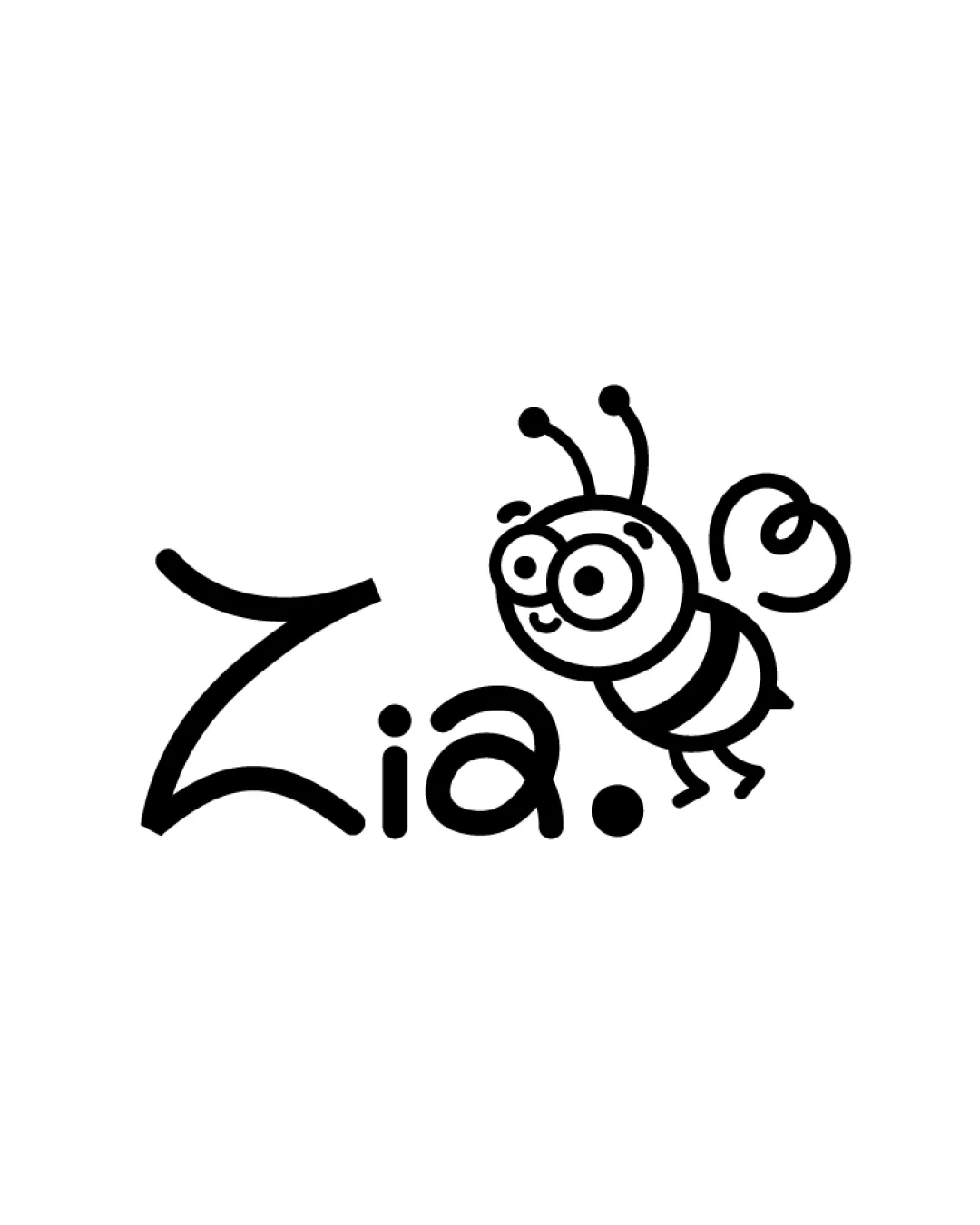
Try it Now!Logo review of Zia.
 Logo analysis by AI
Logo type:
Style:
Detected symbol:
Detected text:
Business industry:
Review requested by Zn.ana22
**If AI can recognize or misinterpret it, so can people.
Structured logo review
Legibility
![]() Text is generally readable and the playful font matches the character of the bee illustration.
Text is generally readable and the playful font matches the character of the bee illustration.![]() High contrast between text and background.
High contrast between text and background.
![]() The exaggerated size and stroke thickness of the 'Z' and its different style may cause momentary hesitation in reading.
The exaggerated size and stroke thickness of the 'Z' and its different style may cause momentary hesitation in reading.![]() The period at the end feels slightly forced and could be mistaken for part of the illustration by some viewers.
The period at the end feels slightly forced and could be mistaken for part of the illustration by some viewers.
Scalability versatility
![]() Simple black-and-white palette works well across print and digital.
Simple black-and-white palette works well across print and digital.![]() Cartoonish linework is bold enough for most uses.
Cartoonish linework is bold enough for most uses.
![]() The thin, detailed lines, especially in the bee’s antennae and legs, may be lost or appear messy at very small sizes (e.g., favicons, embroidery).
The thin, detailed lines, especially in the bee’s antennae and legs, may be lost or appear messy at very small sizes (e.g., favicons, embroidery).![]() May not adapt well to very formal or professional collateral due to the playful character-focused design.
May not adapt well to very formal or professional collateral due to the playful character-focused design.
200x250 px
100×125 px
50×62 px
Balance alignment
![]() Friendly, cohesive integration between wordmark and bee illustration.
Friendly, cohesive integration between wordmark and bee illustration.![]() The dot at the end provides some visual anchoring on the right side.
The dot at the end provides some visual anchoring on the right side.
![]() The oversized, stylistically different 'Z' feels heavy and out of balance with the rest of the wordmark and the bee.
The oversized, stylistically different 'Z' feels heavy and out of balance with the rest of the wordmark and the bee.![]() The bee sits above and to the right, making the composition somewhat top-heavy and off-centered overall.
The bee sits above and to the right, making the composition somewhat top-heavy and off-centered overall.

Originality
![]() Custom hand-drawn bee illustration adds a unique and memorable character.
Custom hand-drawn bee illustration adds a unique and memorable character.![]() Playful integration of illustration and typography shows creativity.
Playful integration of illustration and typography shows creativity.
![]() Cartoon bees are a common motif in children’s branding, so the core idea is not highly original.
Cartoon bees are a common motif in children’s branding, so the core idea is not highly original.![]() The playful hand-drawn script still lacks a truly distinctive typographic twist.
The playful hand-drawn script still lacks a truly distinctive typographic twist.
Aesthetic look
![]() Charming, whimsical style is appealing and appropriate for children-focused branding.
Charming, whimsical style is appealing and appropriate for children-focused branding.![]() Minimal color palette keeps it clean and approachable.
Minimal color palette keeps it clean and approachable.
![]() Thick and thin mismatches between the bee and the text create some visual inconsistency.
Thick and thin mismatches between the bee and the text create some visual inconsistency.![]() Aesthetic could feel unpolished or amateurish if targeting a premium market.
Aesthetic could feel unpolished or amateurish if targeting a premium market.
Dual meaning and misinterpretations
![]() No inappropriate or unintended shapes detected in the mark or in the composition. It clearly reads as a bee and playful text.
No inappropriate or unintended shapes detected in the mark or in the composition. It clearly reads as a bee and playful text.
Color harmony
![]() Monochrome palette minimizes risk of color clash, and works on both light and dark backgrounds.
Monochrome palette minimizes risk of color clash, and works on both light and dark backgrounds.![]() Easy to adapt or recolor for different uses.
Easy to adapt or recolor for different uses.
Black
#000000
White
#FFFFFF


