Wondering how your logo performs? 🧐
Get professional logo reviews in seconds and catch design issues in time.
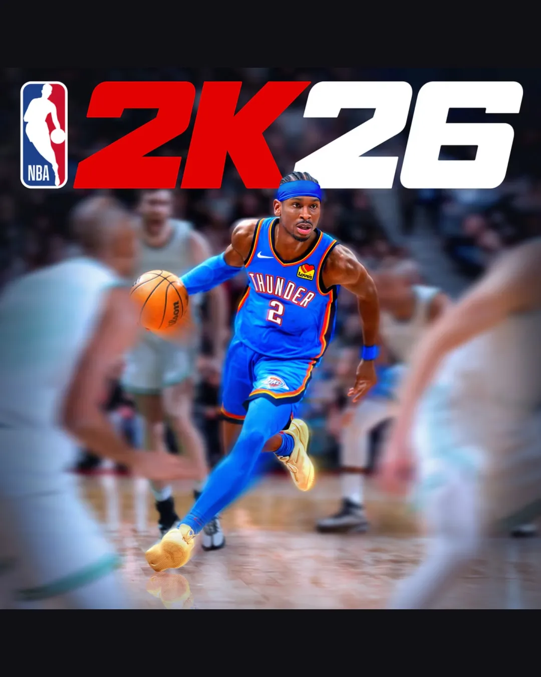
Try it Now!Logo review of 2K26
 Logo analysis by AI
Logo type:
Style:
Detected symbol:
Detected text:
Business industry:
Review requested by Lurodxz
**If AI can recognize or misinterpret it, so can people.
Structured logo review
Legibility
![]() '2K26' is extremely bold, with high contrast against the background. The custom typeface is large and immediately understandable in context.
'2K26' is extremely bold, with high contrast against the background. The custom typeface is large and immediately understandable in context.
Scalability versatility
![]() Logo is simple and bold, which works excellently for billboards, product covers, large merchandise, and digital display.
Logo is simple and bold, which works excellently for billboards, product covers, large merchandise, and digital display.
![]() Very thick strokes and close kerning may lose a bit of detail at extreme favicon or app icon size. The multicolor application may not translate well for single-color printing or embroidery.
Very thick strokes and close kerning may lose a bit of detail at extreme favicon or app icon size. The multicolor application may not translate well for single-color printing or embroidery.
200x250 px
100×125 px
50×62 px
Balance alignment
![]() Text is balanced horizontally. NBA icon bookends the left and anchors the composition visually.
Text is balanced horizontally. NBA icon bookends the left and anchors the composition visually.
![]() Slight imbalance with the heavy '2K' weight compared to '26', which could create a visual heaviness to the left, especially if the NBA icon is omitted in some uses.
Slight imbalance with the heavy '2K' weight compared to '26', which could create a visual heaviness to the left, especially if the NBA icon is omitted in some uses.

Originality
![]() NBA logo provides strong brand association. Bold type choice for '2K26' is recognizable among sports video game fans.
NBA logo provides strong brand association. Bold type choice for '2K26' is recognizable among sports video game fans.
![]() Overall execution is extremely similar to previous NBA 2K branding—no significant new creative twist or unique form. Use of standard NBA icon is expected and not unique.
Overall execution is extremely similar to previous NBA 2K branding—no significant new creative twist or unique form. Use of standard NBA icon is expected and not unique.
Logomark wordmark fit
![]() NBA symbol icon aligns and integrates perfectly with the '2K26' typography, maintaining a unified look.
NBA symbol icon aligns and integrates perfectly with the '2K26' typography, maintaining a unified look.
Aesthetic look
![]() Bold, clean, and vibrant. Immediate association with basketball and gaming. Slick presentation evokes excitement.
Bold, clean, and vibrant. Immediate association with basketball and gaming. Slick presentation evokes excitement.
![]() Very traditional and predictable, offers almost no visual surprise. Some may find it visually generic due to formulaic color use and layout.
Very traditional and predictable, offers almost no visual surprise. Some may find it visually generic due to formulaic color use and layout.
Dual meaning and misinterpretations
![]() No inappropriate dual meanings or negative symbolism detected.
No inappropriate dual meanings or negative symbolism detected.
Color harmony
![]() Classic use of red, white, blue, and black, adhering to NBA and 2K brand guidelines. Strong, energetic palette.
Classic use of red, white, blue, and black, adhering to NBA and 2K brand guidelines. Strong, energetic palette.
Red
#FF0000
White
#FFFFFF
NBA Blue
#003A73
Black
#000000