Wondering how your logo performs? 🧐
Get professional logo reviews in seconds and catch design issues in time.
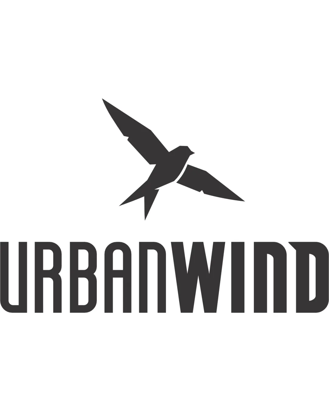
Try it Now!Logo review of URBANWIND
 Logo analysis by AI
Logo type:
Style:
Detected symbol:
Detected text:
Business industry:
Review requested by Mary_v
**If AI can recognize or misinterpret it, so can people.
Structured logo review
Legibility
![]() Typography is clear and easy to read at a glance.
Typography is clear and easy to read at a glance.![]() Uniform stroke width aids recognition in various sizes.
Uniform stroke width aids recognition in various sizes.
Scalability versatility
![]() Simple, bold shapes ensure scalability on digital and print applications.
Simple, bold shapes ensure scalability on digital and print applications.![]() Bird icon is recognizable at most sizes.
Bird icon is recognizable at most sizes.
![]() Extremely small applications (like favicons) could make the bird lose detail.
Extremely small applications (like favicons) could make the bird lose detail.![]() Very thin strokes in text could appear weak on embroidery or low-res formats.
Very thin strokes in text could appear weak on embroidery or low-res formats.
200x250 px
100×125 px
50×62 px
Balance alignment
![]() Centering the bird above the wordmark provides strong symmetry.
Centering the bird above the wordmark provides strong symmetry.![]() Weight of the bird matches the boldness of the type.
Weight of the bird matches the boldness of the type.
![]() Placement of the bird feels slightly disconnected from the wordmark, lacking interaction.
Placement of the bird feels slightly disconnected from the wordmark, lacking interaction.![]() Some negative space between the icon and type feels excessive.
Some negative space between the icon and type feels excessive.

Originality
![]() Abstracted, geometric bird silhouette is less generic than most bird icons.
Abstracted, geometric bird silhouette is less generic than most bird icons.![]() Typeface styling gives the brand a unique, urban personality.
Typeface styling gives the brand a unique, urban personality.
![]() Bird as a symbol is commonly used in many brands, detracting from absolute uniqueness.
Bird as a symbol is commonly used in many brands, detracting from absolute uniqueness.
Logomark wordmark fit
![]() Both icon and wordmark use solid black, creating a unified appearance.
Both icon and wordmark use solid black, creating a unified appearance.![]() Stylistic simplicity is consistent between symbol and typeface.
Stylistic simplicity is consistent between symbol and typeface.
![]() Geometric styling of the bird could be further reflected in the typeface for perfect harmony.
Geometric styling of the bird could be further reflected in the typeface for perfect harmony.
Aesthetic look
![]() Overall form is clean, minimalist, and visually appealing.
Overall form is clean, minimalist, and visually appealing.![]() Monochrome palette adds contemporary edge.
Monochrome palette adds contemporary edge.
![]() Typeface could be considered slightly generic; a unique tweak would improve perceived value.
Typeface could be considered slightly generic; a unique tweak would improve perceived value.
Dual meaning and misinterpretations
![]() No inappropriate or confusing visual suggestion detected.
No inappropriate or confusing visual suggestion detected.
Color harmony
![]() Simple monochrome palette is timeless and professional.
Simple monochrome palette is timeless and professional.![]() Strong contrast makes the logo comprehensible on all backgrounds.
Strong contrast makes the logo comprehensible on all backgrounds.
Bunker
#232323
White
#FFFFFF


