Wondering how your logo performs? 🧐
Get professional logo reviews in seconds and catch design issues in time.
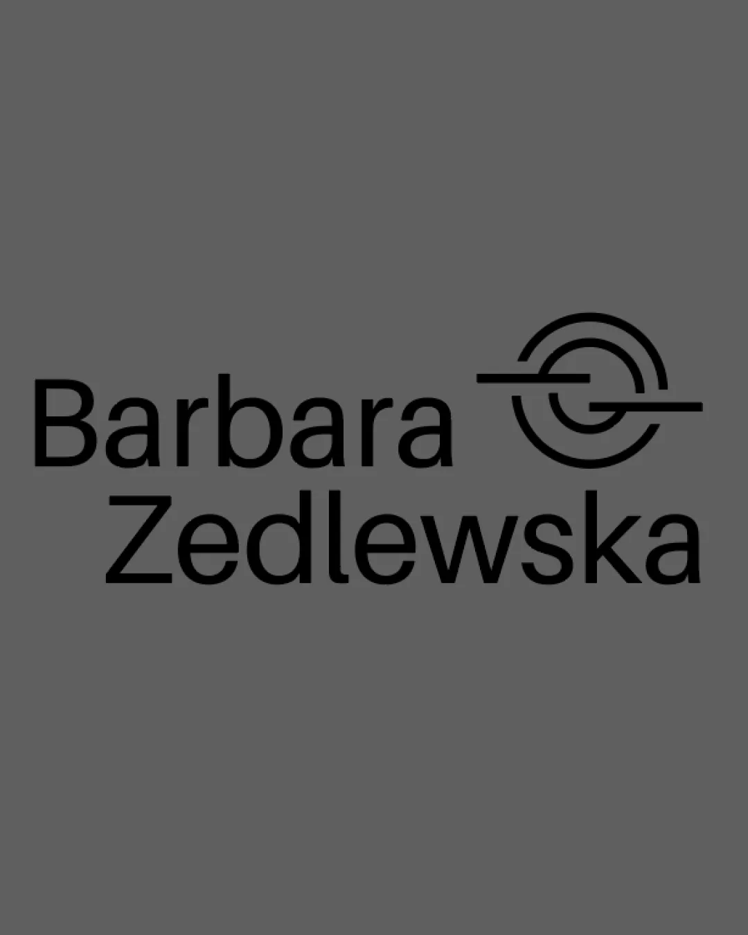
Try it Now!Logo review of Barbara Zedlewska
 Logo analysis by AI
Logo type:
Style:
Detected symbol:
Negative space:
Detected text:
Business industry:
Review requested by Smiarowskadesign
**If AI can recognize or misinterpret it, so can people.
Structured logo review
Legibility
![]() Clear, easily readable sans-serif typeface.
Clear, easily readable sans-serif typeface.![]() Good contrast between text and background enhances legibility.
Good contrast between text and background enhances legibility.
Scalability versatility
![]() Simple, strong lines in the symbol ensure clarity at various sizes.
Simple, strong lines in the symbol ensure clarity at various sizes.![]() Text is large and clear, making it suitable for business cards, websites, and signage.
Text is large and clear, making it suitable for business cards, websites, and signage.
![]() Horizontal symbol may lose some detail when very small, especially the thin line within the mark.
Horizontal symbol may lose some detail when very small, especially the thin line within the mark.![]() Thinner elements could become problematic for embroidery or favicons.
Thinner elements could become problematic for embroidery or favicons.
200x250 px
100×125 px
50×62 px
Balance alignment
![]() Text and symbol are vertically aligned, creating a clean, professional appearance.
Text and symbol are vertically aligned, creating a clean, professional appearance.![]() Adequate spacing between wordmark and logomark avoids crowding.
Adequate spacing between wordmark and logomark avoids crowding.
![]() Symbol may feel slightly heavy on the right due to the extended horizontal line, creating minor imbalance in visual weight compared to the wordmark.
Symbol may feel slightly heavy on the right due to the extended horizontal line, creating minor imbalance in visual weight compared to the wordmark.

Originality
![]() Stylized symbol offers some uniqueness and a modern flair.
Stylized symbol offers some uniqueness and a modern flair.![]() Abstract take on an initial (G or C), which adds personal touch.
Abstract take on an initial (G or C), which adds personal touch.
![]() Abstract circular symbols with lines are somewhat common in personal branding; doesn't push creative boundaries extensively.
Abstract circular symbols with lines are somewhat common in personal branding; doesn't push creative boundaries extensively.
Logomark wordmark fit
![]() Both logomark and wordmark feature similar stroke widths, contributing to harmony.
Both logomark and wordmark feature similar stroke widths, contributing to harmony.![]() Modern style of symbol complements the clean typeface.
Modern style of symbol complements the clean typeface.
![]() Slight disconnect in energy, as the symbol is dynamic and abstract while the wordmark is straightforward and static. The symbol may feel a bit overly technical compared to humanistic text.
Slight disconnect in energy, as the symbol is dynamic and abstract while the wordmark is straightforward and static. The symbol may feel a bit overly technical compared to humanistic text.
Aesthetic look
![]() Cohesive and modern monochrome aesthetic.
Cohesive and modern monochrome aesthetic.![]() Minimalist look feels stylish and up-to-date.
Minimalist look feels stylish and up-to-date.
![]() Gray background dampens energy; feels a bit clinical and could be more vibrant or inviting.
Gray background dampens energy; feels a bit clinical and could be more vibrant or inviting.
Dual meaning and misinterpretations
![]() No inappropriate or ambiguous shapes detected. Symbol does not resemble any unintended forms.
No inappropriate or ambiguous shapes detected. Symbol does not resemble any unintended forms.
Color harmony
![]() Monochrome palette is cohesive and timeless.
Monochrome palette is cohesive and timeless.![]() Excellent contrast between symbol/wordmark and background.
Excellent contrast between symbol/wordmark and background.
Dove Gray
#474747
Black
#000000