Wondering how your logo performs? 🧐
Get professional logo reviews in seconds and catch design issues in time.
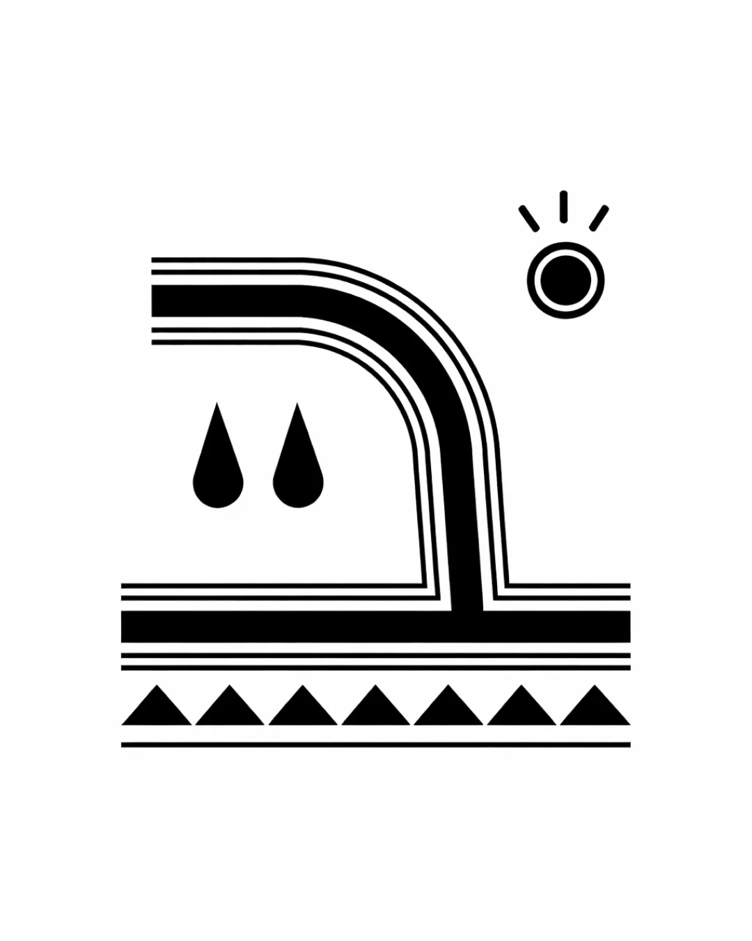
Try it Now!Logo review of abstract pipe with water droplets, sun, stylized g..
 Logo analysis by AI
Logo type:
Style:
Detected symbol:
Business industry:
Review requested by Miim
**If AI can recognize or misinterpret it, so can people.
Structured logo review
Scalability versatility
Strong geometric lines and minimal detail make the logo highly scalable.
Will reproduce well on business cards, signage, and digital media.
Small intricate lines (especially in the parallel pipe and tile areas) may blur at very small sizes or when embroidered.

200x250 px

100×125 px

50×62 px
Balance alignment
Linear symmetry and consistent visual weight provide good balance.
Elements are neatly aligned, with clear visual separation between the pipe, droplets, and decorative base.
The sun symbol feels visually disconnected from the main composition, slightly disrupting overall harmony.


Originality
The integration of plumbing elements with a sun and geometric patterns creates unique visual storytelling.
Minimalist approach avoids common plumbing clichés like generic wrenches or pipes.
The geometric sun and droplets are somewhat generic and could be more creatively stylized or integrated.
Aesthetic look
Clean, bold aesthetic with harmonious repetition of lines and forms.
Modern minimalist look feels professional and uncluttered.
The visual separation of the sun from the lower elements makes the composition feel slightly fragmented.
Dual meaning and misinterpretations
No accidental or inappropriate symbols detected.
Abstract forms remain industry-appropriate.
Color harmony
Monochrome palette ensures maximum contrast and versatility.
Works well for one-color applications.
Black
#000000
White
#FFFFFF

