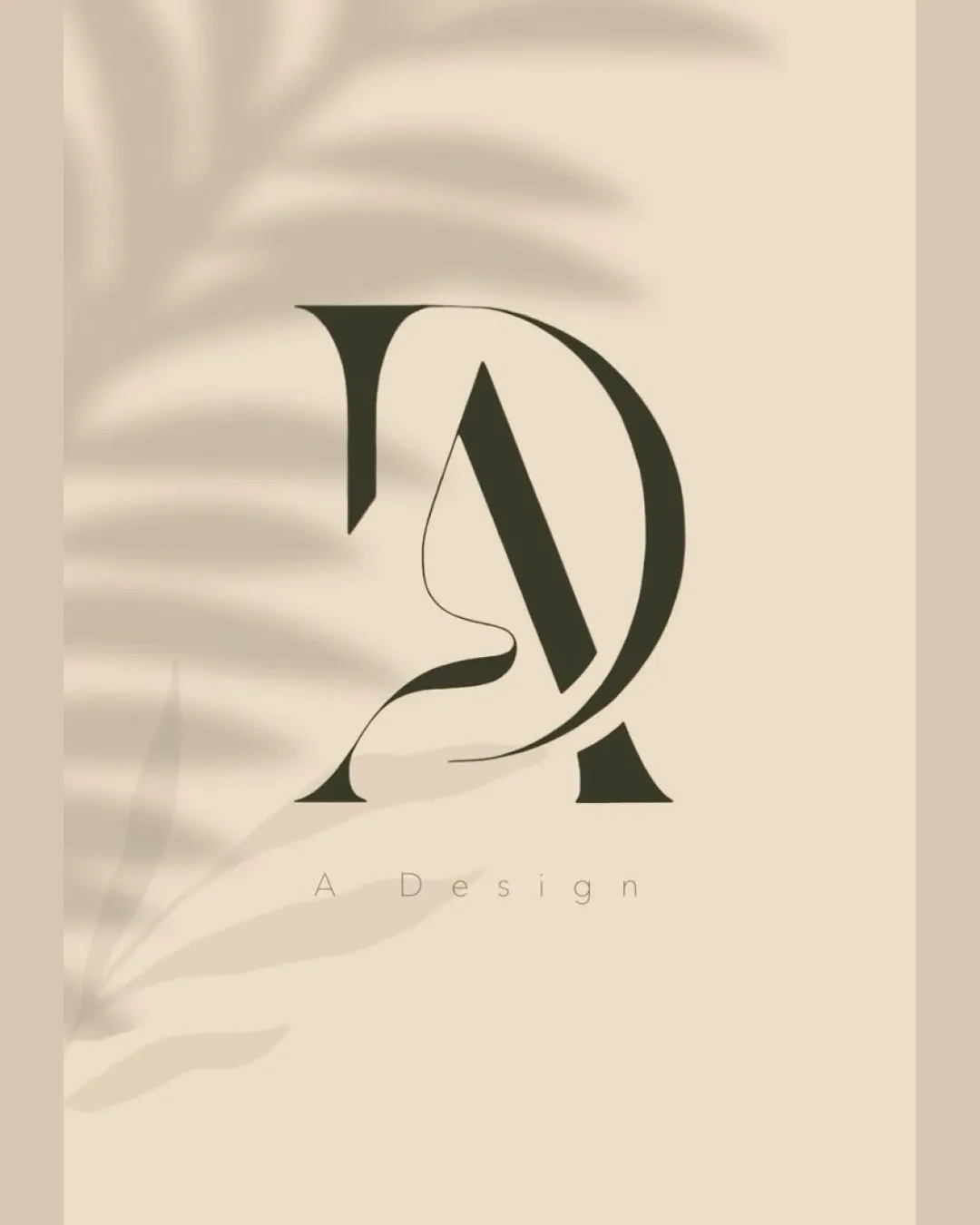
A Design logo review
4.3/5
Logo score
Logo review of

A Design

Distinctive, elegant, and memorable monogram poised for artistic or luxury markets.

Monogram Minimalist, Elegant, Fashion-inspired Creative/design/fashion
4/5
Legibility
4.5/5
Originality
5/5
Misread
4.5/5
Balance
3.5/5
Scale
Action plan

What to fix first

The most important fixes to handle before polishing the full presentation.

1

Simplify or reinforce the fine face-profile line for small size clarity

High priority

The monoline illustration could lose definition at smaller sizes, affecting recognition.

Impact: Improves Scalability And Detail Retention In All Practical Applications · Effort: Low

2

Deepen the personality of the wordmark (optional)

Medium priority

While elegant, the generic wordmark may limit the logo's memorability in competitive sectors.

Impact: Enhances Identity Distinctiveness · Effort: Medium

Detailed review

Logo performance breakdown

4/5

Legibility

Checkmark icon Wordmark 'A Design' is readable and refined
Checkmark icon Main monogram letters are generally clear

Warning icon High contrast between refined wordmark and visually complex monogram might affect immediate recognition

4.5/5

Originality

Checkmark icon Unique face-profile integration in monogram
Checkmark icon Distinctive letter construction

Warning icon Slightly reminiscent of luxury or beauty sector cliches

4/5

Color harmony

Checkmark icon Earth-tone palette gives a modern and upscale feel
Checkmark icon High contrast between foreground and background

Warning icon Palette may appear muted on certain backgrounds

Beige
#DDD4C1

Dark Olive
#373326

Your palette is close. Refine the color roles and combinations before updating the logo.

Build brand colors
4.5/5

Balance alignment

Checkmark icon Excellent proportion and harmony in monogram composition
Checkmark icon Well-centered; wordmark sits comfortably below

Warning icon Slight visual tension where hand-drawn line intersects letters

logo 200x250 pixels scalability test alignment grid overlay
3.5/5

Scalability

Checkmark icon Monogram is bold enough for medium sizes
Checkmark icon Minimalist palette maintains clarity

Warning icon Fine linework in the profile illustration could lose detail at small sizes

logo 200x250 pixels scalability test

200x250 px

logo 100x125 pixels scalability test

100×125 px

logo 50x62 pixels scalability test

50×62 px

5/5

Misinterpretations

Checkmark icon No negative or ambiguous interpretations

4.5/5

Logo structure & brief match

Checkmark icon Wordmark subtly supports and doesn't compete with main mark

Warning icon Minimal wordmark may lack distinctive character

Checkmark icon Creativity: Strong, with artistic integration of abstract and literal elements
Checkmark icon Aesthetic: Aligns well with minimalist, upscale, or creative industry desires

Try your own review

Wondering how your logo performs?

Get a clear logo score, key risks, and priority fix ideas before your client or audience sees it.

Review my logo