Concept & direction
An abstract, flowing monogram hints at intertwined growth or connection, suggesting personalized guidance.
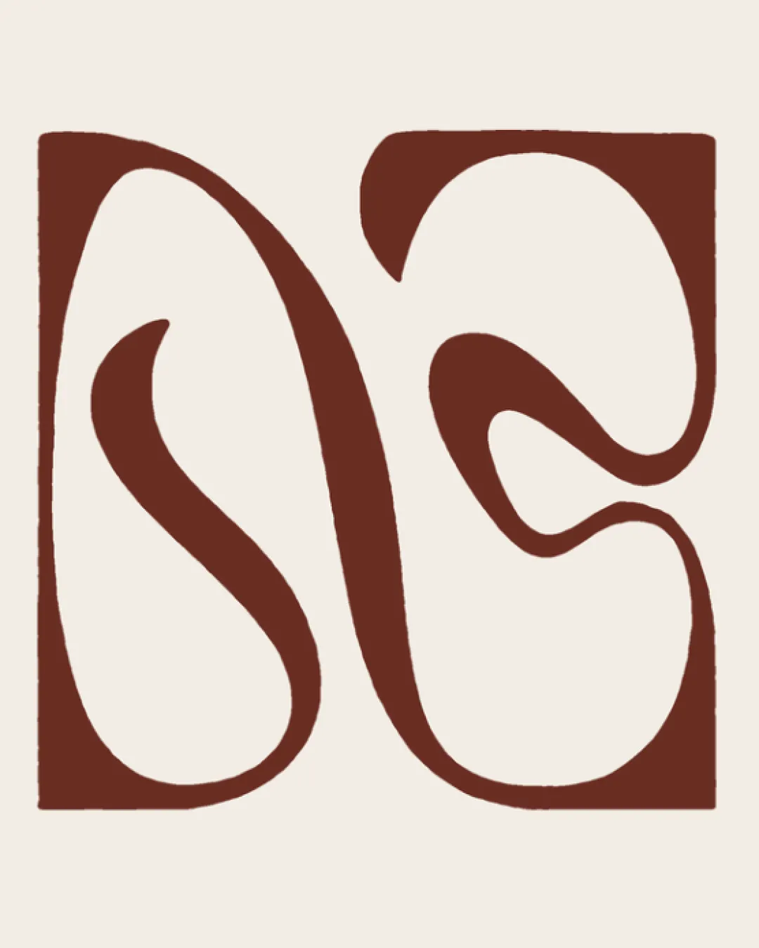
A bold, memorable abstract monogram suitable for coaching, but its main limitation is letter legibility for first-time viewers.
This monogram shows solid execution, supported by distinctive construction and clarity at smaller sizes; improving letter recognition is the clearest next step.
Focus on the changes that matter. Keep what makes the logo work.
An abstract, flowing monogram hints at intertwined growth or connection, suggesting personalized guidance.
Logo preview unavailable. The written feedback is still available on this card.
entire mark
The monogram features highly stylized letterforms that could be interpreted as 'N' and 'S', but the abstract style may obscure the letters, depending on viewer familiarity.
See the category reviewThe flowing monogram and stable geometric form fit leadership coaching, though improved clarity in the letterforms would serve the brief even better.

Inspect spacing with the guide. Optical balance may differ from geometric centering.
The monogram features highly stylized letterforms that could be interpreted as 'N' and 'S', but the abstract style may obscure the letters, depending on viewer familiarity.
Try: Test with target users to confirm letter recognition; consider clarifying one or both forms if confused.
Logo preview unavailable. The written feedback is still available on this card.
Get a clear logo score, key risks, and priority fix ideas before your client or audience sees it.
More credits needed
Add credits to continue without losing your work.
Then $7/month. Cancel anytime.
Essential logo review with AI
Estimated progress