What to preserve
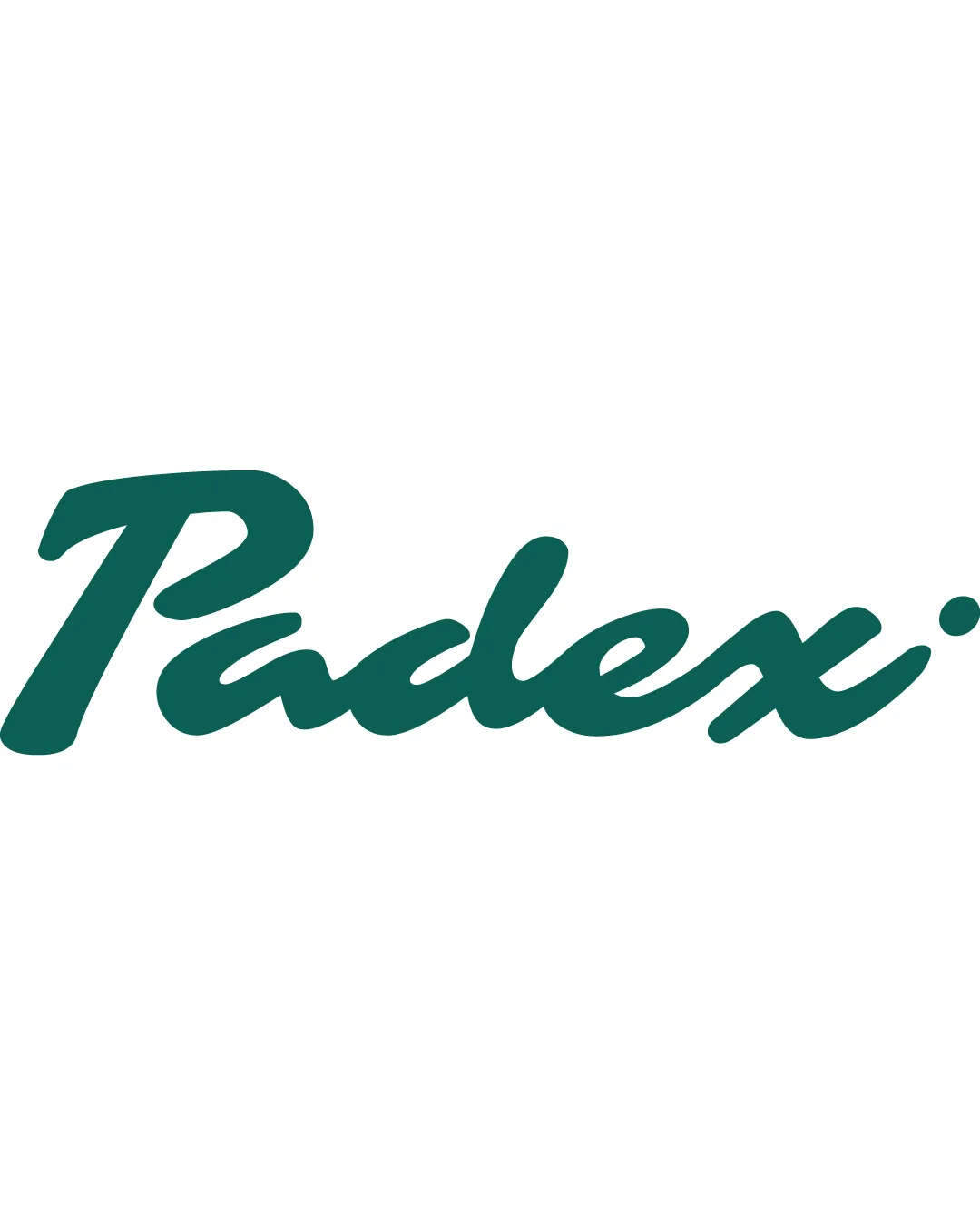
A custom script wordmark creates an elegant, refined impression suitable for a premium sports and lifestyle brand.

A sophisticated, legible custom script wordmark that convincingly supports a premium sports/lifestyle positioning, with only minor improvements needed for optimal balance.
This wordmark shows strong execution, supported by text readability and distinctive construction.
Focus on the changes that matter. Keep what makes the logo work.
A custom script wordmark creates an elegant, refined impression suitable for a premium sports and lifestyle brand.
entire wordmark
The custom script achieves visual flow and energy, but large flourishes on certain letters create a slightly uneven visual weight across the wordmark.
See the category reviewThe bespoke, elegant script directly reflects the quiet luxury and high-end design goals described in the brand brief.
The custom script achieves visual flow and energy, but large flourishes on certain letters create a slightly uneven visual weight across the wordmark.
Try: Refine the transition and proportion between the 'P' and the rest of the word to enhance overall balance.

Inspect spacing with the guide. Optical balance may differ from geometric centering.
Get a clear logo score, key risks, and priority fix ideas before your client or audience sees it.
More credits needed
Add credits to continue without losing your work.
Then $7/month. Cancel anytime.
Essential logo review with AI
Estimated progress