What to preserve
An elegant, flowing abstract stroke paired with refined serif typography effectively conveys a sense of care, individuality, and sophistication suited for a women's health brand.
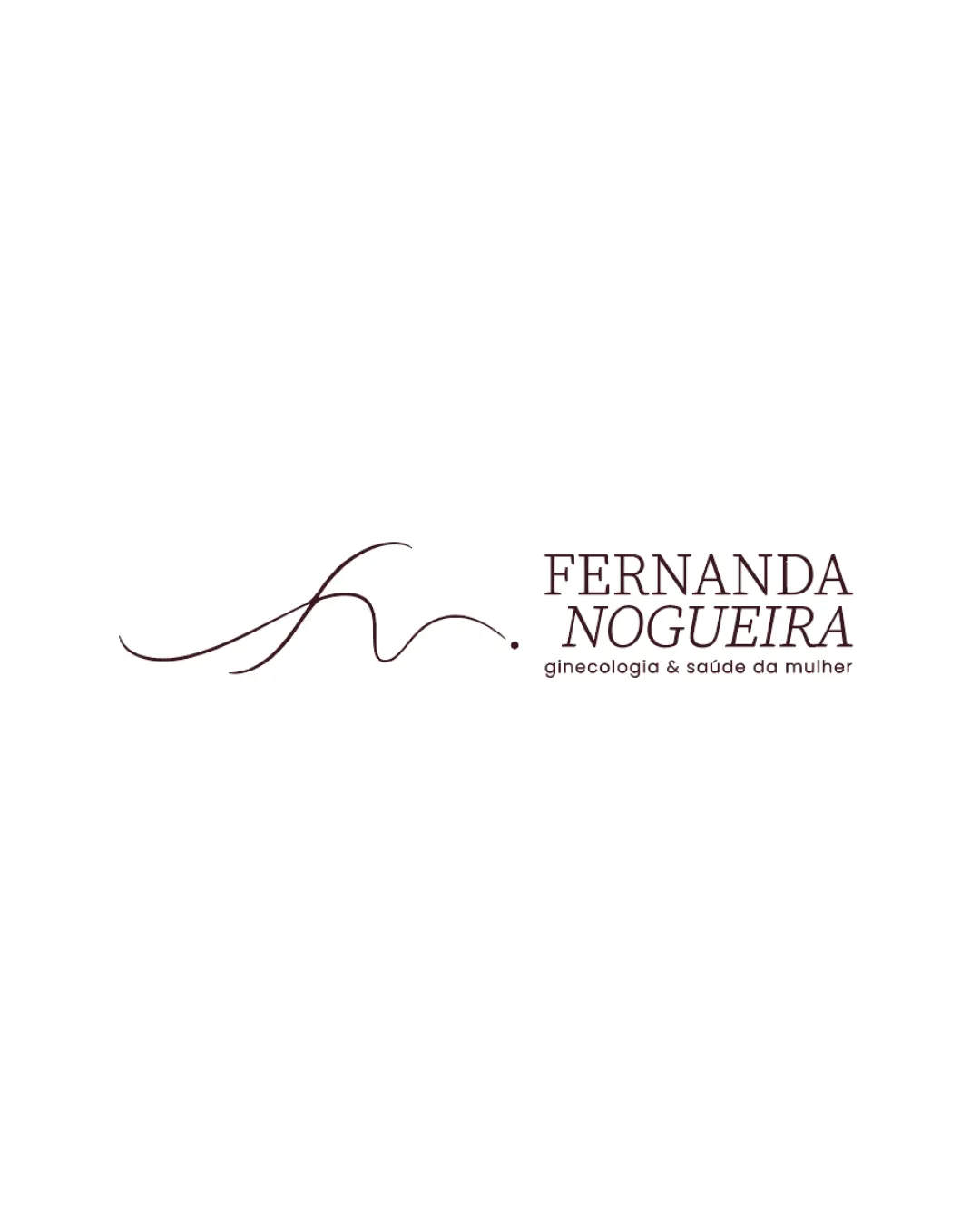
A refined, elegant logo well-matched to a personal brand in women's health, expressing care and individuality; minor improvements would optimize its impact.
This logo lockup shows strong execution, supported by visual balance and distinctive construction.
Focus on the changes that matter. Keep what makes the logo work.
An elegant, flowing abstract stroke paired with refined serif typography effectively conveys a sense of care, individuality, and sophistication suited for a women's health brand.
Logo preview unavailable. The written feedback is still available on this card.
combination mark arrangement
The spacing between the fluid abstract mark and the wordmark is ample, possibly leading to a slight disconnect; the elements could potentially feel more integrated with subtle adjustment.
See the category reviewThe logo effectively communicates femininity, personal care, and individuality through its elegant abstract mark and refined wordmark, aligning closely with the brand's values and proposed positioning.
Wordmark 4/5 · Layout 4/5
The tagline ('ginecologia & saúde da mulher') is set in small, thin text, which may be less legible at reduced sizes or lower resolutions.
Symbol 4/5 · Wordmark 4/5
Symbol 4/5 · Wordmark 4/5 · Layout 4/5
The spacing between the fluid abstract mark and the wordmark is ample, possibly leading to a slight disconnect; the elements could potentially feel more integrated with subtle adjustment.
Try: Reduce spacing or create a subtle overlap to increase cohesion between mark and wordmark.
Logo preview unavailable. The written feedback is still available on this card.

Inspect spacing with the guide. Optical balance may differ from geometric centering.
Symbol 4/5 · Wordmark 4/5 · Layout 4/5
Get a clear logo score, key risks, and priority fix ideas before your client or audience sees it.
More credits needed
Add credits to continue without losing your work.
Then $7/month. Cancel anytime.
Essential logo review with AI
Estimated progress