What to preserve
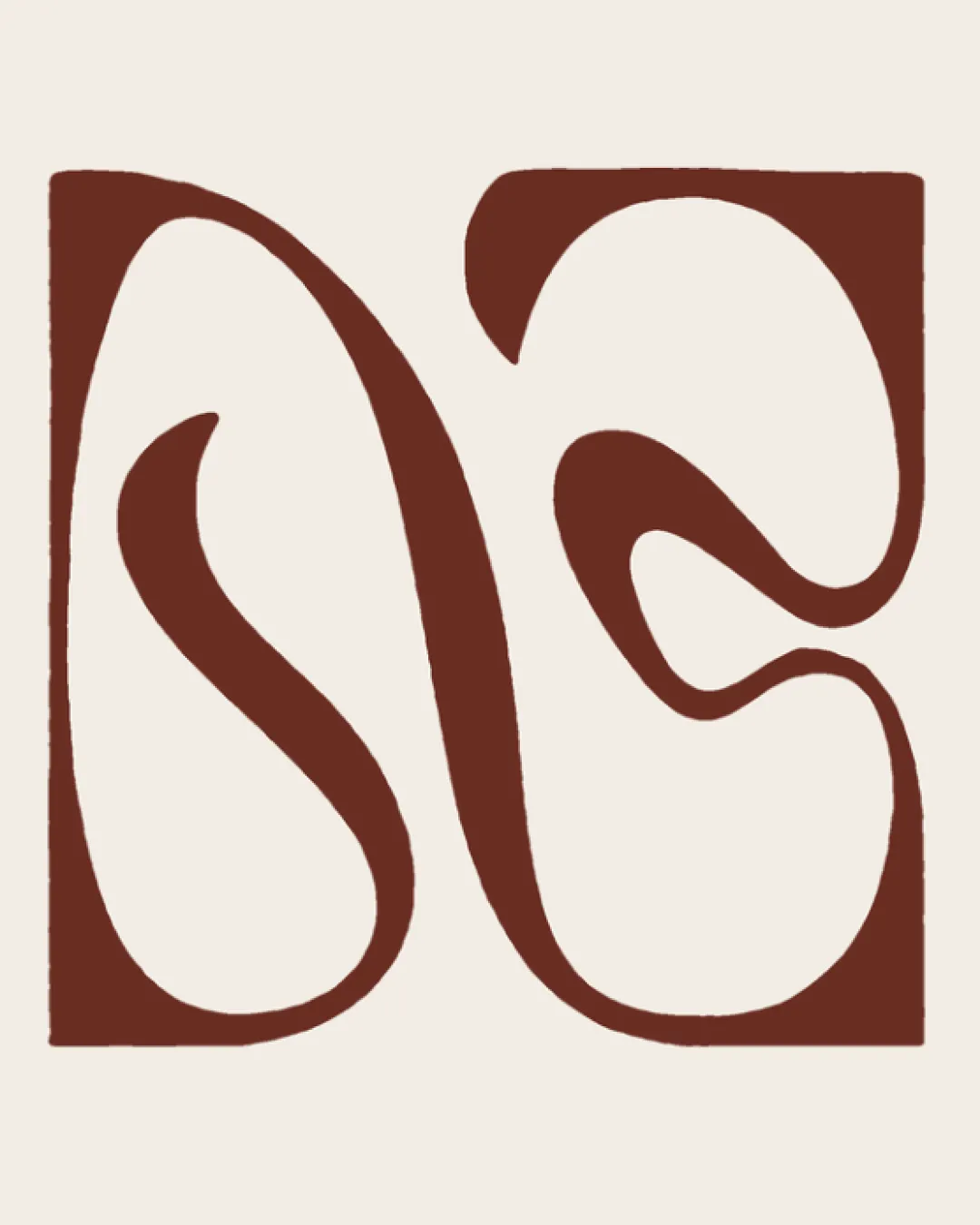
The logo creatively uses a tape motif to form the letter 'N', effectively connecting the brand name with a handcraft theme.
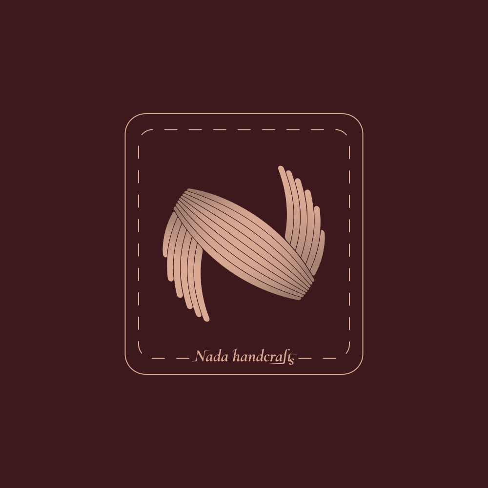
This is a visually original, relevant handmade brand logo with minor risks: the script needs testing at reduced sizes to maintain practical usability.
This logo lockup shows solid execution, supported by visual balance and text hierarchy; improving text readability is the clearest next step.
Focus on the changes that matter. Keep what makes the logo work.
The logo creatively uses a tape motif to form the letter 'N', effectively connecting the brand name with a handcraft theme.
Logo preview unavailable. The written feedback is still available on this card.
wordmark (bottom center)
The small, delicate script of 'Nada handcrafts' may become difficult to read at reduced sizes or in low-contrast contexts.
See the category reviewCreative tape 'N' symbol directly and elegantly reflects Nada's handcrafts focus, with main risk in small text clarity.
Symbol 4/5 · Wordmark 4/5 · Layout 4/5
The square border, dashed lines, and central N-mark are well aligned, but the wordmark placement may be perceived as low, creating a slightly bottom-heavy feel.
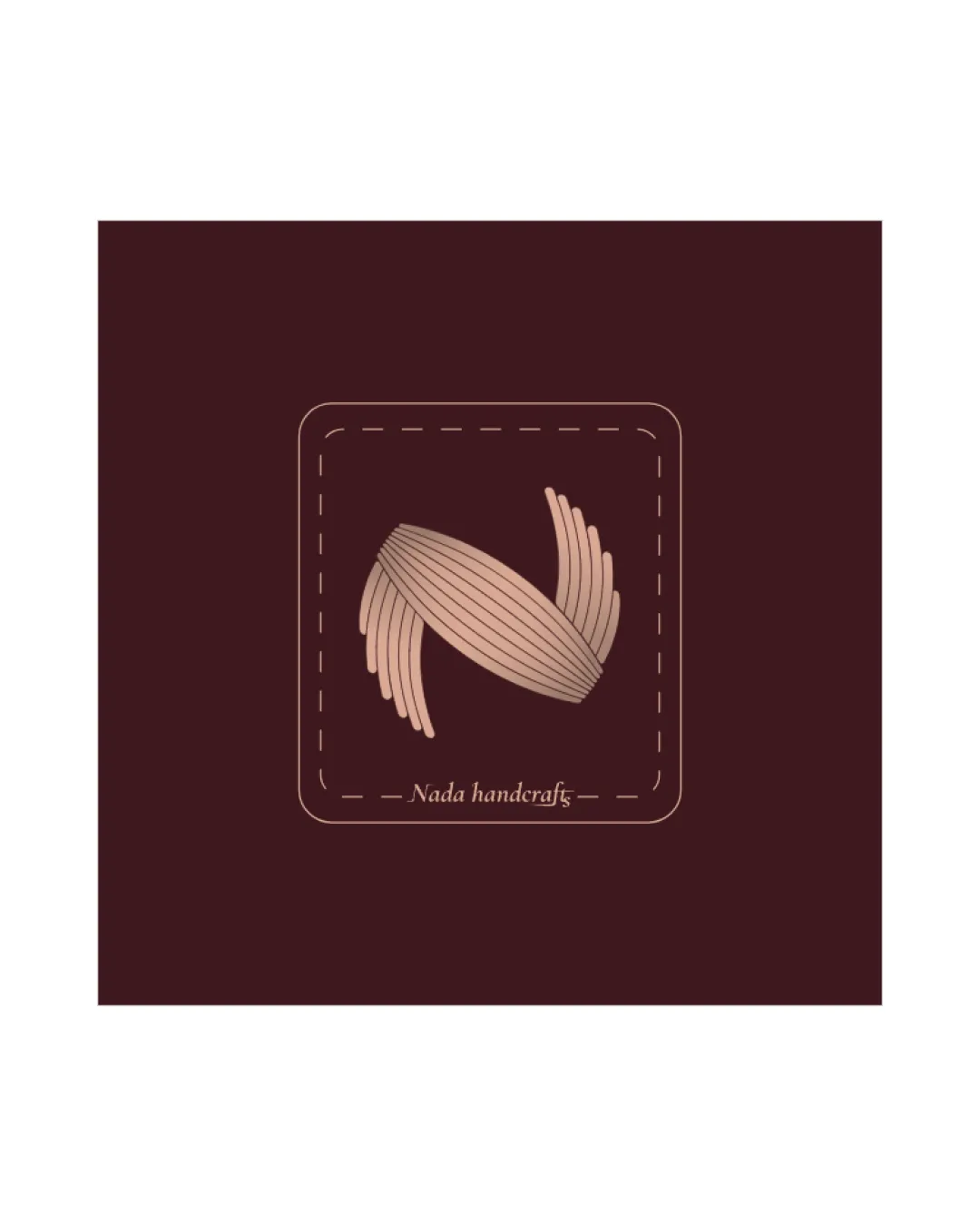

Inspect spacing with the guide. Optical balance may differ from geometric centering.
Symbol 4/5 · Wordmark 3/5
Wordmark 3/5 · Layout 4/5
The small, delicate script of 'Nada handcrafts' may become difficult to read at reduced sizes or in low-contrast contexts.
Try: Test wordmark legibility at small sizes and consider a bolder or clearer typeface if necessary.
Logo preview unavailable. The written feedback is still available on this card.
Symbol 3/5 · Wordmark 3/5 · Layout 3/5
Fine parallel tape lines and interior spacing are visually striking but may merge or lose detail in very small applications like embroidery or stamp-size prints.
Does the shape still work without color?
Find the surfaces where your logo stays clear.
Compare the mark and lettering on each surface.
Shows the lower-contrast areas of the logo (5th percentile). Tiny details may have lower contrast. Good ≥ 4.5:1 · Medium ≥ 3:1 · Bad < 3:1. A visual guide, not an accessibility rating.
A 3px blur softens fine details so you can check whether the overall shape stays recognizable. If key gaps close or elements merge, the logo may rely too heavily on detail.
Look for clear separation between shapes and a distinctive outline.
Get a clear logo score, key risks, and priority fix ideas before your client or audience sees it.
More credits needed
Add credits to continue without losing your work.
Then $7/month. Cancel anytime.
Essential logo review with AI
Estimated progress