What to preserve
A uniquely crafted 'o' resembling a swirling pearl reinforces the brand name and premium feel.
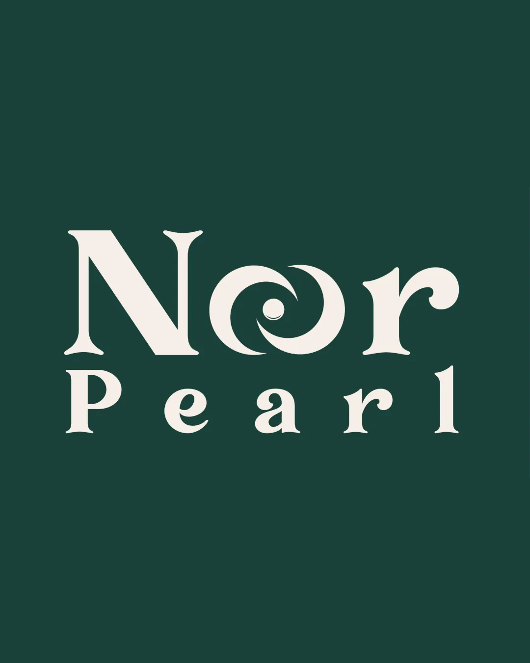
Stylish, memorable wordmark with a clear concept and strong category alignment; typographic detail adds signature flair.
This wordmark shows strong execution, supported by distinctive construction and text readability.
Focus on the changes that matter. Keep what makes the logo work.
A uniquely crafted 'o' resembling a swirling pearl reinforces the brand name and premium feel.
Logo preview unavailable. The written feedback is still available on this card.
central 'o' in 'Nor'
The custom spiral 'o' is distinctive and integrates a pearlescent concept, elevating the logotype beyond standard serif fonts.
Test the 'o' for legibility at small sizes to ensure the swirl remains clear.
The spiral 'o' and elegant serif suit a luxury or jewelry brand, with only minor scalability caution for optimal application.
The custom spiral 'o' is distinctive and integrates a pearlescent concept, elevating the logotype beyond standard serif fonts.
Try: Retain the unique 'o' as a strong brand device.
Check: Test the 'o' for legibility at small sizes to ensure the swirl remains clear.
Logo preview unavailable. The written feedback is still available on this card.
The two-line arrangement is visually balanced, though the wide, decorative 'N' and stylized 'o' make 'Nor' appear slightly heavier than 'Pearl'.

Inspect spacing with the guide. Optical balance may differ from geometric centering.
Get a clear logo score, key risks, and priority fix ideas before your client or audience sees it.
More credits needed
Add credits to continue without losing your work.
Then $7/month. Cancel anytime.
Essential logo review with AI
Estimated progress