What to preserve
The logo cleverly abstracts the letterforms 'P' and 'B' into map pin-like shapes, evoking a sense of place and connection relevant to a bar named 'piazza B'.
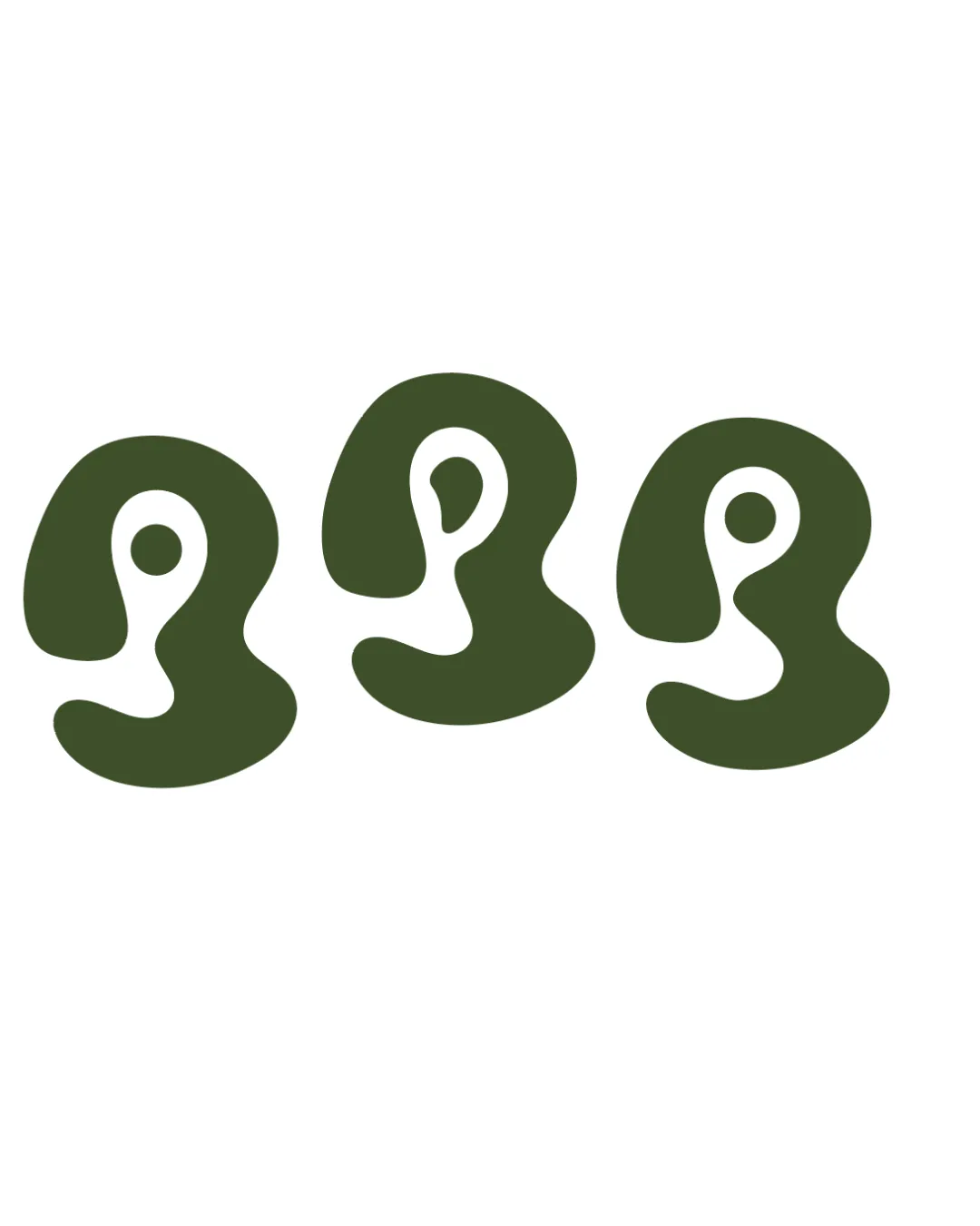
Distinctive, unified abstract symbol suitable for a bar, with excellent originality and style but potentially ambiguous letterform/message recognition.
This logomark shows strong execution, supported by distinctive construction and clarity at smaller sizes.
Focus on the changes that matter. Keep what makes the logo work.
The logo cleverly abstracts the letterforms 'P' and 'B' into map pin-like shapes, evoking a sense of place and connection relevant to a bar named 'piazza B'.
Logo preview unavailable. The written feedback is still available on this card.
overall shapes
The highly abstracted forms may not be immediately read as 'P', 'B', or a map pin to viewers unfamiliar with the intended meaning.
See the category reviewThe logo inventively merges the 'P', 'B', and map pin ideas for piazza B bar, but may require user familiarity for full impact.

Inspect spacing with the guide. Optical balance may differ from geometric centering.
The forms are solid and simple, likely holding up well at small sizes, though whitespace inside may blur on very small applications.
The highly abstracted forms may not be immediately read as 'P', 'B', or a map pin to viewers unfamiliar with the intended meaning.
Try: Test recognition of the letterforms and pin metaphor with typical customers.
Logo preview unavailable. The written feedback is still available on this card.
Get a clear logo score, key risks, and priority fix ideas before your client or audience sees it.
More credits needed
Add credits to continue without losing your work.
Then $7/month. Cancel anytime.
Essential logo review with AI
Estimated progress