Wondering how your logo performs? 🧐
Get professional logo reviews in seconds and catch design issues in time.
Try it Now!Logo review of BOMBITE
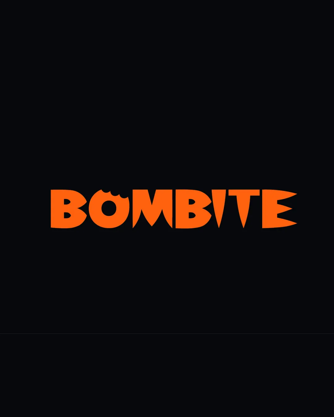
 Logo analysis by AI
Logo type:
Style:
Detected symbol:
Negative space:
Detected text:
Business industry:
Review requested by Fuwu.reads
**If AI can recognize or misinterpret it, so can people.
Structured logo review
Legibility
Text is bold and letterforms are distinct.
High contrast between orange text and black background ensures clarity.
Scalability versatility
Simple and bold letterforms make the logo scalable.
Should reproduce well on signage, packaging, and digital formats.
Highly stylized type might lose impact or become less legible at extremely small sizes, especially the bite detail.

200x250 px

100×125 px

50×62 px
Balance alignment
Overall composition is visually balanced.
Even letterspacing gives a cohesive, unified appearance.
Exaggerated angles in the 'E' create slight visual tension on the right side.


Originality
Creative use of a 'bite' mark in the ‘O’ ties conceptually to the brand name.
Custom letterforms add individuality.
Avoids complete originality due to the trend of using bite effects in food brands.
Aesthetic look
Vibrant color, playful style, and geometric forms are attractive.
Typeface and negative space effect result in a bold, memorable look.
Aggressive points in some letters (‘E’) might feel visually harsh and could be rounded slightly for better cohesion.
Dual meaning and misinterpretations
No inappropriate double meanings or visual misinterpretations detected.
Color harmony
Strong contrast and excellent choice for a food or snack brand.
Limited to two bold colors, maintaining simplicity.
Orange
#FF6F07
Rich Black
#151515

