Wondering how your logo performs? 🧐
Get professional logo reviews in seconds and catch design issues in time.
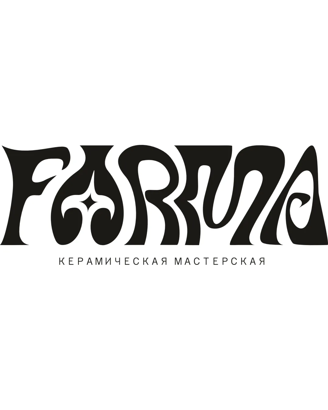
Try it Now!Logo review of KARMA
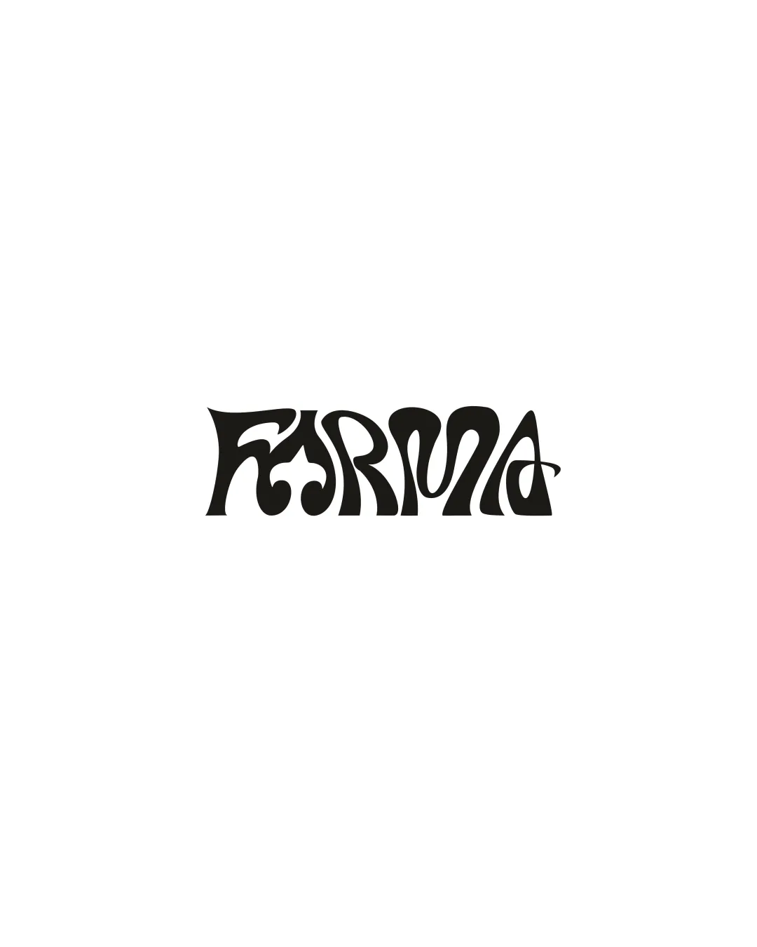
 Logo analysis by AI
Logo type:
Style:
Detected text:
Business industry:
Review requested by Looopska
**If AI can recognize or misinterpret it, so can people.
Structured logo review
Legibility
Unique custom lettering that stands out visually.
Every letter is connected, suggesting a cohesive brand identity.
Legibility is severely compromised due to elaborate, ornate typographic shapes.
Letterforms such as 'K', 'R', and 'M' are difficult to discern at a glance—risking serious misreading.
Overly stylized approach makes instant recognition nearly impossible, especially at smaller sizes.
Scalability versatility
Thick lines and bold style could retain some visibility at medium scales, such as posters or album covers.
Fine quirky internal details will blur or disappear completely when scaled down, making it unusable for favicons, business cards, or embroidery.
At very large scales (like signage), the legibility issue becomes even more pronounced due to the unusual shapes.

200x250 px

100×125 px

50×62 px
Balance alignment
The composition is horizontally centered and the word length is balanced overall.
Individual letter shapes introduce visual weight inconsistencies, making the baseline look uneven and slightly chaotic.
Varying widths and heights for different letters disrupt smooth reading and optical alignment.


Originality
Distinctive and memorable typographic style not typically seen in mainstream logos.
Retro and psychedelic influences create a strong visual statement.
The highly stylized approach could inadvertently echo generic psychedelic band wordmarks from the 1970s, reducing differentiation in that niche.
Aesthetic look
Bold and eye-catching look with a definite retro/psychedelic vibe.
Visual rhythm across the letters feels intentional and artistic.
Visual busyness may alienate audiences seeking modern or minimal aesthetics.
The style could be perceived as dated outside of nostalgia-driven sectors.
Dual meaning and misinterpretations
No immediate or obvious inappropriate symbols detected.
Color harmony
Single black color choice maximizes contrast, making the logo stand out against white backgrounds.
Simple palette allows for easy adaptation.
Black
#000000
White
#FFFFFF

