Wondering how your logo performs? 🧐
Get professional logo reviews in seconds and catch design issues in time.
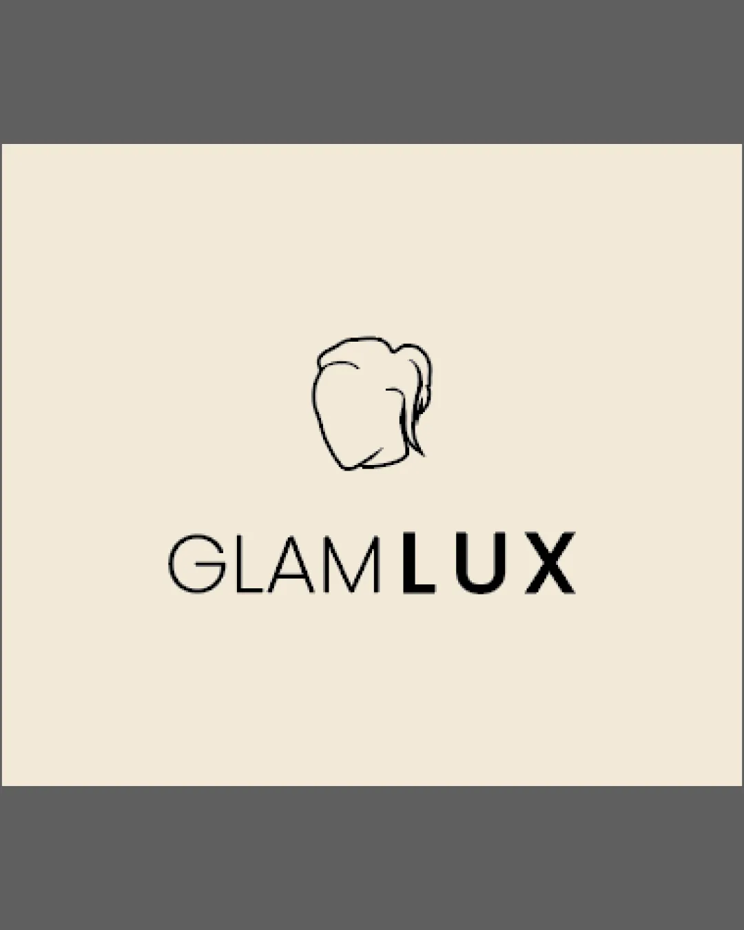
Try it Now!Logo review of Longessa

 Logo analysis by AI
Logo type:
Style:
Detected symbol:
Detected text:
Business industry:
Review requested by Gama
**If AI can recognize or misinterpret it, so can people.
Structured logo review
Legibility
![]() Wordmark is clean, evenly spaced, and immediately readable.
Wordmark is clean, evenly spaced, and immediately readable.![]() Font choice aids clarity and gives a modern tone.
Font choice aids clarity and gives a modern tone.
Scalability versatility
![]() Minimal detail allows for clear scaling to small sizes such as app icons and business cards.
Minimal detail allows for clear scaling to small sizes such as app icons and business cards.![]() Strong contrast works across digital and print media.
Strong contrast works across digital and print media.
![]() Script-style 'L' in the symbol may lose some clarity in very tiny applications such as embroidery or small favicons.
Script-style 'L' in the symbol may lose some clarity in very tiny applications such as embroidery or small favicons.
200x250 px
100×125 px
50×62 px
Balance alignment
![]() Perfect centering of the symbol above the wordmark maintains visual balance.
Perfect centering of the symbol above the wordmark maintains visual balance.![]() Thickness of strokes is consistent throughout the logomark and wordmark.
Thickness of strokes is consistent throughout the logomark and wordmark.

Originality
![]() Custom, monoline script 'L' feels unique within its circle enclosure.
Custom, monoline script 'L' feels unique within its circle enclosure.![]() Combination mark provides a distinct visual identity.
Combination mark provides a distinct visual identity.
![]() Use of a letter inside a circle is a moderately common motif—could push for more inventive form to reach top originality.
Use of a letter inside a circle is a moderately common motif—could push for more inventive form to reach top originality.
Logomark wordmark fit
![]() Line weights match perfectly between the symbol and text.
Line weights match perfectly between the symbol and text.![]() Both share a soft, geometric character, which enhances cohesion.
Both share a soft, geometric character, which enhances cohesion.
Aesthetic look
![]() Clean, modern, and visually appealing.
Clean, modern, and visually appealing.![]() Minimalist approach gives the logo timelessness and high versatility.
Minimalist approach gives the logo timelessness and high versatility.
Dual meaning and misinterpretations
![]() No inappropriate or accidental dual meanings detected.
No inappropriate or accidental dual meanings detected.![]() Symbol is abstract yet clearly an 'L', free from misleading references.
Symbol is abstract yet clearly an 'L', free from misleading references.
Color harmony
![]() Single color use is sophisticated, professional, and ensures maximum applicability.
Single color use is sophisticated, professional, and ensures maximum applicability.![]() Dark gray on off-white gives strong contrast and visual comfort.
Dark gray on off-white gives strong contrast and visual comfort.
Mine Shaft
#46443D
Alabaster
#FAF7F1