Wondering how your logo performs? 🧐
Get professional logo reviews in seconds and catch design issues in time.
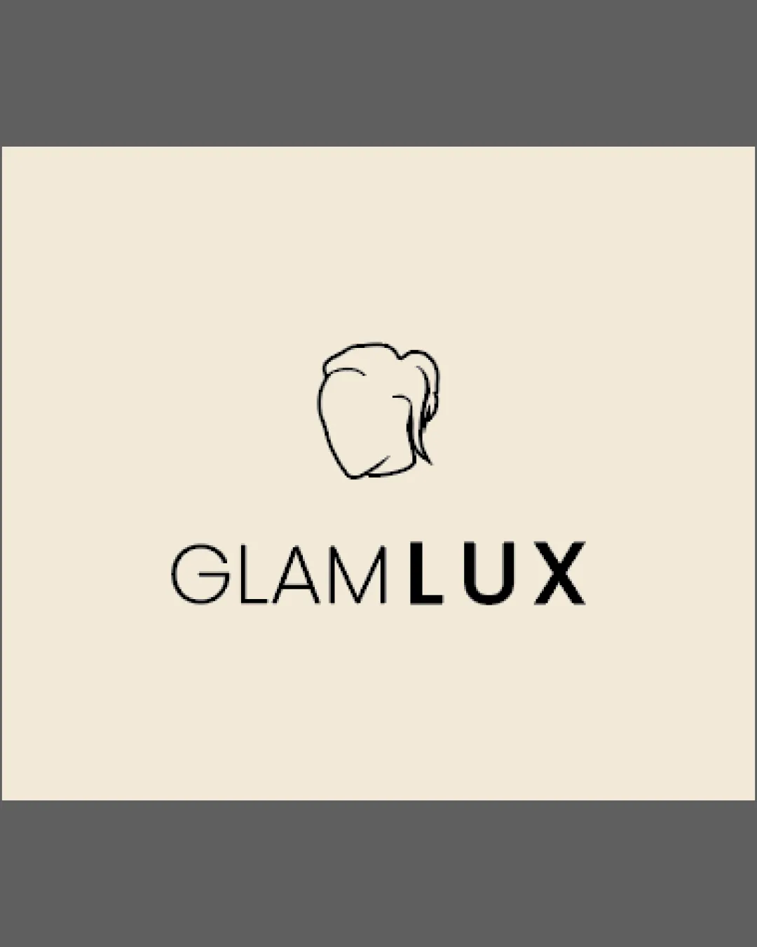
Try it Now!Logo review of KWAH SAHN

 Logo analysis by AI
Logo type:
Style:
Detected text:
Business industry:
Review requested by Fuwu.reads
**If AI can recognize or misinterpret it, so can people.
Structured logo review
Legibility
![]() Letters are clean, geometric, and distinct.
Letters are clean, geometric, and distinct.![]() High contrast between text and background aids readability.
High contrast between text and background aids readability.
![]() Some spacing and unconventional alignment between the two words may slightly impact quick legibility at a glance.
Some spacing and unconventional alignment between the two words may slightly impact quick legibility at a glance.![]() The unique curvature of the 'K' could initially be misread by some viewers.
The unique curvature of the 'K' could initially be misread by some viewers.
Scalability versatility
![]() Simple design ensures visibility at large scales (e.g., billboards, banners).
Simple design ensures visibility at large scales (e.g., billboards, banners).![]() Would translate well to signage, posters, and digital screens.
Would translate well to signage, posters, and digital screens.
![]() Thin lines and tight letter spacing may lose clarity at very small sizes (e.g., business cards, merch tags).
Thin lines and tight letter spacing may lose clarity at very small sizes (e.g., business cards, merch tags).
200x250 px
100×125 px
50×62 px
Balance alignment
![]() Vertical and horizontal centering creates a strong visual anchor.
Vertical and horizontal centering creates a strong visual anchor.![]() The geometric style gives a sense of uniformity.
The geometric style gives a sense of uniformity.
![]() The spacing between lines feels uneven, causing minor imbalance.
The spacing between lines feels uneven, causing minor imbalance.![]() Letterforms (such as the 'K' and open counter of the 'A') create slight visual gaps that interrupt flow.
Letterforms (such as the 'K' and open counter of the 'A') create slight visual gaps that interrupt flow.

Originality
![]() Distinct geometric approach in the typeface adds some uniqueness.
Distinct geometric approach in the typeface adds some uniqueness.![]() Letter modifications (notably the 'K') make the wordmark distinctive.
Letter modifications (notably the 'K') make the wordmark distinctive.
![]() No symbol or icon makes it less memorable and less flexible for branding.
No symbol or icon makes it less memorable and less flexible for branding.![]() Typeface choice, while elegant, resembles many contemporary minimalist brands—risking some generic feel.
Typeface choice, while elegant, resembles many contemporary minimalist brands—risking some generic feel.
Aesthetic look
![]() Minimal color palette creates elegance and versatility.
Minimal color palette creates elegance and versatility.![]() Modern typeface and careful spacing evoke sophistication.
Modern typeface and careful spacing evoke sophistication.
![]() Letterform quirks may be polarizing and reduce broader appeal.
Letterform quirks may be polarizing and reduce broader appeal.
Dual meaning and misinterpretations
![]() No ambiguous or inappropriate imagery detected.
No ambiguous or inappropriate imagery detected.
Color harmony
![]() Two-color palette provides excellent contrast and brand recognition.
Two-color palette provides excellent contrast and brand recognition.![]() Sophisticated use of brown and off-white is harmonious and refined.
Sophisticated use of brown and off-white is harmonious and refined.
Brown
#522814
Off White
#F8F3ED