Wondering how your logo performs? 🧐
Get professional logo reviews in seconds and catch design issues in time.
Try it Now!Logo review of TABOURETTE interior design
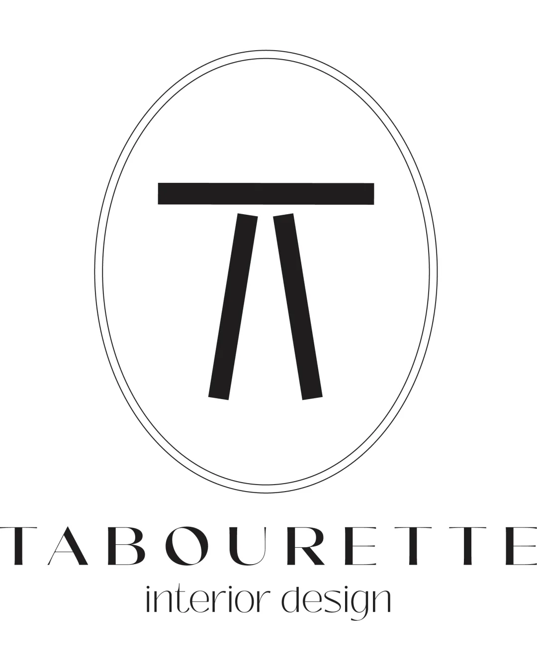
 Logo analysis by AI
Logo type:
Style:
Detected symbol:
Detected text:
Business industry:
Review requested by Shadowberry
**If AI can recognize or misinterpret it, so can people.
Structured logo review
Legibility
Main wordmark 'TABOURETTE' is clean and easy to read.
Descriptive sub-text 'interior design' is clear.
Letter spacing is slightly tight, particularly in the wordmark, making some letters less distinct at smaller sizes.
Scalability versatility
Simple forms in the symbol will scale well and remain legible at small sizes.
Minimal color ensures adaptability on various backgrounds.
Thinness of lines in wordmark and oval may become hard to see at very small sizes, such as on business cards or product tags.
Detailed sub-text may blur at smaller scales.

200x250 px

100×125 px

50×62 px
Balance alignment
The central symbol is visually balanced within the oval frame.
Wordmark is noticeably wider than the circular emblem, creating a disconnect between symbol and text.
Visual weight of the top bar in the symbol is heavy compared to the typography.


Originality
Stool/table abstract form is distinctive and cleverly references the business name and function.
Stylized approach to the initial 'T' is creative.
While the symbol is unique, minimalist symbols incorporating simple geometric shapes are common in design industries.
Logomark wordmark fit
Both symbol and typography align with a modern, clean aesthetic.
Disparity in visual heft—symbol is bold, wordmark is delicate, creating a minor mismatch in style.
Aesthetic look
Clean, modern look is visually appealing and fits well with interior design industry norms.
Strong use of minimalism enhances memorability.
Imbalance in visual weight between symbol and text.
Dual meaning and misinterpretations
No inappropriate or confusing secondary imagery detected.
Color harmony
Monochrome palette is elegant and works with nearly any application.
Strong visual contrast aids clarity.
Black
#000000
White
#FFFFFF

