Wondering how your logo performs? 🧐
Get professional logo reviews in seconds and catch design issues in time.
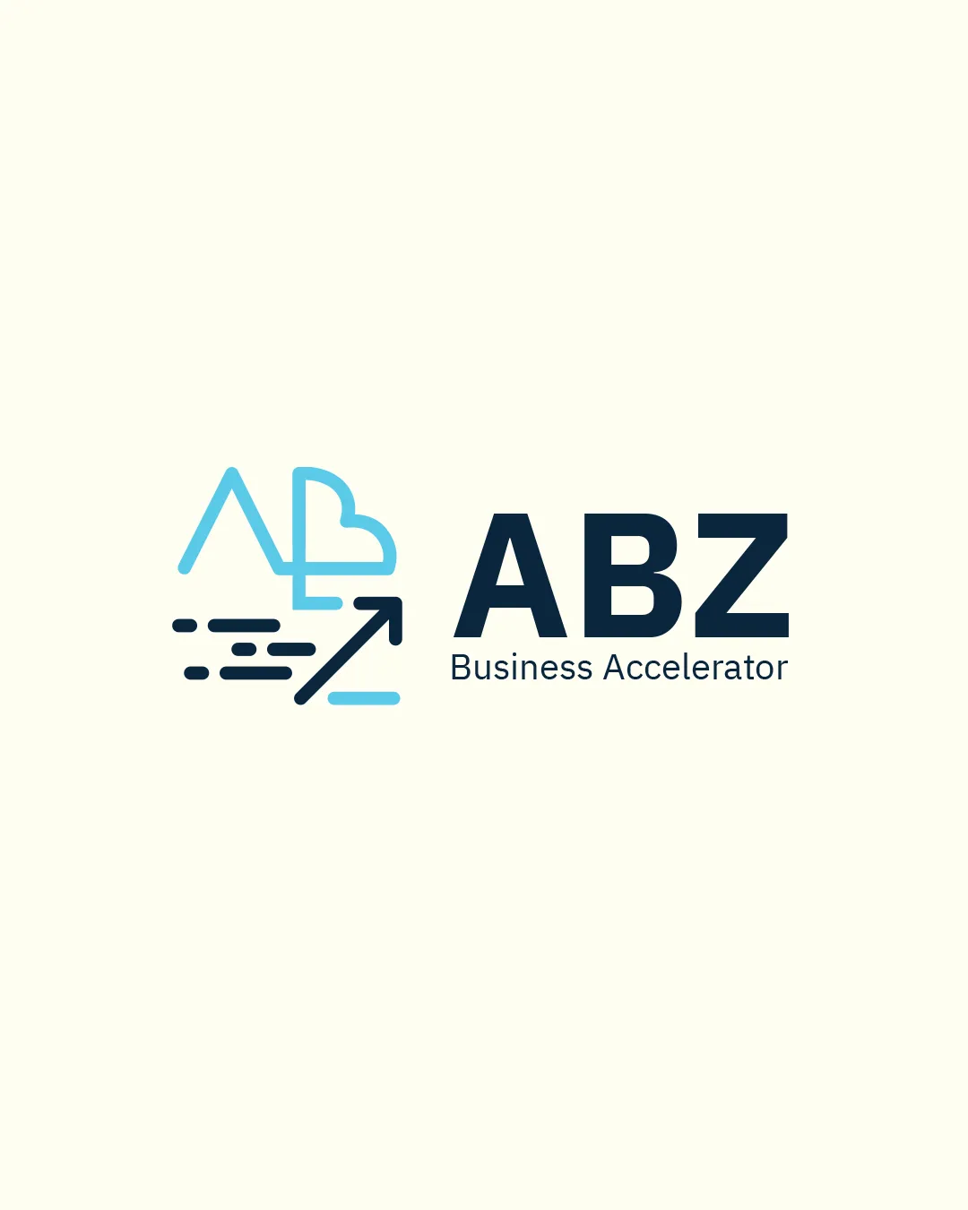
Try it Now!Logo review of ABZ, Business Accelerator
 Logo analysis by AI
Logo type:
Style:
Detected symbol:
Negative space:
Detected text:
Business industry:
Review requested by Nj_des
**If AI can recognize or misinterpret it, so can people.
Structured logo review
Legibility
![]() Primary brand name 'ABZ' is clear and high-contrast.
Primary brand name 'ABZ' is clear and high-contrast.![]() Tagline 'Business Accelerator' uses a legible, simple font.
Tagline 'Business Accelerator' uses a legible, simple font.![]() Good size differentiation between symbol and text.
Good size differentiation between symbol and text.
![]() Tagline could become harder to read at very small sizes.
Tagline could become harder to read at very small sizes.
Scalability versatility
![]() Bold logomark and simple typography support clear reproduction on large formats like billboards or signage.
Bold logomark and simple typography support clear reproduction on large formats like billboards or signage.![]() Limited color palette aids adaptability.
Limited color palette aids adaptability.
![]() Thin lines and detailed logomark could lose legibility or become muddled on small scales such as favicons, social icons, or stitching on fabric.
Thin lines and detailed logomark could lose legibility or become muddled on small scales such as favicons, social icons, or stitching on fabric.![]() Arrow could become indistinct in small applications.
Arrow could become indistinct in small applications.
200x250 px
100×125 px
50×62 px
Balance alignment
![]() Logo feels generally balanced left-to-right, with the symbol weight matching the boldness of 'ABZ.'
Logo feels generally balanced left-to-right, with the symbol weight matching the boldness of 'ABZ.'![]() Text and symbol are properly aligned horizontally.
Text and symbol are properly aligned horizontally.
![]() The tagline alignment feels slightly out of visual harmony beneath the much bolder 'ABZ.'
The tagline alignment feels slightly out of visual harmony beneath the much bolder 'ABZ.'![]() Logomark could feel slightly disconnected due to the difference in line weights.
Logomark could feel slightly disconnected due to the difference in line weights.

Originality
![]() Clever use of monogram merging A and B, suggesting growth/cloud.
Clever use of monogram merging A and B, suggesting growth/cloud.![]() Arrow and speed lines add a sense of movement.
Arrow and speed lines add a sense of movement.
![]() Monogram/cloud/arrow motifs are not unique in the business/tech acceleration sector.
Monogram/cloud/arrow motifs are not unique in the business/tech acceleration sector.![]() Some elements risk blending with other tech logos.
Some elements risk blending with other tech logos.
Logomark wordmark fit
![]() Colors and strokes connect the logomark to the wordmark harmoniously.
Colors and strokes connect the logomark to the wordmark harmoniously.![]() The tech/corporate style of both symbol and wordmark is unified.
The tech/corporate style of both symbol and wordmark is unified.
![]() Minor mismatch in thickness between the symbol’s lines and boldness of 'ABZ' detracts from perfect harmony.
Minor mismatch in thickness between the symbol’s lines and boldness of 'ABZ' detracts from perfect harmony.
Aesthetic look
![]() Modern, minimalist look.
Modern, minimalist look.![]() Professional color selection and geometric composition.
Professional color selection and geometric composition.
![]() Logomark could be simplified for more visual impact.
Logomark could be simplified for more visual impact.![]() Cloud/arrow arrangement makes the symbol look slightly busy at a glance.
Cloud/arrow arrangement makes the symbol look slightly busy at a glance.
Dual meaning and misinterpretations
![]() Symbol clearly communicates 'acceleration' and 'growth' without risk of inappropriate associations.
Symbol clearly communicates 'acceleration' and 'growth' without risk of inappropriate associations.
Color harmony
![]() Excellent contrast between blue accents and dark typography.
Excellent contrast between blue accents and dark typography.![]() Pleasing, limited corporate palette.
Pleasing, limited corporate palette.
Sky Blue
#64CEDD
Charcoal
#192839
Ivory
#FFFDEB