View review
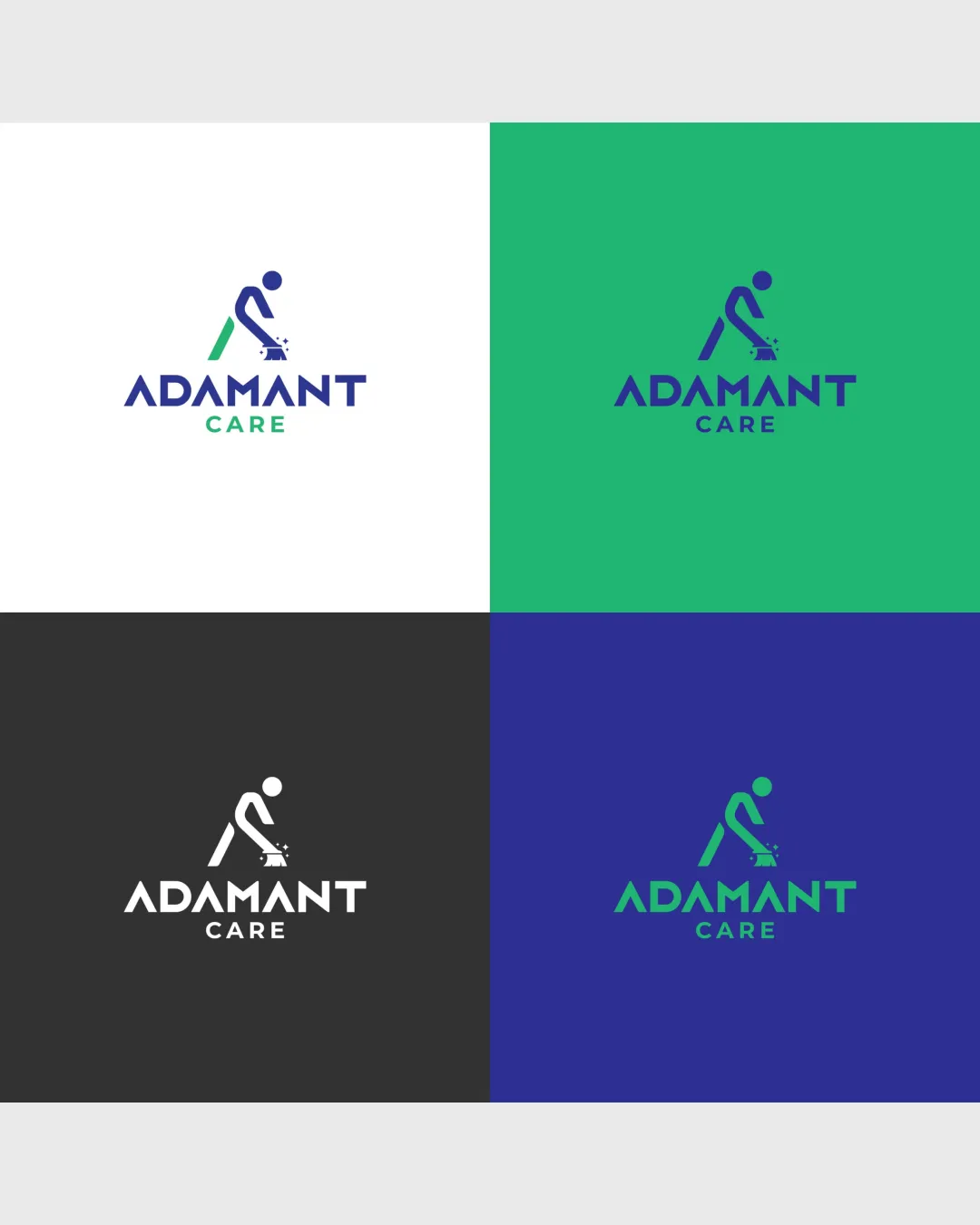
Adamant Care
Distinctive, modern, and professional—very strong solution with minor polish needed for maximum versatility and clarity.
What to fix first
The most important fixes to handle before polishing the full presentation.
Increase contrast and weight for the 'CARE' text in all color versions.
High priorityThe subtext becomes understated, especially at small sizes or on specific backgrounds.
Impact: Improves Legibility And Brand Name Clarity. · Effort: Low
Slightly thicken or simplify the human figure's lines for small-scale reproduction.
Medium priorityThin strokes in the symbol may become illegible when scaled down.
Impact: Reduces Risk Of Details Collapsing At Small Sizes. · Effort: Medium
Logo performance breakdown
Legibility
Wordmark is highly readable.
Font choice fits a professional, modern tone.
'CARE' in smaller type is less prominent, especially on colored backgrounds.
Originality
Cleaner silhouette than many industry competitors.
Direct, descriptive mark.
Figure-with-machine is somewhat common in cleaning sector logos.
Color harmony
Green and blue palette is fresh and professional.
Good contrast on most backgrounds.
Green wordmark on white or blue background has slightly reduced contrast for 'CARE'.
Navy
#26377E
Green
#22B788
White
#FFFFFF
Dark Gray
#383838
Your palette is close. Refine the color roles and combinations before updating the logo.
Build brand colorsBalance alignment
Good vertical alignment between wordmark and symbol.
Pleasant proportioning.
Minor optical imbalance as the mark is left-heavy compared to wordmark width.
Scalability
Simple forms retain clarity at smaller sizes.
Multiple color versions prepared for versatile use.
Thin strokes in symbol may struggle at very small scale.
200x250 px
100×125 px
50×62 px
Misinterpretations
No obvious risk of misreading or embarrassing interpretation.
Logo structure & brief match
Mark and wordmark integrate well; visual link through shared angles and alignment.
Color split between mark and wordmark could be unified more strongly.
Industry Relevance: Symbol clearly communicates cleaning services and professionalism.
Modern And Premium Perception: Typography, simplicity, and color contribute to a premium and modern feel.
Versatility: Logo is shown working on light, dark, and color backgrounds, supporting various usage contexts.
Wondering how your logo performs?
Get a clear logo score, key risks, and priority fix ideas before your client or audience sees it.