Wondering how your logo performs? 🧐
Get professional logo reviews in seconds and catch design issues in time.
Try it Now!Logo review of maeki, Feel it. Create it
 Logo analysis by AI
Logo type:
Style:
Detected symbol:
Negative space:
Detected text:
Business industry:
Review requested by Meri
**If AI can recognize or misinterpret it, so can people.
Structured logo review
Legibility
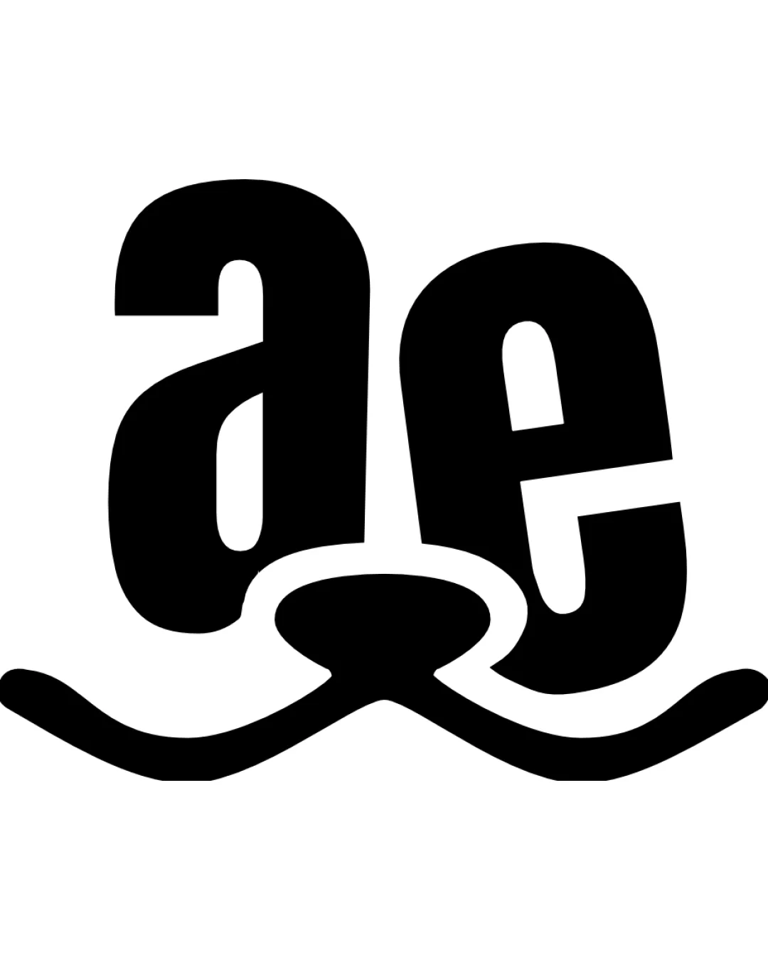
![]() Primary brand name 'maeki' is bold and mostly clear
Primary brand name 'maeki' is bold and mostly clear![]() Tagline is readable with monospaced typewriter-style font
Tagline is readable with monospaced typewriter-style font
![]() Integrated mustache/smile graphic beneath the 'ae' could distract and slightly obscure the overall flow of the brand name, particularly at smaller sizes
Integrated mustache/smile graphic beneath the 'ae' could distract and slightly obscure the overall flow of the brand name, particularly at smaller sizes![]() The connection between 'a', 'e', and the mustache/smile element may cause momentary confusion when reading quickly
The connection between 'a', 'e', and the mustache/smile element may cause momentary confusion when reading quickly
Scalability versatility
![]() Thick, bold letterforms ensure decent visibility at typical logo sizes
Thick, bold letterforms ensure decent visibility at typical logo sizes![]() Simple color palette allows for ease of reproduction in monochrome contexts
Simple color palette allows for ease of reproduction in monochrome contexts
![]() Integrated graphic under 'ae' could lose clarity and appear as visual noise at small sizes such as business cards, favicons, or embroidery
Integrated graphic under 'ae' could lose clarity and appear as visual noise at small sizes such as business cards, favicons, or embroidery![]() Fine detail in the smile/mustache may not translate cleanly to small-scale usage, reducing impact
Fine detail in the smile/mustache may not translate cleanly to small-scale usage, reducing impact![]() Would work well on store signage and digital banners but may struggle on compact merchandise
Would work well on store signage and digital banners but may struggle on compact merchandise
200x250 px
100×125 px
50×62 px
Balance alignment
![]() Overall horizontal balance is strong, with even weight throughout wordmark
Overall horizontal balance is strong, with even weight throughout wordmark![]() Tagline is well-aligned and grounds the design
Tagline is well-aligned and grounds the design
![]() The integration of the curved graphic creates slight visual heaviness under the central letters, giving mild bottom-weighted imbalance
The integration of the curved graphic creates slight visual heaviness under the central letters, giving mild bottom-weighted imbalance

Originality
![]() Creative integration of the abstract mustache/smile element into the letterforms is distinct
Creative integration of the abstract mustache/smile element into the letterforms is distinct![]() Logo avoids typical generic iconography, granting some uniqueness
Logo avoids typical generic iconography, granting some uniqueness
![]() Mustache/smile ambiguity—intent isn’t immediately clear, reducing immediate brand memorability
Mustache/smile ambiguity—intent isn’t immediately clear, reducing immediate brand memorability![]() May seem playful but could be mistaken for clipart in certain interpretations
May seem playful but could be mistaken for clipart in certain interpretations
Aesthetic look
![]() Bold black and white design has strong visual impact
Bold black and white design has strong visual impact![]() Playful graphic adds energy and character
Playful graphic adds energy and character
![]() Aesthetic cohesion between the smile/mustache element and letterforms is imperfect, leading to a slightly busy look
Aesthetic cohesion between the smile/mustache element and letterforms is imperfect, leading to a slightly busy look
Dual meaning and misinterpretations
![]() No inappropriate symbols or accidental negative connotations detected
No inappropriate symbols or accidental negative connotations detected
Color harmony
![]() Black and white palette is universally harmonious and versatile
Black and white palette is universally harmonious and versatile![]() Ensures high contrast and clarity
Ensures high contrast and clarity
Black
#000000
White
#FFFFFF