Wondering how your logo performs? 🧐
Get professional logo reviews in seconds and catch design issues in time.
Try it Now!Logo review of AIM GROUP INTERNATIONAL
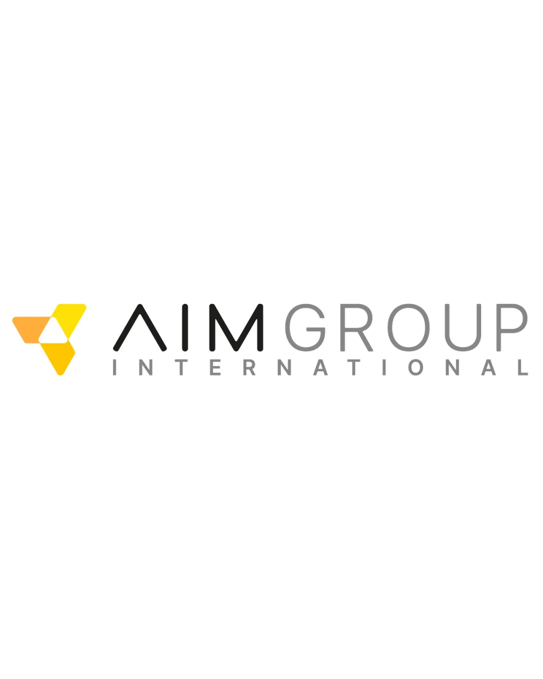
 Logo analysis by AI
Logo type:
Style:
Detected symbol:
Negative space:
Detected text:
Business industry:
Review requested by Anto.mosca
**If AI can recognize or misinterpret it, so can people.
Structured logo review
Legibility
Wordmark is clear and easily readable in all caps.
Strong contrast between text and background ensures high readability.
Scalability versatility
Simple, bold geometric mark ensures clarity at small sizes.
Wordmark is clean and legible; can be broken apart for avatar/icons.
Fine line weight in 'INTERNATIONAL' could become faint or indistinct at small scales.
Gradient in the logomark may lose impact in embroidery or single-color applications.

200x250 px

100×125 px

50×62 px
Balance alignment
Strong horizontal alignment between symbol and wordmark.
Good spacing between logo mark and type; well-proportioned wordmark.


Originality
Dynamic use of interlocking triangles hints at direction, growth, and collaboration.
Central arrow in negative space is a clever, modern touch.
Triangle/arrow approaches are somewhat common in consulting/business branding.
Logomark wordmark fit
Geometric style of the logomark complements the clean, modern typography.
Consistent weight and simplicity between mark and type.
Color choices in the logomark harmonize with the grayscale wordmark.
Aesthetic look
Modern appearance; minimal and uncluttered aesthetic.
Color palette feels energetic yet professional.
Dual meaning and misinterpretations
No inappropriate or accidental dual imagery present.
The arrow and triangle motif are universally positive business symbols.
Color harmony
Consistent use of yellow shades in the logomark for vibrancy.
Neutral grays/black in typography maintain a professional feel.
Limited color palette avoids visual clutter.
Sunglow
#FFC43D
Mustard
#FFD662
Ebony
#231F20
Light Gray
#B3B3B3

