Wondering how your logo performs? 🧐
Get professional logo reviews in seconds and catch design issues in time.
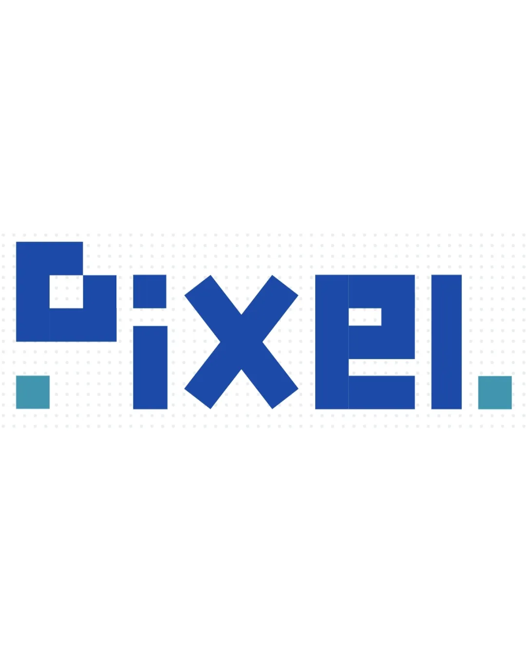
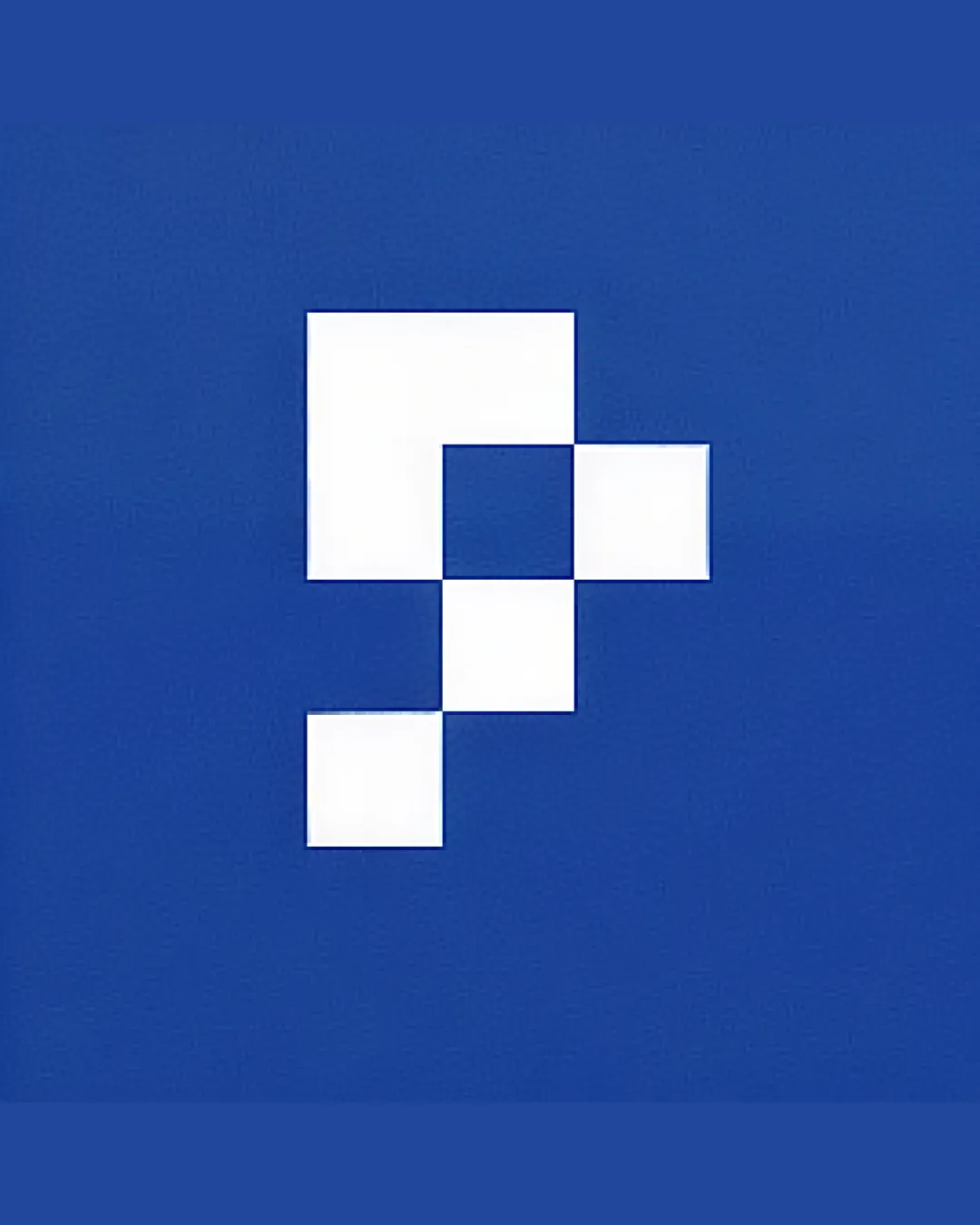
Try it Now!Logo review of pixelated checkmark or abstract 'P' shape with fou..
 Logo analysis by AI
Logo type:
Style:
Detected symbol:
Business industry:
Review requested by Amet4
**If AI can recognize or misinterpret it, so can people.
Structured logo review
Scalability versatility
![]() Bold, blocky design stays crisp at both small and large sizes.
Bold, blocky design stays crisp at both small and large sizes.![]() Works well for digital applications such as app icons, website favicons, and print (stationery, packaging).
Works well for digital applications such as app icons, website favicons, and print (stationery, packaging).
200x250 px
100×125 px
50×62 px
Balance alignment
![]() Symmetrical grid structure provides visual balance.
Symmetrical grid structure provides visual balance.![]() Geometric alignment makes the mark feel stable.
Geometric alignment makes the mark feel stable.
![]() Slight visual tension where the diagonal flow of squares meets the grid, creating an almost unfinished edge on the lower right.
Slight visual tension where the diagonal flow of squares meets the grid, creating an almost unfinished edge on the lower right.

Originality
![]() Pixel motif subtly suggests digital innovation or technology focus.
Pixel motif subtly suggests digital innovation or technology focus.
![]() Pixel/check motifs are common in tech branding—visual approach is somewhat generic without further brand context.
Pixel/check motifs are common in tech branding—visual approach is somewhat generic without further brand context.![]() Abstract 'P' is not immediately distinctive.
Abstract 'P' is not immediately distinctive.
Aesthetic look
![]() Minimalist execution gives a modern and clean appearance.
Minimalist execution gives a modern and clean appearance.![]() Color contrast is strong and professionally harnessed.
Color contrast is strong and professionally harnessed.
![]() Design lacks an emotional element or human touch, possibly making it feel too cold or corporate.
Design lacks an emotional element or human touch, possibly making it feel too cold or corporate.
Dual meaning and misinterpretations
![]() No inappropriate visual associations or risky ambiguities detected.
No inappropriate visual associations or risky ambiguities detected.
Color harmony
![]() Strong contrast between the blue background and white squares.
Strong contrast between the blue background and white squares.![]() Limited, disciplined color application makes the logo versatile and memorable.
Limited, disciplined color application makes the logo versatile and memorable.
Cobalt Blue
#2555A6
White
#FFFFFF