Wondering how your logo performs? 🧐
Get professional logo reviews in seconds and catch design issues in time.
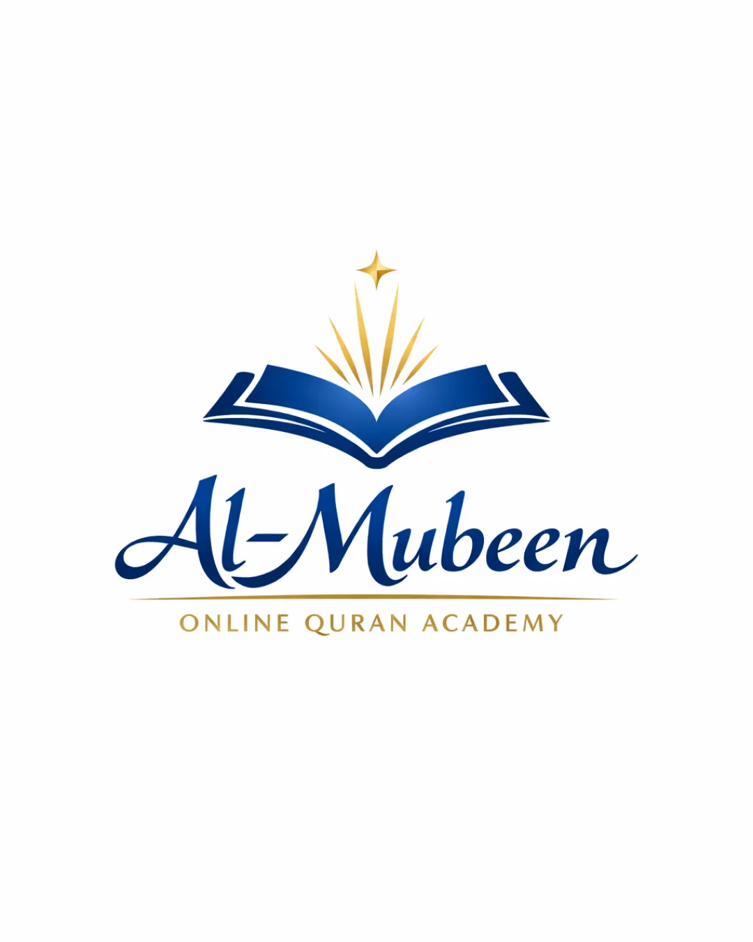
Try it Now!Logo review of Al-Mubeen, ONLINE QURAN ACADEMY
 Logo analysis by AI
Logo type:
Style:
Detected symbol:
Negative space:
Detected text:
Business industry:
Review requested by David.mill
**If AI can recognize or misinterpret it, so can people.
Structured logo review
Legibility
![]() Primary name 'Al-Mubeen' is clear and uses a stylish yet readable serif script.
Primary name 'Al-Mubeen' is clear and uses a stylish yet readable serif script.![]() Subtext 'ONLINE QURAN ACADEMY' in all caps sans-serif is highly legible.
Subtext 'ONLINE QURAN ACADEMY' in all caps sans-serif is highly legible.
Scalability versatility
![]() Bold symbol and strong contrast ensure visibility on most formats.
Bold symbol and strong contrast ensure visibility on most formats.![]() Clean design works well on digital applications and print materials like business cards or flyers.
Clean design works well on digital applications and print materials like business cards or flyers.
![]() Fine radiant gold lines and the thin golden divider may lose clarity at very small sizes or embroidery.
Fine radiant gold lines and the thin golden divider may lose clarity at very small sizes or embroidery.
200x250 px
100×125 px
50×62 px
Balance alignment
![]() Logomark is well-centered above the wordmark, maintaining visual harmony.
Logomark is well-centered above the wordmark, maintaining visual harmony.![]() Symmetry in the book icon and distribution of glowing lines reinforces balance.
Symmetry in the book icon and distribution of glowing lines reinforces balance.

Originality
![]() The integration of radiant lines and the star adds a sense of enlightenment and guidance.
The integration of radiant lines and the star adds a sense of enlightenment and guidance.
![]() Open book symbols are very common in education and religious logos, making the central idea generic.
Open book symbols are very common in education and religious logos, making the central idea generic.![]() Star and rays are standard motifs and do not introduce a significant creative twist.
Star and rays are standard motifs and do not introduce a significant creative twist.
Logomark wordmark fit
![]() Style and color of the logomark match the script and professional look of the wordmark.
Style and color of the logomark match the script and professional look of the wordmark.![]() Clear hierarchy and visual fit between logomark and both wordmark and tagline.
Clear hierarchy and visual fit between logomark and both wordmark and tagline.
Aesthetic look
![]() Elegant color pairing and a clean, well-executed modern aesthetic.
Elegant color pairing and a clean, well-executed modern aesthetic.![]() No clutter; simplicity helps the message come through strongly.
No clutter; simplicity helps the message come through strongly.
![]() Generic visual approach; could benefit from a more unique or culturally specific motif.
Generic visual approach; could benefit from a more unique or culturally specific motif.
Dual meaning and misinterpretations
![]() No inappropriate or misleading visual elements detected.
No inappropriate or misleading visual elements detected.![]() Symbolism is clear and aligns with the brand’s values.
Symbolism is clear and aligns with the brand’s values.
Color harmony
![]() Blue and gold are classic, harmonious colors that evoke wisdom and prestige.
Blue and gold are classic, harmonious colors that evoke wisdom and prestige.![]() Consistent use of two main brand colors ensures clarity and focus.
Consistent use of two main brand colors ensures clarity and focus.
Dark Blue
#1D3F7A
Gold
#C7A345
White
#FFFFFF