Wondering how your logo performs? 🧐
Get professional logo reviews in seconds and catch design issues in time.
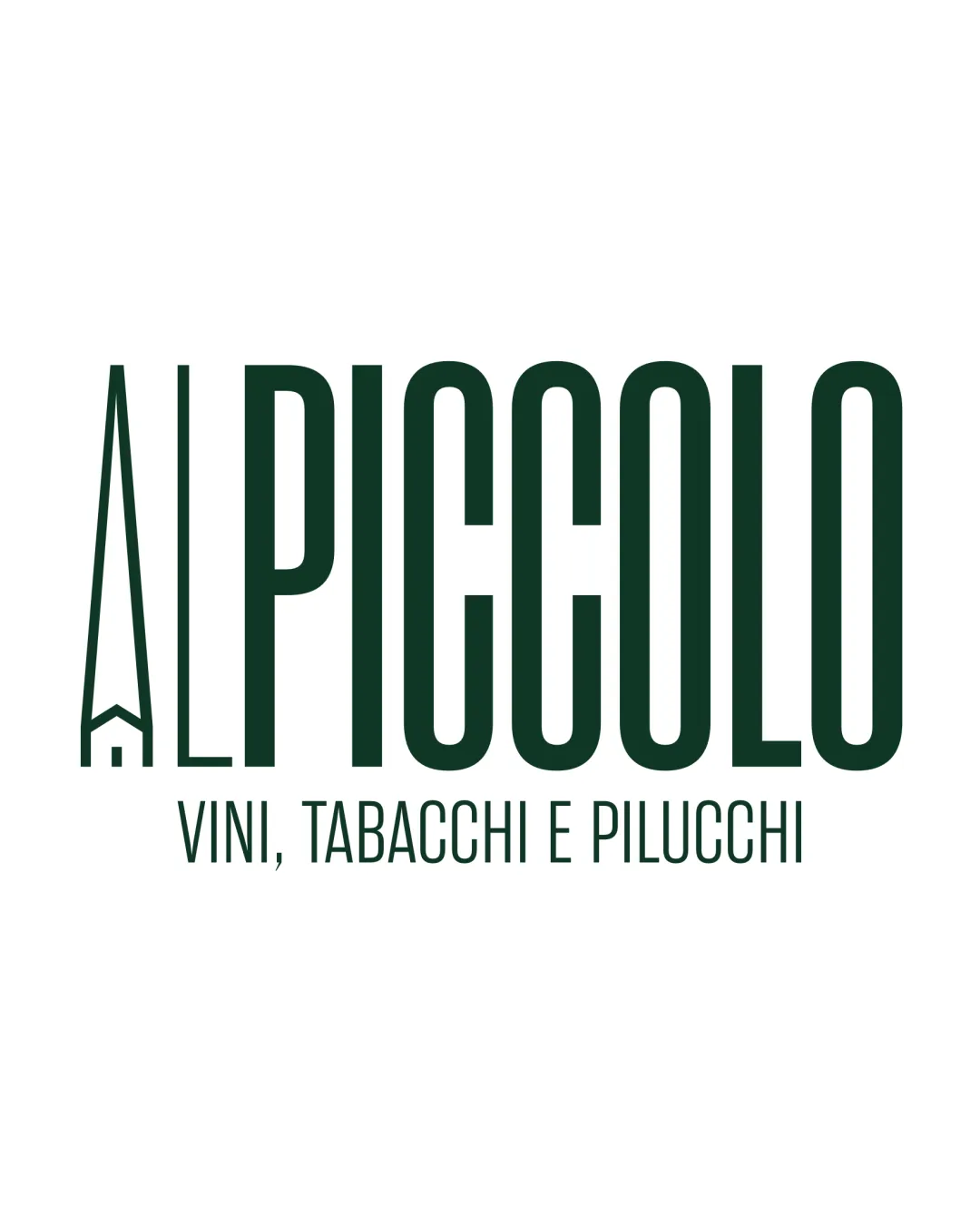
Try it Now!Logo review of AL PICCOLO VINI, TABACCHI E PILUCCHI
 Logo analysis by AI
Logo type:
Style:
Detected symbol:
Negative space:
Detected text:
Business industry:
Review requested by Maicomecredi
**If AI can recognize or misinterpret it, so can people.
Structured logo review
Legibility
![]() Main wordmark 'PICCOLO' is extremely readable with clear sans-serif type.
Main wordmark 'PICCOLO' is extremely readable with clear sans-serif type.![]() Subline is legible and sufficiently spaced.
Subline is legible and sufficiently spaced.
![]() 'A' in 'AL' is stylized, which might create a minor legibility disruption especially at small sizes or fast glances.
'A' in 'AL' is stylized, which might create a minor legibility disruption especially at small sizes or fast glances.![]() Contrast could be an issue on non-white backgrounds.
Contrast could be an issue on non-white backgrounds.
Scalability versatility
![]() Simple forms and limited color palette enhance scalability.
Simple forms and limited color palette enhance scalability.![]() House/door symbol within 'A' remains clear at moderate sizes.
House/door symbol within 'A' remains clear at moderate sizes.
![]() Thin lines in the 'A' and subline text may disappear or blur on small applications like business cards, embroidery, or favicons.
Thin lines in the 'A' and subline text may disappear or blur on small applications like business cards, embroidery, or favicons.![]() Subline is likely not readable at small scales.
Subline is likely not readable at small scales.
200x250 px
100×125 px
50×62 px
Balance alignment
![]() Overall alignment is solid.
Overall alignment is solid.![]() Main wordmark stands out and is well-centered relative to the symbol and tagline.
Main wordmark stands out and is well-centered relative to the symbol and tagline.
![]() The 'A' symbol is significantly lighter/thinner compared to the bold 'PICCOLO', introducing slight imbalance in visual weight.
The 'A' symbol is significantly lighter/thinner compared to the bold 'PICCOLO', introducing slight imbalance in visual weight.![]() Verticality of 'A' and horizontal spread of 'PICCOLO' creates minor visual tension.
Verticality of 'A' and horizontal spread of 'PICCOLO' creates minor visual tension.

Originality
![]() Nice integration of a house/door symbol in the negative space of 'A', adding a unique touch.
Nice integration of a house/door symbol in the negative space of 'A', adding a unique touch.![]() Tall condensed letters create a distinctive, recognizable silhouette.
Tall condensed letters create a distinctive, recognizable silhouette.
![]() Sans-serif condensed style is fairly common; only the 'A' mark offers uniqueness.
Sans-serif condensed style is fairly common; only the 'A' mark offers uniqueness.![]() House/door in 'A' could be seen as a generic 'home' metaphor.
House/door in 'A' could be seen as a generic 'home' metaphor.
Logomark wordmark fit
![]() 'A' logomark concept ties into ‘AL’ text cleanly, and the overall style is cohesive.
'A' logomark concept ties into ‘AL’ text cleanly, and the overall style is cohesive.
![]() The ultra-thin 'A' doesn't quite match the heavy geometric stroke weight of 'PICCOLO', causing inconsistency.
The ultra-thin 'A' doesn't quite match the heavy geometric stroke weight of 'PICCOLO', causing inconsistency.![]() Visual weight imbalance between logomark and wordmark.
Visual weight imbalance between logomark and wordmark.
Aesthetic look
![]() Clean, modern, and minimalist.
Clean, modern, and minimalist.![]() Proportionate letter spacing and bold presence.
Proportionate letter spacing and bold presence.
![]() Slightly rigid and stiff due to the condensed, tall format.
Slightly rigid and stiff due to the condensed, tall format.![]() Contrast between symbol and wordmark stroke weights detracts from a unified aesthetic.
Contrast between symbol and wordmark stroke weights detracts from a unified aesthetic.
Dual meaning and misinterpretations
![]() No inappropriate or confusing secondary symbols detected.
No inappropriate or confusing secondary symbols detected.![]() Negative space use is relevant to the theme.
Negative space use is relevant to the theme.
Color harmony
![]() Limited, harmonious color palette that is professional and elegant.
Limited, harmonious color palette that is professional and elegant.![]() Dark green is suitable for hospitality and food/beverage context.
Dark green is suitable for hospitality and food/beverage context.
DarkGreen
#17382B
White
#FFFFFF