Wondering how your logo performs? 🧐
Get professional logo reviews in seconds and catch design issues in time.
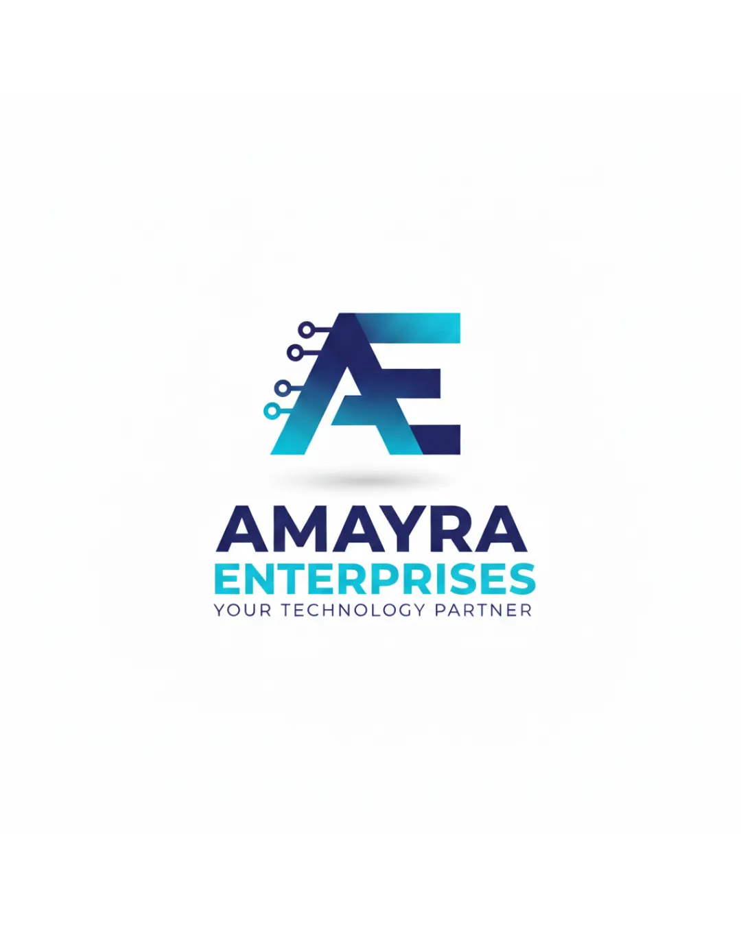
Try it Now!Logo review of AMAYRA ENTERPRISES YOUR TECHNOLOGY PARTNER
 Logo analysis by AI
Logo type:
Style:
Detected symbol:
Detected text:
Business industry:
Review requested by Amayraenterprisesnsk
**If AI can recognize or misinterpret it, so can people.
Structured logo review
Legibility
![]() Bold sans-serif typeface ensures all text is easily readable.
Bold sans-serif typeface ensures all text is easily readable.![]() Clear hierarchy between company name, descriptor, and tagline.
Clear hierarchy between company name, descriptor, and tagline.
Scalability versatility
![]() Logo mark is relatively simple, allowing for reasonable downscaling.
Logo mark is relatively simple, allowing for reasonable downscaling.![]() Main mark works well for digital and print uses like websites and business cards.
Main mark works well for digital and print uses like websites and business cards.
![]() Circuit lines and tight spacing in the monogram may not render clearly at very small sizes like favicons or embroidery.
Circuit lines and tight spacing in the monogram may not render clearly at very small sizes like favicons or embroidery.![]() Color gradients can be problematic for single-color printing and adaptability on dark backgrounds.
Color gradients can be problematic for single-color printing and adaptability on dark backgrounds.![]() Tagline will become unreadable at small scales such as on pens or social icons.
Tagline will become unreadable at small scales such as on pens or social icons.
200x250 px
100×125 px
50×62 px
Balance alignment
![]() Symmetrical arrangement between monogram and stacked text elements.
Symmetrical arrangement between monogram and stacked text elements.![]() Good vertical alignment in the composition.
Good vertical alignment in the composition.
![]() Monogram's weight is slightly heavier than the wordmark, which may draw more attention than necessary to the symbol.
Monogram's weight is slightly heavier than the wordmark, which may draw more attention than necessary to the symbol.

Originality
![]() Clever integration of tech/circuit lines into AE monogram.
Clever integration of tech/circuit lines into AE monogram.![]() Monogram has some distinction from standard lettermarks.
Monogram has some distinction from standard lettermarks.
![]() AE monogram plus circuitry motif is common in tech branding and lacks a distinct proprietary twist.
AE monogram plus circuitry motif is common in tech branding and lacks a distinct proprietary twist.![]() Overall style and elements are seen frequently in technology company logos.
Overall style and elements are seen frequently in technology company logos.
Logomark wordmark fit
![]() Consistent geometric style and color palette between monogram and wordmark.
Consistent geometric style and color palette between monogram and wordmark.![]() Both elements give a modern, high-tech impression.
Both elements give a modern, high-tech impression.
![]() Slight imbalance in how visually heavy the monogram is versus the wordmark, creating a mild disconnect at a glance.
Slight imbalance in how visually heavy the monogram is versus the wordmark, creating a mild disconnect at a glance.
Aesthetic look
![]() Modern gradient colors add visual interest.
Modern gradient colors add visual interest.![]() Clean, professional feel appropriate for technology industry.
Clean, professional feel appropriate for technology industry.![]() Minimal but not bland.
Minimal but not bland.
![]() The trendy gradient coloration may date the design in a few years.
The trendy gradient coloration may date the design in a few years.![]() Somewhat generic due to overused visual cues within the tech industry.
Somewhat generic due to overused visual cues within the tech industry.
Dual meaning and misinterpretations
![]() No inappropriate or controversial symbols detected within logo composition.
No inappropriate or controversial symbols detected within logo composition.
Color harmony
![]() Cool blue tones provide strong tech connotation and visual synergy.
Cool blue tones provide strong tech connotation and visual synergy.![]() Limited color palette ensures clarity and coherence.
Limited color palette ensures clarity and coherence.
Vivid Cerulean
#13C6E6
Dark Blue
#18356D
White
#FFFFFF