Wondering how your logo performs? 🧐
Get professional logo reviews in seconds and catch design issues in time.
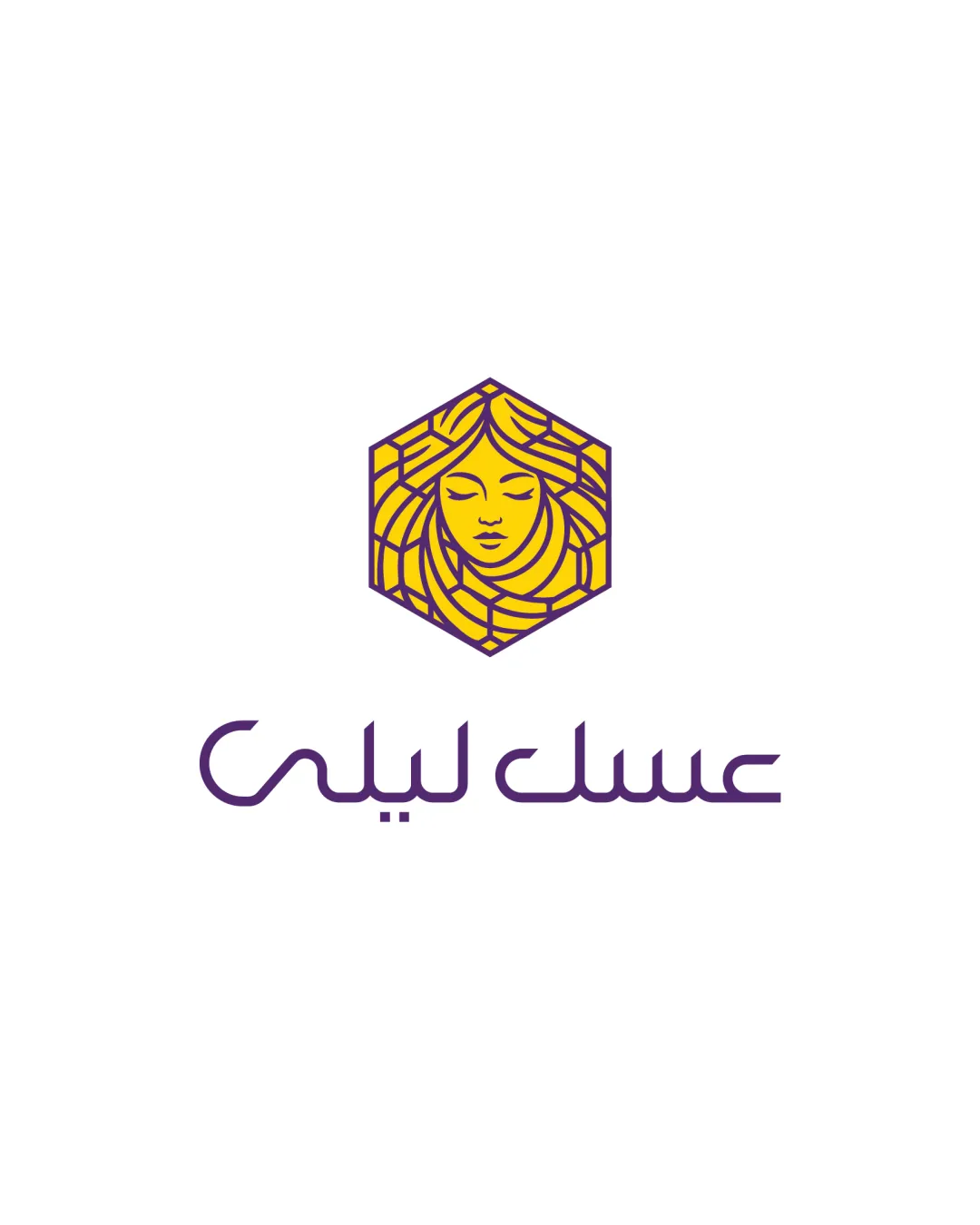
Try it Now!Logo review of Arabic script
 Logo analysis by AI
Logo type:
Style:
Detected symbol:
Negative space:
Detected text:
Business industry:
Review requested by S.alipour
**If AI can recognize or misinterpret it, so can people.
Structured logo review
Legibility
![]() Text is distinct and maintains integrity at various sizes.
Text is distinct and maintains integrity at various sizes.![]() Arabic script is stylish but readable for native readers.
Arabic script is stylish but readable for native readers.
![]() Some stylization in the script may make it slightly less legible to non-native readers.
Some stylization in the script may make it slightly less legible to non-native readers.![]() Moderate complexity in the linear text could affect very small-scale readability.
Moderate complexity in the linear text could affect very small-scale readability.
Scalability versatility
![]() Bold lines and high contrast ensure visibility at larger scales, like signage or packaging.
Bold lines and high contrast ensure visibility at larger scales, like signage or packaging.![]() The symbol remains recognizable due to its geometric frame.
The symbol remains recognizable due to its geometric frame.
![]() Intricate hair details within the hexagon may blur or lose definition at very small applications like favicons or embroidery.
Intricate hair details within the hexagon may blur or lose definition at very small applications like favicons or embroidery.![]() Fine linework in both symbol and script could pose challenges for print on small merchandise.
Fine linework in both symbol and script could pose challenges for print on small merchandise.
200x250 px
100×125 px
50×62 px
Balance alignment
![]() Logomark and wordmark are well-centered with consistent spacing.
Logomark and wordmark are well-centered with consistent spacing.![]() Hexagon provides a solid visual foundation that grounds the composition.
Hexagon provides a solid visual foundation that grounds the composition.

Originality
![]() Unique integration of a woman's face within a honeycomb structure connects brand and industry meaningfully.
Unique integration of a woman's face within a honeycomb structure connects brand and industry meaningfully.![]() Clever use of hair as stylized honeycomb lines is unconventional.
Clever use of hair as stylized honeycomb lines is unconventional.
Logomark wordmark fit
![]() Color, line weight, and style between the logomark and wordmark are harmonious.
Color, line weight, and style between the logomark and wordmark are harmonious.![]() The visual language of both elements is cohesive and contemporary.
The visual language of both elements is cohesive and contemporary.
Aesthetic look
![]() Modern, visually appealing style with professional execution.
Modern, visually appealing style with professional execution.![]() Color palette is well-chosen and industry relevant.
Color palette is well-chosen and industry relevant.
Dual meaning and misinterpretations
![]() No inappropriate or ambiguous symbols present.
No inappropriate or ambiguous symbols present.![]() Composition is clear and supports intended brand perception.
Composition is clear and supports intended brand perception.
Color harmony
![]() Color combination of purple and yellow is striking, attractive, and thematically on-point for honey.
Color combination of purple and yellow is striking, attractive, and thematically on-point for honey.
Sunglow
#FFD600
Bossanova
#4B2566
White
#FFFFFF