 View review
Logo score
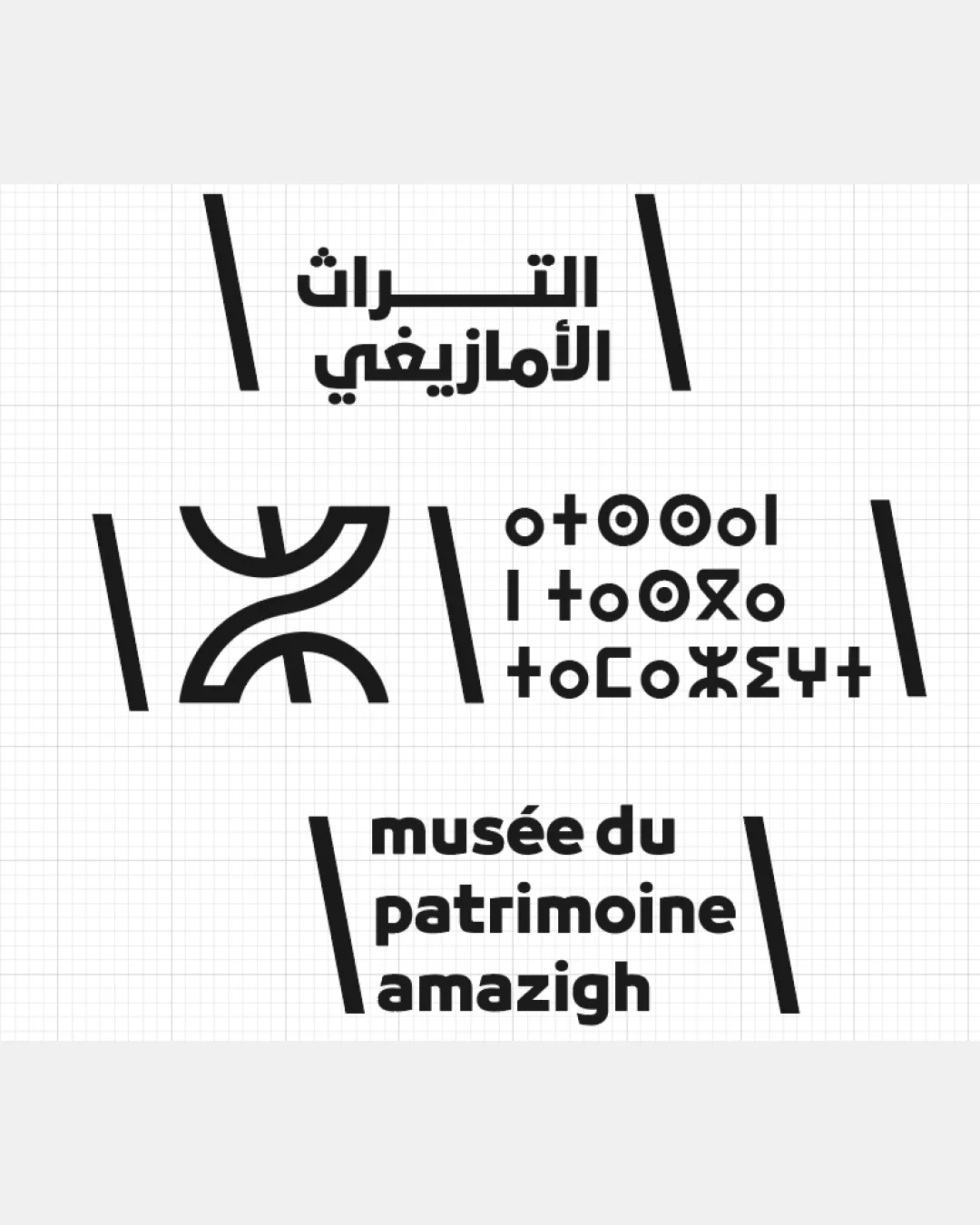
Logo review ofArabic Script, Tifinagh Script, Latin Alphabet
Review the detailed scores below to see what is working and what should be refined first.
Legibility
Originality
Misread
Balance
Scale
Detailed review
Logo performance breakdown
Legibility
![]() Latin and Arabic text is bold and easy to read
Latin and Arabic text is bold and easy to read![]() Strong contrast between text and background aids readability
Strong contrast between text and background aids readability
![]() Tifinagh script may not be legible for all audiences unfamiliar with the script
Tifinagh script may not be legible for all audiences unfamiliar with the script![]() Stacked wordmark in Latin script lacks clear hierarchy and spacing between lines
Stacked wordmark in Latin script lacks clear hierarchy and spacing between lines
Originality
![]() Strong cultural reference through both symbol and scripts
Strong cultural reference through both symbol and scripts![]() Use of Amazigh/Tifinagh script is unique and contextually relevant
Use of Amazigh/Tifinagh script is unique and contextually relevant
![]() Symbol, while culturally meaningful, is strongly abstract and may not be immediately recognizable to those outside the culture
Symbol, while culturally meaningful, is strongly abstract and may not be immediately recognizable to those outside the culture
Color harmony
![]() Monochrome palette is harmonious and versatile across contexts
Monochrome palette is harmonious and versatile across contexts![]() High contrast supports use in any color environment
High contrast supports use in any color environment
Black
#000000
White
#FFFFFF
Balance alignment
![]() Centrally aligned blocks of text and symbol give overall structure
Centrally aligned blocks of text and symbol give overall structure
![]() Diagonal framing slashes are inconsistent in length and angle, disrupting visual harmony
Diagonal framing slashes are inconsistent in length and angle, disrupting visual harmony![]() Symbol and text blocks feel compartmentalized instead of unified
Symbol and text blocks feel compartmentalized instead of unified

Scalability
![]() The geometric symbol can scale well for various applications like signage or promotional materials
The geometric symbol can scale well for various applications like signage or promotional materials![]() Single color palette supports clarity in different formats
Single color palette supports clarity in different formats
![]() Detailed text and multiple script layout may become illegible at small sizes (e.g., app icons or small labels)
Detailed text and multiple script layout may become illegible at small sizes (e.g., app icons or small labels)![]() Diagonal framing elements may become visually cluttered in small-scale usages (embroidery or favicons)
Diagonal framing elements may become visually cluttered in small-scale usages (embroidery or favicons)
200x250 px
100×125 px
50×62 px
Misinterpretations
![]() No inappropriate or ambiguous symbols detected
No inappropriate or ambiguous symbols detected
Symbol & text fit
![]() Consistent geometric and bold style across symbol and type
Consistent geometric and bold style across symbol and type
![]() Culturally synchronized between symbol and scripts
Culturally synchronized between symbol and scripts
![]() Spatial disconnection between logomark and wordmarks due to framing slashes and separation
Spatial disconnection between logomark and wordmarks due to framing slashes and separation
![]() No direct integration of the symbol with the text blocks
No direct integration of the symbol with the text blocks
Try your own review
Review my logo
Wondering how your logo performs?
Get a clear logo score, key risks, and priority fix ideas before your client or audience sees it.
Keep exploring


