Wondering how your logo performs? 🧐
Get professional logo reviews in seconds and catch design issues in time.
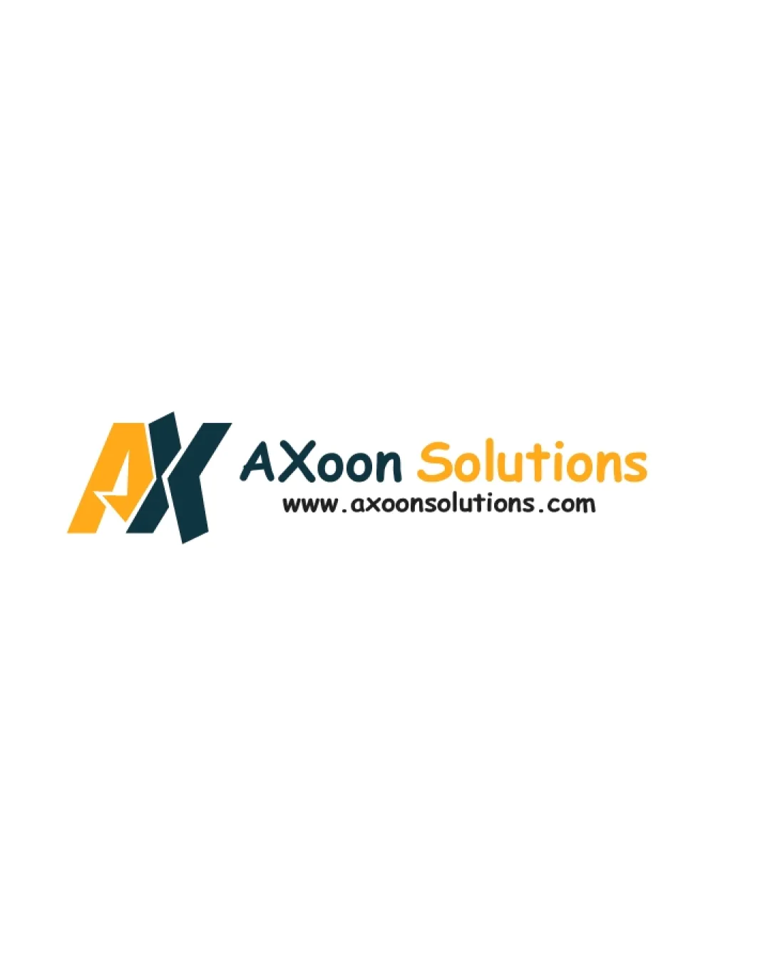
Try it Now!Logo review of AXoon Solutions, www.axoonsolutions.com
 Logo analysis by AI
Logo type:
Style:
Detected symbol:
Negative space:
Detected text:
Business industry:
Review requested by Mudassir
**If AI can recognize or misinterpret it, so can people.
Structured logo review
Legibility
![]() Company name is clear and easy to read.
Company name is clear and easy to read.![]() URL is presented in a legible typeface despite being small.
URL is presented in a legible typeface despite being small.
![]() Contrast between 'Solutions' (orange) and white background could be reduced in poor lighting or at small sizes.
Contrast between 'Solutions' (orange) and white background could be reduced in poor lighting or at small sizes.![]() Font consistency between the two words is not strong, slightly impacting at-a-glance readability.
Font consistency between the two words is not strong, slightly impacting at-a-glance readability.
Scalability versatility
![]() Bold, simple shapes in the monogram work well at moderate sizes.
Bold, simple shapes in the monogram work well at moderate sizes.![]() Would work well on digital platforms and larger printed materials.
Would work well on digital platforms and larger printed materials.
![]() Small details in the arrow of the monogram could be lost at favicon or small scale.
Small details in the arrow of the monogram could be lost at favicon or small scale.![]() The thinness of 'www.axoonsolutions.com' will not reproduce well at micro-sizes or embroidery.
The thinness of 'www.axoonsolutions.com' will not reproduce well at micro-sizes or embroidery.![]() Three text elements (monogram, business name, URL) may clutter smaller print applications like business cards.
Three text elements (monogram, business name, URL) may clutter smaller print applications like business cards.
200x250 px
100×125 px
50×62 px
Balance alignment
![]() General horizontal alignment is tidy.
General horizontal alignment is tidy.![]() Logomark and wordmark on single line creates a professional presentation.
Logomark and wordmark on single line creates a professional presentation.
![]() Monogram is visually heavier than the type, creating slight imbalance.
Monogram is visually heavier than the type, creating slight imbalance.![]() Distinctive weights between the mark and 'Solutions' reduce cohesion.
Distinctive weights between the mark and 'Solutions' reduce cohesion.

Originality
![]() Creative interlocking of A and X creates a unified monogram.
Creative interlocking of A and X creates a unified monogram.![]() Arrow in negative space adds a sense of motion and modernity.
Arrow in negative space adds a sense of motion and modernity.
![]() Monogram style is somewhat common in tech branding.
Monogram style is somewhat common in tech branding.![]() Color split and geometric A/X is a recurring visual trope.
Color split and geometric A/X is a recurring visual trope.
Logomark wordmark fit
![]() The monogram and wordmark pair together as a unit.
The monogram and wordmark pair together as a unit.
![]() The monogram is much bolder and more attention-grabbing than the thinner wordmark, leading to some disconnect.
The monogram is much bolder and more attention-grabbing than the thinner wordmark, leading to some disconnect.![]() Color difference and font weights make the combination feel less integrated.
Color difference and font weights make the combination feel less integrated.
Aesthetic look
![]() Modern, clean aesthetic with friendly color palette.
Modern, clean aesthetic with friendly color palette.![]() Geometric style is visually appealing and tech-appropriate.
Geometric style is visually appealing and tech-appropriate.
![]() Somewhat generic and lacks a distinctive twist.
Somewhat generic and lacks a distinctive twist.![]() Visual weight between mark and words feels mismatched.
Visual weight between mark and words feels mismatched.
Dual meaning and misinterpretations
![]() No inappropriate or confusing imagery detected.
No inappropriate or confusing imagery detected.![]() Arrow adds a positive dynamic message.
Arrow adds a positive dynamic message.
Color harmony
![]() Limited palette retains harmony.
Limited palette retains harmony.![]() Contrast between orange and teal is attractive and memorable.
Contrast between orange and teal is attractive and memorable.
![]() Some risks if logo is used on colored backgrounds besides white.
Some risks if logo is used on colored backgrounds besides white.![]() Slight contrast issue between orange and white could hinder accessibility.
Slight contrast issue between orange and white could hinder accessibility.
Orange
#FDBA25
Dark teal
#18353A
White
#FFFFFF
Black
#000000