 View review
Logo score
Logo review ofDeck Solutions
Review the detailed scores below to see what is working and what should be refined first.
Legibility
Originality
Misread
Balance
Scale
Detailed review
Logo performance breakdown
Legibility
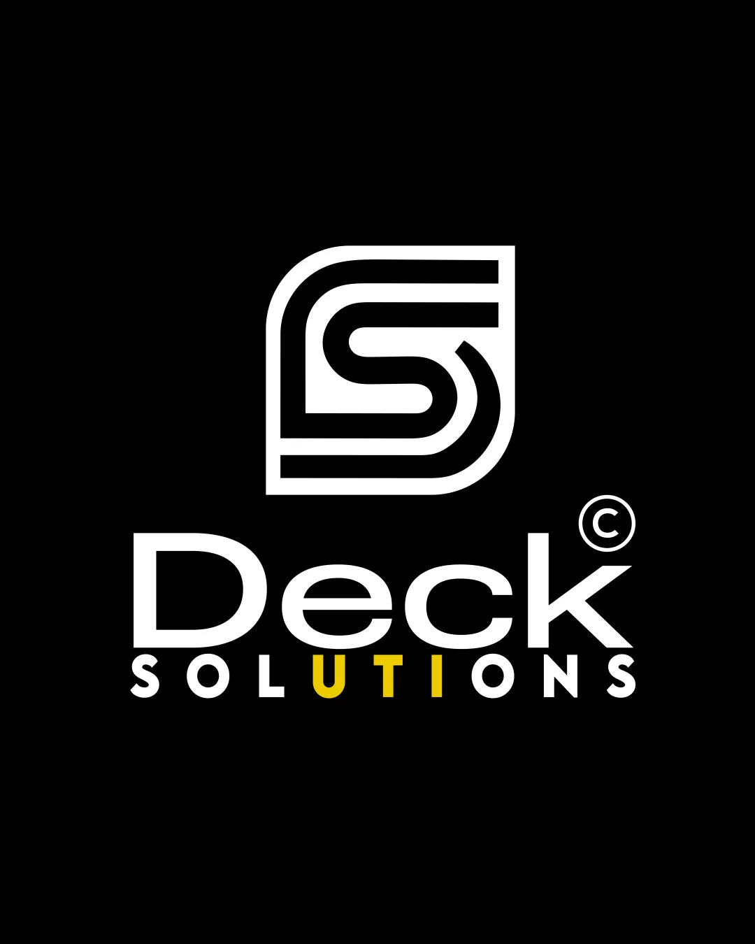
![]() Main wordmark 'Deck' is clear and easy to read.
Main wordmark 'Deck' is clear and easy to read.![]() 'SOLUTIONS' is legible, with contrast between white and yellow letters on black.
'SOLUTIONS' is legible, with contrast between white and yellow letters on black.
![]() Yellow used for 'U', 'T', 'I', 'O', 'N', and 'S' in the sub-text may reduce consistency and can slightly hinder quick readability at small sizes.
Yellow used for 'U', 'T', 'I', 'O', 'N', and 'S' in the sub-text may reduce consistency and can slightly hinder quick readability at small sizes.
Originality
![]() Custom DS monogram is distinctive and ties to the brand name.
Custom DS monogram is distinctive and ties to the brand name.![]() Modern style stands out from overly generic marks.
Modern style stands out from overly generic marks.
![]() Letterform-based monograms are common, and the 'DS' shape—though well-drawn—could be interpreted as somewhat familiar or trend-driven in its execution.
Letterform-based monograms are common, and the 'DS' shape—though well-drawn—could be interpreted as somewhat familiar or trend-driven in its execution.
Color harmony
![]() Good contrast with black, white, and selective yellow accents.
Good contrast with black, white, and selective yellow accents.![]() Color choices are appropriate for the industry.
Color choices are appropriate for the industry.
![]() Overuse of yellow in the subtext could be toned down for subtler impact and improved harmony.
Overuse of yellow in the subtext could be toned down for subtler impact and improved harmony.
White
#FFFFFF
Yellow
#FFD700
Black
#000000
Your palette is close. Explore sharper color combinations with Colorfly.design before updating the logo.
Explore palettesBalance alignment
![]() Logo elements are well-centered and symmetrical.
Logo elements are well-centered and symmetrical.![]() Monogram sits neatly above the wordmark.
Monogram sits neatly above the wordmark.![]() Consistent spacing and strong alignment between logo parts.
Consistent spacing and strong alignment between logo parts.

Scalability
![]() Simple monogram design maintains integrity at small sizes.
Simple monogram design maintains integrity at small sizes.![]() Works well for digital, print, and signage applications.
Works well for digital, print, and signage applications.![]() Limited color palette enhances scalability.
Limited color palette enhances scalability.
![]() Thin lines of the monogram may vanish in embroidery or at very small sizes.
Thin lines of the monogram may vanish in embroidery or at very small sizes.![]() The colored sub-text could be lost on monochrome or transparent backgrounds.
The colored sub-text could be lost on monochrome or transparent backgrounds.
200x250 px
100×125 px
50×62 px
Misinterpretations
![]() No inappropriate or confusing imagery detected.
No inappropriate or confusing imagery detected.![]() Overall visual is safe and appropriate.
Overall visual is safe and appropriate.
Symbol & text fit
![]() Stylistic consistency between the modern monogram and the sans-serif wordmark.
Stylistic consistency between the modern monogram and the sans-serif wordmark.
![]() Size and visual weight between the logomark and the wordmark are well-matched.
Size and visual weight between the logomark and the wordmark are well-matched.
Try your own review
Review my logo
Wondering how your logo performs?
Get a clear logo score, key risks, and priority fix ideas before your client or audience sees it.
Keep exploring


