Wondering how your logo performs? 🧐
Get professional logo reviews in seconds and catch design issues in time.
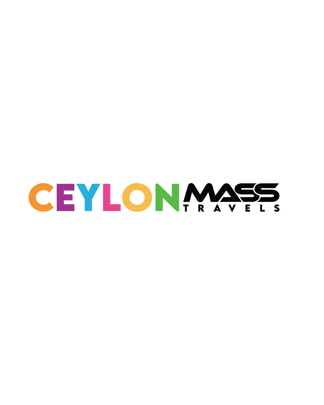
Try it Now!Logo review of CEYLON MASS TRAVELS
 Logo analysis by AI
Logo type:
Style:
Detected symbol:
Detected text:
Business industry:
Review requested by Sahan1321
**If AI can recognize or misinterpret it, so can people.
Structured logo review
Legibility
![]() Main text is clear and easily readable.
Main text is clear and easily readable.![]() 'CEYLON' is playful yet legible despite multiple colors.
'CEYLON' is playful yet legible despite multiple colors.![]() 'TRAVELS' in uppercase sans-serif is clean and readable.
'TRAVELS' in uppercase sans-serif is clean and readable.
![]() 'MASS' uses a stylized, stretched typeface that could hinder quick recognition, especially at smaller sizes.
'MASS' uses a stylized, stretched typeface that could hinder quick recognition, especially at smaller sizes.
Scalability versatility
![]() Logo works adequately on large formats like billboards or banners.
Logo works adequately on large formats like billboards or banners.
![]() Multiple colors will be hard to reproduce in embroidery or one-color printing.
Multiple colors will be hard to reproduce in embroidery or one-color printing.![]() The detail and color variety may lose clarity on small applications like favicons or promotional pens.
The detail and color variety may lose clarity on small applications like favicons or promotional pens.![]() 'MASS' becomes blurry at small sizes due to condensed, stylized type.
'MASS' becomes blurry at small sizes due to condensed, stylized type.
200x250 px
100×125 px
50×62 px
Balance alignment
![]() Text is generally well-aligned on a single baseline.
Text is generally well-aligned on a single baseline.
![]() 'CEYLON' and 'MASS' have significant weight/style contrast, causing imbalance.
'CEYLON' and 'MASS' have significant weight/style contrast, causing imbalance.![]() 'MASS' is visually heavier and dominates the design, creating awkward visual hierarchy.
'MASS' is visually heavier and dominates the design, creating awkward visual hierarchy.![]() 'TRAVELS' feels almost like an afterthought and lacks integration.
'TRAVELS' feels almost like an afterthought and lacks integration.

Originality
![]() Colorful rendering of 'CEYLON' adds a unique, playful touch.
Colorful rendering of 'CEYLON' adds a unique, playful touch.
![]() No icon or symbol: pure wordmark approach is generic for the travel sector.
No icon or symbol: pure wordmark approach is generic for the travel sector.![]() Typographic style for 'MASS' is fairly common in travel/transport brands, lacking distinctiveness.
Typographic style for 'MASS' is fairly common in travel/transport brands, lacking distinctiveness.
Logomark wordmark fit
![]() Effort to establish brand hierarchy through type contrast.
Effort to establish brand hierarchy through type contrast.
![]() 'CEYLON' and 'MASS' feel like separate design elements, not a cohesive whole.
'CEYLON' and 'MASS' feel like separate design elements, not a cohesive whole.![]() Color palette and typographic styles between sections clash, not blend.
Color palette and typographic styles between sections clash, not blend.![]() 'TRAVELS' sits awkwardly below, disconnected.
'TRAVELS' sits awkwardly below, disconnected.
Aesthetic look
![]() Playful colors in 'CEYLON' bring vibrancy and relate to tourism.
Playful colors in 'CEYLON' bring vibrancy and relate to tourism.
![]() 'MASS' feels overly forced/futuristic in contrast to playful 'CEYLON'.
'MASS' feels overly forced/futuristic in contrast to playful 'CEYLON'.![]() Multicolor approach quickly feels dated and visually busy.
Multicolor approach quickly feels dated and visually busy.![]() Overall style lacks sophistication, with insufficient integration among components.
Overall style lacks sophistication, with insufficient integration among components.
Dual meaning and misinterpretations
![]() Logo does not contain inappropriate or confusing double meanings.
Logo does not contain inappropriate or confusing double meanings.
Color harmony
![]() Colors in 'CEYLON' are individually bright and cheerful, evoking travel and diversity.
Colors in 'CEYLON' are individually bright and cheerful, evoking travel and diversity.
![]() Too many colors (six in total for 'CEYLON'), making the logo busy.
Too many colors (six in total for 'CEYLON'), making the logo busy.![]() Color harmony suffers from lack of palette discipline.
Color harmony suffers from lack of palette discipline.![]() 'MASS' in black feels visually cut off from the rest of the design.
'MASS' in black feels visually cut off from the rest of the design.
Orange
#F89827
Purple
#9B3A82
Cyan
#21C3E7
Pink
#E55091
Yellow
#F9E66E
Green
#6BBE44
Black
#181818


