Wondering how your logo performs? 🧐
Get professional logo reviews in seconds and catch design issues in time.
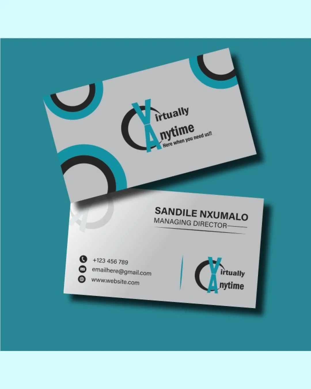
Try it Now!Logo review of Virtually Anytime
 Logo analysis by AI
Logo type:
Style:
Detected symbol:
Detected text:
Business industry:
Review requested by Fatema023
**If AI can recognize or misinterpret it, so can people.
Structured logo review
Legibility
![]() Primary text 'Virtually Anytime' is readable at medium sizes.
Primary text 'Virtually Anytime' is readable at medium sizes.![]() Color contrast is adequate for main text elements.
Color contrast is adequate for main text elements.
![]() Staggered alignment of 'Virtually' and 'Anytime' can create confusion, especially at smaller sizes.
Staggered alignment of 'Virtually' and 'Anytime' can create confusion, especially at smaller sizes.![]() Overlap of 'VA' on the circular form slightly compromises clarity.
Overlap of 'VA' on the circular form slightly compromises clarity.![]() Thin tagline text is difficult to read at reduced scale.
Thin tagline text is difficult to read at reduced scale.
Scalability versatility
![]() Simple geometric forms are easy to identify at larger scales, such as signage or letterheads.
Simple geometric forms are easy to identify at larger scales, such as signage or letterheads.
![]() Thin elements and tagline are not legible at favicon or small icon size.
Thin elements and tagline are not legible at favicon or small icon size.![]() Multiple overlapping elements make it less versatile for embroidery or monochrome applications.
Multiple overlapping elements make it less versatile for embroidery or monochrome applications.![]() The circular motif and color blocking lose impact at reduced sizes.
The circular motif and color blocking lose impact at reduced sizes.
200x250 px
100×125 px
50×62 px
Balance alignment
![]() Centralized composition draws attention toward the middle of the logo.
Centralized composition draws attention toward the middle of the logo.![]() Balanced color placement between cyan and black creates some equilibrium.
Balanced color placement between cyan and black creates some equilibrium.
![]() VA monogram and circular motif are off center in relation to text, causing visual imbalance.
VA monogram and circular motif are off center in relation to text, causing visual imbalance.![]() The alignment between logomark and wordmark feels forced and not optically centered.
The alignment between logomark and wordmark feels forced and not optically centered.![]() Text placement relative to the symbol feels crowded.
Text placement relative to the symbol feels crowded.

Originality
![]() Overlay of VA monogram on a stylized circle adds some uniqueness.
Overlay of VA monogram on a stylized circle adds some uniqueness.![]() Use of broken circular motif is moderately creative.
Use of broken circular motif is moderately creative.
![]() Monogram-over-circle is a common structure, lacks strong distinction.
Monogram-over-circle is a common structure, lacks strong distinction.![]() Typography and overall composition are generic for the technology industry.
Typography and overall composition are generic for the technology industry.
Logomark wordmark fit
![]() Monogram style visually matches the wordmark for a unified look.
Monogram style visually matches the wordmark for a unified look.
![]() Wordmark is squeezed into the logomark, making the sizing appear inconsistent.
Wordmark is squeezed into the logomark, making the sizing appear inconsistent.![]() There’s insufficient negative space between logomark and wordmark, contributing to visual congestion.
There’s insufficient negative space between logomark and wordmark, contributing to visual congestion.
Aesthetic look
![]() Modern color palette and geometric elements produce a contemporary feel.
Modern color palette and geometric elements produce a contemporary feel.
![]() The overall effect is somewhat generic, lacking a memorable or iconic impression.
The overall effect is somewhat generic, lacking a memorable or iconic impression.![]() Visual clutter from overlapping elements and mixed alignments.
Visual clutter from overlapping elements and mixed alignments.![]() Excessive use of circular elements on the business card background detracts from logo focus.
Excessive use of circular elements on the business card background detracts from logo focus.
Dual meaning and misinterpretations
![]() No inappropriate or unintended visual double-meanings detected.
No inappropriate or unintended visual double-meanings detected.
Color harmony
![]() Cohesive use of teal, black, and grey provides a clean and professional look.
Cohesive use of teal, black, and grey provides a clean and professional look.![]() High contrast between logomark and background.
High contrast between logomark and background.
![]() Use of multiple accent circles on card creates mild dissonance but not within the core logo.
Use of multiple accent circles on card creates mild dissonance but not within the core logo.
Persian Green
#25AEB0
Black
#000000
Silver
#C0C0C0
White
#FFFFFF