Wondering how your logo performs? 🧐
Get professional logo reviews in seconds and catch design issues in time.
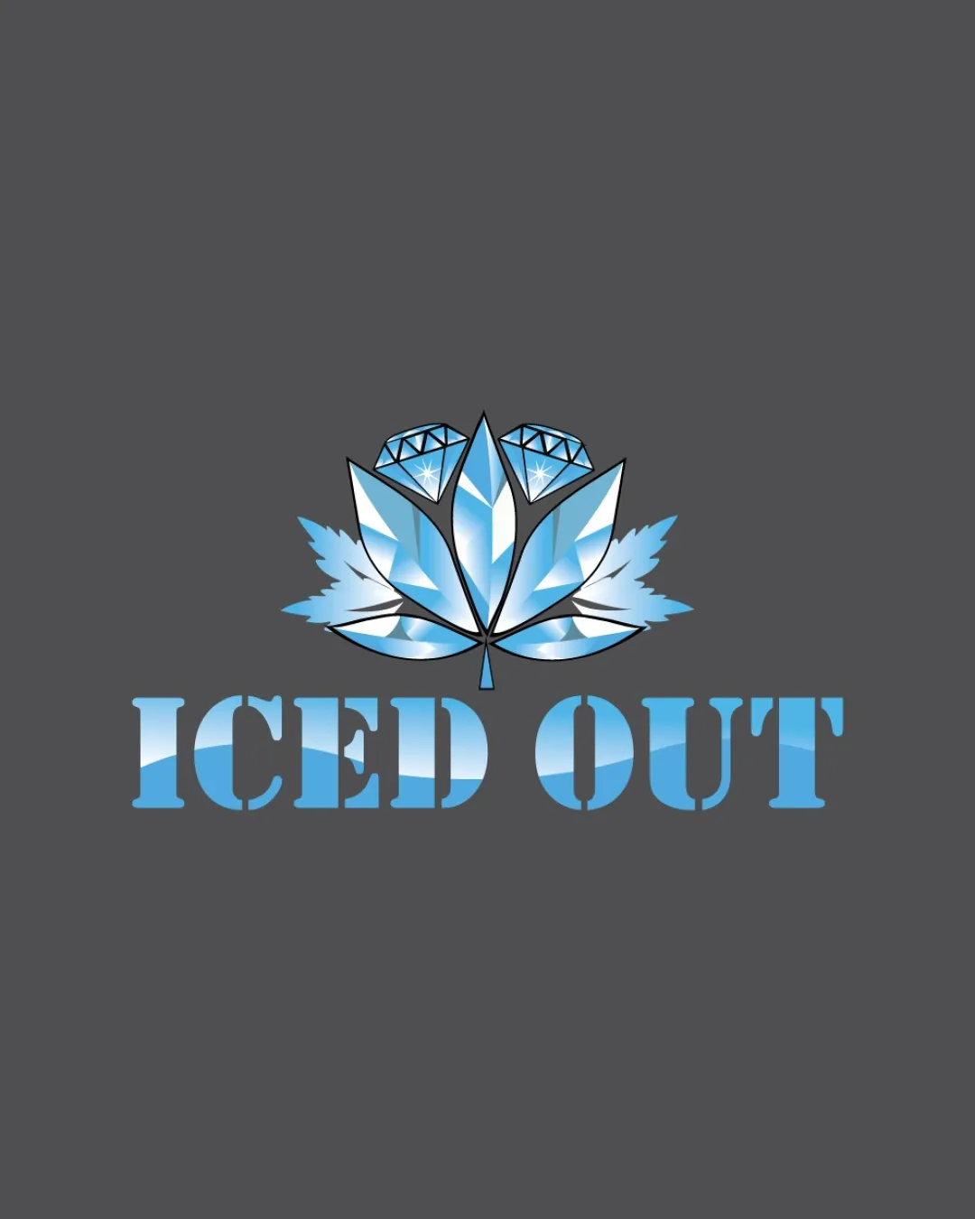
Try it Now!Logo review of ICED OUT
 Logo analysis by AI
Logo type:
Style:
Detected symbol:
Detected text:
Business industry:
Review requested by Fatema023
**If AI can recognize or misinterpret it, so can people.
Structured logo review
Legibility
![]() Text is bold and highly readable with a strong sans-serif stencil typeface.
Text is bold and highly readable with a strong sans-serif stencil typeface.![]() Contrast between text and background maintains legibility.
Contrast between text and background maintains legibility.
![]() Gradient fill within the letters detracts slightly from clarity, especially at smaller sizes.
Gradient fill within the letters detracts slightly from clarity, especially at smaller sizes.
Scalability versatility
![]() The bold text remains distinguishable at multiple sizes.
The bold text remains distinguishable at multiple sizes.![]() Logo could work for online store banners or apparel prints.
Logo could work for online store banners or apparel prints.
![]() Intricate detail in the diamond/leaf symbol will be lost at small sizes or embroidery.
Intricate detail in the diamond/leaf symbol will be lost at small sizes or embroidery.![]() Gradient details and inner highlights will not reproduce well in simple black-and-white or on small favicons.
Gradient details and inner highlights will not reproduce well in simple black-and-white or on small favicons.![]() Not ideal for signage or tiny branded goods like jewelry tags.
Not ideal for signage or tiny branded goods like jewelry tags.
200x250 px
100×125 px
50×62 px
Balance alignment
![]() Symbol is well-centered above the wordmark.
Symbol is well-centered above the wordmark.![]() Leaf/diamond mark is symmetrical and visually anchored.
Leaf/diamond mark is symmetrical and visually anchored.
![]() Top symbol slightly overpowers the text in terms of visual weight, risking imbalance.
Top symbol slightly overpowers the text in terms of visual weight, risking imbalance.

Originality
![]() Creative integration of icy leaf with diamonds is relevant to the 'iced out' theme.
Creative integration of icy leaf with diamonds is relevant to the 'iced out' theme.![]() Custom illustration attempts to differentiate from generic diamond symbols.
Custom illustration attempts to differentiate from generic diamond symbols.
![]() Combining leaf and diamonds is inventive, but the overall shapes mask common motifs (leaf, gem).
Combining leaf and diamonds is inventive, but the overall shapes mask common motifs (leaf, gem).![]() No use of negative space to accentuate or differentiate.
No use of negative space to accentuate or differentiate.
Logomark wordmark fit
![]() Both symbol and wordmark share an icy, crystalline visual language.
Both symbol and wordmark share an icy, crystalline visual language.![]() Gradient color treatment is consistent across both elements.
Gradient color treatment is consistent across both elements.
![]() Minor mismatch: the organic shape of the symbol conflicts very slightly with the rigid, geometric typeface.
Minor mismatch: the organic shape of the symbol conflicts very slightly with the rigid, geometric typeface.
Aesthetic look
![]() Color palette effectively reinforces the icy and luxurious feel.
Color palette effectively reinforces the icy and luxurious feel.![]() Gradient and illustrated facets provide a modern, glossy touch.
Gradient and illustrated facets provide a modern, glossy touch.
![]() Logo feels busy due to layered gradients and fine detail.
Logo feels busy due to layered gradients and fine detail.![]() The combination of illustration and stencil font creates mild discord.
The combination of illustration and stencil font creates mild discord.
Dual meaning and misinterpretations
![]() No overt inappropriate shapes or risky double meanings.
No overt inappropriate shapes or risky double meanings.
![]() Leaf shape could be misread as referencing cannabis, depending on context, though not a major issue.
Leaf shape could be misread as referencing cannabis, depending on context, though not a major issue.
Color harmony
![]() Blues and whites support the theme and create a cohesive cool tone.
Blues and whites support the theme and create a cohesive cool tone.![]() Gradients are controlled and within a tight color range.
Gradients are controlled and within a tight color range.
![]() Gradient-heavy fills may struggle to remain harmonious across all print mediums, particularly on dark backgrounds or poor quality printing.
Gradient-heavy fills may struggle to remain harmonious across all print mediums, particularly on dark backgrounds or poor quality printing.
Glacier Blue
#6DA8D6
Ebony
#1B232B
White
#CCC
Dark Gray
#585657