Wondering how your logo performs? 🧐
Get professional logo reviews in seconds and catch design issues in time.
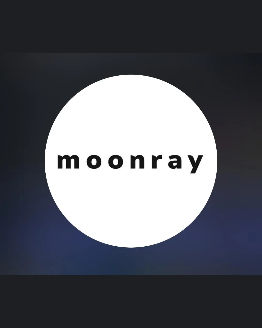
Try it Now!Logo review of moonray
 Logo analysis by AI
Logo type:
Style:
Detected symbol:
Detected text:
Business industry:
Review requested by Oops_mnya
**If AI can recognize or misinterpret it, so can people.
Structured logo review
Legibility
![]() Typography is clean and easy to read at all sizes.
Typography is clean and easy to read at all sizes.![]() Letter spacing provides excellent clarity.
Letter spacing provides excellent clarity.
Scalability versatility
![]() Bold, simple typography ensures clarity on both large and small applications.
Bold, simple typography ensures clarity on both large and small applications.![]() Works well for web, print, packaging, and social media avatars.
Works well for web, print, packaging, and social media avatars.
![]() The pure wordmark lacks an iconic element for standalone recognition, limiting versatility in minimalist brand marks or app icons.
The pure wordmark lacks an iconic element for standalone recognition, limiting versatility in minimalist brand marks or app icons.
200x250 px
100×125 px
50×62 px
Balance alignment
![]() Strong central alignment within the circle provides good visual balance.
Strong central alignment within the circle provides good visual balance.![]() Consistent style across all characters.
Consistent style across all characters.

Originality
![]() The rounded geometric wordmark gives a modern touch.
The rounded geometric wordmark gives a modern touch.
![]() The use of a generic sans-serif in a circle is common and does not stand out or express unique brand personality.
The use of a generic sans-serif in a circle is common and does not stand out or express unique brand personality.
Aesthetic look
![]() Minimalist aesthetic is visually pleasing and contemporary.
Minimalist aesthetic is visually pleasing and contemporary.![]() Simple design avoids unnecessary visual clutter.
Simple design avoids unnecessary visual clutter.
![]() Feels slightly generic due to lack of unique design elements or custom typography.
Feels slightly generic due to lack of unique design elements or custom typography.
Dual meaning and misinterpretations
![]() No inappropriate or confusing shapes detected in the composition.
No inappropriate or confusing shapes detected in the composition.![]() Clear meaning with no risk of misinterpretation.
Clear meaning with no risk of misinterpretation.
Color harmony
![]() Monochrome color palette with high contrast is visually cohesive and professional.
Monochrome color palette with high contrast is visually cohesive and professional.![]() Works well for both light and dark backgrounds.
Works well for both light and dark backgrounds.
White
#FFFFFF
Ebony
#232323
Charcoal
#2B3144