Wondering how your logo performs? 🧐
Get professional logo reviews in seconds and catch design issues in time.
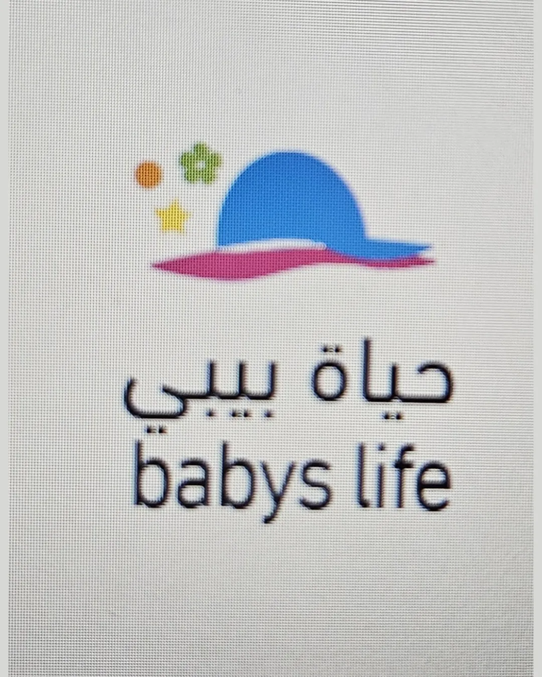
Try it Now!Logo review of حياة بيبي, babys life
 Logo analysis by AI
Logo type:
Style:
Detected symbol:
Detected text:
Business industry:
Review requested by Soma
**If AI can recognize or misinterpret it, so can people.
Structured logo review
Legibility
![]() Both Arabic and English text are clearly separated.
Both Arabic and English text are clearly separated.![]() Font size is reasonably large.
Font size is reasonably large.
![]() English text contains a grammatical error ('babys' should be 'baby's').
English text contains a grammatical error ('babys' should be 'baby's').![]() Font choice is very basic and uninspired for a baby/children brand.
Font choice is very basic and uninspired for a baby/children brand.![]() Contrast between text and background is good but could be increased for the baby blue.
Contrast between text and background is good but could be increased for the baby blue.
Scalability versatility
![]() Simple icon shapes aid in basic scaling.
Simple icon shapes aid in basic scaling.![]() Could work on banners, social media, product packaging if not downsized excessively.
Could work on banners, social media, product packaging if not downsized excessively.
![]() Small details, especially the star and clover, may be lost at favicon or very small scale.
Small details, especially the star and clover, may be lost at favicon or very small scale.![]() Fine elements and pixelation may hinder clean reproduction on embroidery, small labels, or signage.
Fine elements and pixelation may hinder clean reproduction on embroidery, small labels, or signage.
200x250 px
100×125 px
50×62 px
Balance alignment
![]() Overall centered alignment of elements.
Overall centered alignment of elements.
![]() Top symbols (clover, star, dot) are scattered with little visual cohesion to the hat.
Top symbols (clover, star, dot) are scattered with little visual cohesion to the hat.![]() Visual weight feels top-heavy with the cluster of shapes above the hat.
Visual weight feels top-heavy with the cluster of shapes above the hat.![]() Spacing between the Arabic and English text feels cramped.
Spacing between the Arabic and English text feels cramped.

Originality
![]() Baby hat motif is directly relevant.
Baby hat motif is directly relevant.![]() Use of multi-symbols shows an attempt at a playful approach.
Use of multi-symbols shows an attempt at a playful approach.
![]() Symbols (hat, star, clover) are standard, generic visual language for childcare.
Symbols (hat, star, clover) are standard, generic visual language for childcare.![]() No creative or unique twist—elements are literal, not inventive.
No creative or unique twist—elements are literal, not inventive.![]() Overused iconography reduces memorability.
Overused iconography reduces memorability.
Logomark wordmark fit
![]() Colors of hat connect slightly with youthful theme.
Colors of hat connect slightly with youthful theme.
![]() Typefaces do not complement the playful, rounded look of the hat and symbols.
Typefaces do not complement the playful, rounded look of the hat and symbols.![]() Font is very neutral, failing to match the personality of the illustration.
Font is very neutral, failing to match the personality of the illustration.
Aesthetic look
![]() Bright, friendly color palette.
Bright, friendly color palette.
![]() Too many unrelated small symbols; feels cluttered.
Too many unrelated small symbols; feels cluttered.![]() Logo appears more like a clipart collage than a refined mark.
Logo appears more like a clipart collage than a refined mark.![]() No strong focal point, lacking visual hierarchy.
No strong focal point, lacking visual hierarchy.
Dual meaning and misinterpretations
![]() Fairly safe imagery for a childcare brand.
Fairly safe imagery for a childcare brand.
Color harmony
![]() Colors are playful, evoke childlike vibes.
Colors are playful, evoke childlike vibes.
![]() Five colors may complicate printing and reduce brand cohesiveness.
Five colors may complicate printing and reduce brand cohesiveness.![]() No dominant brand color established, too scattered in palette.
No dominant brand color established, too scattered in palette.
Cornflower Blue
#4890D3
Medium Violet
#C25A99
Dandelion
#EEDA32
Moss Green
#8DB553
Orange
#E18B39


