 View review
Logo score
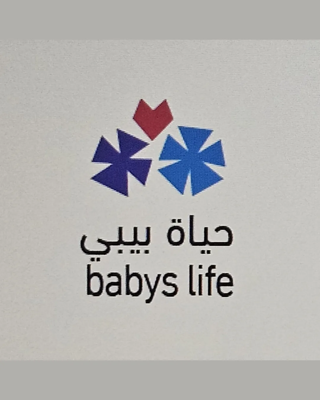
Logo review ofحياة بيبي Babys Life
Review the detailed scores below to see what is working and what should be refined first.
Legibility
Originality
Misread
Balance
Scale
Detailed review
Logo performance breakdown
Legibility
![]() Bilingual (Arabic and English) text included for broader communication.
Bilingual (Arabic and English) text included for broader communication.![]() Black text on white background offers good contrast.
Black text on white background offers good contrast.
![]() English text contains a grammatical error ('babys' should be 'baby's' or 'babies').
English text contains a grammatical error ('babys' should be 'baby's' or 'babies').![]() Font choice lacks warmth or personality suitable for a baby- or child-focused brand.
Font choice lacks warmth or personality suitable for a baby- or child-focused brand.![]() Arabic and English fonts do not visually harmonize.
Arabic and English fonts do not visually harmonize.
Originality
![]() Pinwheel/asterisk forms combined with a heart add an original twist.
Pinwheel/asterisk forms combined with a heart add an original twist.
![]() Pinwheel/asterisk shapes are generic and commonly used in childcare/healthcare logos.
Pinwheel/asterisk shapes are generic and commonly used in childcare/healthcare logos.![]() No clear unique storytelling or memorable mark.
No clear unique storytelling or memorable mark.
Color harmony
![]() Colors are well separated and not overwhelming.
Colors are well separated and not overwhelming.![]() Blue and purple harmonize well, red offers necessary contrast.
Blue and purple harmonize well, red offers necessary contrast.
![]() Addition of red may be slightly abrupt compared to calming blue and purple.
Addition of red may be slightly abrupt compared to calming blue and purple.![]() Heart color stands out but may feel disconnected from the use of cooler hues.
Heart color stands out but may feel disconnected from the use of cooler hues.
Purple
#512A8A
Blue
#3384C5
Red
#B43238
Black
#000000
Your palette is close. Explore sharper color combinations with Colorfly.design before updating the logo.
Explore palettesBalance alignment
![]() Central alignment between symbol and text creates a cohesive vertical layout.
Central alignment between symbol and text creates a cohesive vertical layout.![]() Symmetrical placement of pinwheels and heart leads to a balanced top element.
Symmetrical placement of pinwheels and heart leads to a balanced top element.
![]() Symbol could be perceived as floating above the text, reducing integration.
Symbol could be perceived as floating above the text, reducing integration.![]() Size ratio between the symbol and text may appear top-heavy.
Size ratio between the symbol and text may appear top-heavy.

Scalability
![]() Simple geometric shapes and minimal palette support scaling well.
Simple geometric shapes and minimal palette support scaling well.![]() No excessive detail; potential to work on small applications.
No excessive detail; potential to work on small applications.
![]() Thin text may lose clarity in very small sizes, such as tags or favicons.
Thin text may lose clarity in very small sizes, such as tags or favicons.![]() Heart and pinwheel shapes may merge visually at small scales, losing distinctive meaning.
Heart and pinwheel shapes may merge visually at small scales, losing distinctive meaning.![]() Red color in the heart may print poorly in monochrome applications.
Red color in the heart may print poorly in monochrome applications.
200x250 px
100×125 px
50×62 px
Misinterpretations
![]() No unintentional references or inappropriate visual elements.
No unintentional references or inappropriate visual elements.
Symbol & text fit
![]() Clean separation but clear association between symbol and company name.
Clean separation but clear association between symbol and company name.
![]() Geometric style of symbol does not match the fairly standard font of the text.
Geometric style of symbol does not match the fairly standard font of the text.
![]() The personality of the logomark feels more playful than the utilitarian font of the wordmark/text.
The personality of the logomark feels more playful than the utilitarian font of the wordmark/text.
Try your own review
Review my logo
Wondering how your logo performs?
Get a clear logo score, key risks, and priority fix ideas before your client or audience sees it.
Keep exploring


