 View review
Logo score
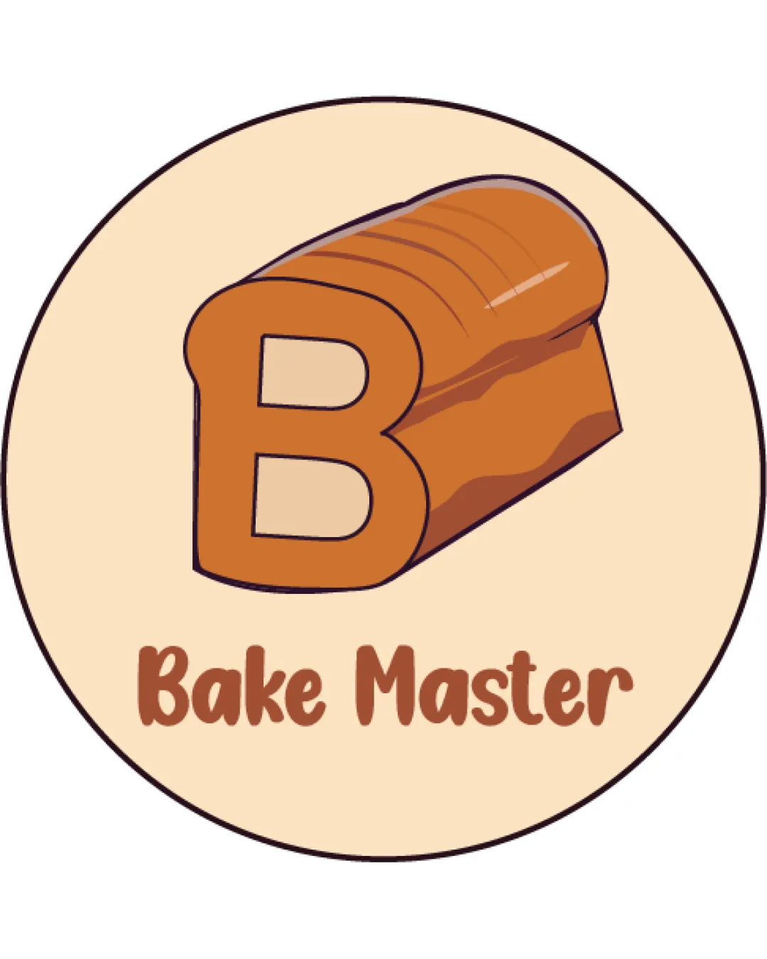
Logo review ofBake Master
Review the detailed scores below to see what is working and what should be refined first.
Legibility
Originality
Misread
Balance
Scale
Detailed review
Logo performance breakdown
Legibility
![]() 'Bake Master' is easily readable in a clear, friendly font.
'Bake Master' is easily readable in a clear, friendly font.![]() Text color contrasts well with the background, ensuring high legibility.
Text color contrasts well with the background, ensuring high legibility.
Originality
![]() Creative integration of the 'B' with a loaf of bread adds uniqueness.
Creative integration of the 'B' with a loaf of bread adds uniqueness.![]() Friendly, illustrative style stands out among more generic bakery logos.
Friendly, illustrative style stands out among more generic bakery logos.
![]() Still employs common bakery imagery and visual language, reducing full originality.
Still employs common bakery imagery and visual language, reducing full originality.![]() Circular badge is a standard logo frame, which lessens distinctiveness.
Circular badge is a standard logo frame, which lessens distinctiveness.
Color harmony
![]() Warm, cohesive palette with only three main colors.
Warm, cohesive palette with only three main colors.![]() Colors are harmonious, balanced, and relevant to baked goods.
Colors are harmonious, balanced, and relevant to baked goods.
Beige
#EFD6BB
Brown
#B06323
Dark Brown
#8B4A23
Balance alignment
![]() General visual balance between logomark and wordmark.
General visual balance between logomark and wordmark.![]() Centralized layout within a circular badge for orderly composition.
Centralized layout within a circular badge for orderly composition.
![]() The bread and 'B' combination feels somewhat visually heavy at the top, making the layout slightly top-heavy.
The bread and 'B' combination feels somewhat visually heavy at the top, making the layout slightly top-heavy.![]() Spacing between the symbol and the text could be optimized for better proportional harmony.
Spacing between the symbol and the text could be optimized for better proportional harmony.

Scalability
![]() Simple shapes and lines help adaptability across most standard applications.
Simple shapes and lines help adaptability across most standard applications.![]() Works well on large formats like signage and packaging.
Works well on large formats like signage and packaging.
![]() Fine shading and color gradients on the bread could lose definition at small sizes, such as on business cards or social media avatars.
Fine shading and color gradients on the bread could lose definition at small sizes, such as on business cards or social media avatars.![]() Details may not translate well to embroidery or black and white applications.
Details may not translate well to embroidery or black and white applications.
200x250 px
100×125 px
50×62 px
Misinterpretations
![]() No inappropriate or misleading visual associations detected.
No inappropriate or misleading visual associations detected.![]() Imagery is direct and matches brand category.
Imagery is direct and matches brand category.
Symbol & text fit
![]() Typeface complements the playful cartoon style of the logomark.
Typeface complements the playful cartoon style of the logomark.
![]() Color palette and visual tone are consistent between text and symbol.
Color palette and visual tone are consistent between text and symbol.
Try your own review
Review my logo
Wondering how your logo performs?
Get a clear logo score, key risks, and priority fix ideas before your client or audience sees it.
Keep exploring


