Wondering how your logo performs? 🧐
Get professional logo reviews in seconds and catch design issues in time.
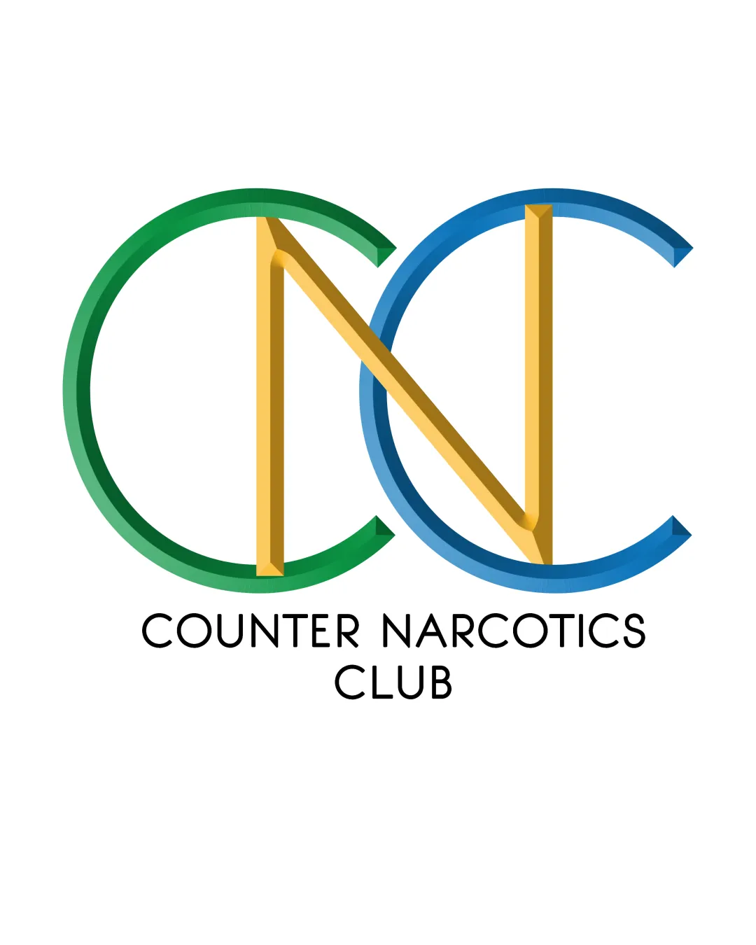
Try it Now!Logo review of CNC, COUNTER NARCOTICS CLUB
 Logo analysis by AI
Logo type:
Style:
Detected symbol:
Detected text:
Business industry:
Review requested by Adhikko
**If AI can recognize or misinterpret it, so can people.
Structured logo review
Legibility
![]() The main monogram letters (CNC) are mostly readable despite the overlapping style.
The main monogram letters (CNC) are mostly readable despite the overlapping style.![]() Supporting text 'COUNTER NARCOTICS CLUB' uses a clear, sans-serif typeface with sufficient spacing.
Supporting text 'COUNTER NARCOTICS CLUB' uses a clear, sans-serif typeface with sufficient spacing.
![]() Overlap of the gold 'N' with the green and blue 'C's creates mild ambiguity, especially at smaller sizes.
Overlap of the gold 'N' with the green and blue 'C's creates mild ambiguity, especially at smaller sizes.![]() Dimensional shading effect on the monogram slightly reduces at-a-glance clarity.
Dimensional shading effect on the monogram slightly reduces at-a-glance clarity.
Scalability versatility
![]() Simplicity of the geometric forms allows moderately good scaling.
Simplicity of the geometric forms allows moderately good scaling.![]() Should work on medium-to-large formats like folders, digital banners, and posters.
Should work on medium-to-large formats like folders, digital banners, and posters.
![]() 3D shading and overlapping letters may muddy detail in smaller applications such as favicons, business cards, or embroidery.
3D shading and overlapping letters may muddy detail in smaller applications such as favicons, business cards, or embroidery.![]() Fine color gradations and thin line segments will not translate cleanly to single-color or very small-scale uses.
Fine color gradations and thin line segments will not translate cleanly to single-color or very small-scale uses.
200x250 px
100×125 px
50×62 px
Balance alignment
![]() Monogram is centered above wordmark and appears visually unified.
Monogram is centered above wordmark and appears visually unified.![]() Wordmark has proper alignment and clear hierarchy.
Wordmark has proper alignment and clear hierarchy.
![]() Angular 'N' disrupts perfect symmetry between the two 'C's, resulting in slight visual weight imbalance.
Angular 'N' disrupts perfect symmetry between the two 'C's, resulting in slight visual weight imbalance.![]() Intersections of the letters may feel cluttered, particularly at the points where 'N' crosses through both 'C's.
Intersections of the letters may feel cluttered, particularly at the points where 'N' crosses through both 'C's.

Originality
![]() Attempts an original dimensional effect and geometric overlap.
Attempts an original dimensional effect and geometric overlap.![]() Distinctive color segmentation adds personality.
Distinctive color segmentation adds personality.
![]() Monogram construction (overlapping sans-serif letters) is a common approach and feels somewhat generic.
Monogram construction (overlapping sans-serif letters) is a common approach and feels somewhat generic.![]() No unique visual metaphor or abstract symbol that ties directly to the club’s mission beyond the abbreviation.
No unique visual metaphor or abstract symbol that ties directly to the club’s mission beyond the abbreviation.
Logomark wordmark fit
![]() Font style of both logomark and wordmark is modern and cohesive.
Font style of both logomark and wordmark is modern and cohesive.![]() Simplicity in both parts creates a consistent and professional appearance.
Simplicity in both parts creates a consistent and professional appearance.
![]() Wordmark is neutral and clean but lacks any visual connection or playfulness found in the monogram’s dimensionality.
Wordmark is neutral and clean but lacks any visual connection or playfulness found in the monogram’s dimensionality.
Aesthetic look
![]() The logo makes use of crisp, modern lines and neat color application.
The logo makes use of crisp, modern lines and neat color application.
![]() Color shading and interlocking elements generate a sense of visual busyness, especially where the ‘N’ crosses both ‘C’s.
Color shading and interlocking elements generate a sense of visual busyness, especially where the ‘N’ crosses both ‘C’s.![]() Slightly outdated 3D effect may detract from contemporary minimalist trends.
Slightly outdated 3D effect may detract from contemporary minimalist trends.
Dual meaning and misinterpretations
![]() No inappropriate or accidental imagery detected in the overall composition.
No inappropriate or accidental imagery detected in the overall composition.
Color harmony
![]() Green, blue, and gold create a harmonious, optimistic palette.
Green, blue, and gold create a harmonious, optimistic palette.![]() Good color contrast between background, logomark, and wordmark.
Good color contrast between background, logomark, and wordmark.
![]() Multiple saturated colors in the monogram make converting to one-color less legible and cohesive.
Multiple saturated colors in the monogram make converting to one-color less legible and cohesive.![]() Color segmentation could distract from the club’s serious mission.
Color segmentation could distract from the club’s serious mission.
Green
#2FAA3C
Blue
#2871BA
Gold
#E3B035
Black
#000000
White
#FFFFFF


