Wondering how your logo performs? 🧐
Get professional logo reviews in seconds and catch design issues in time.
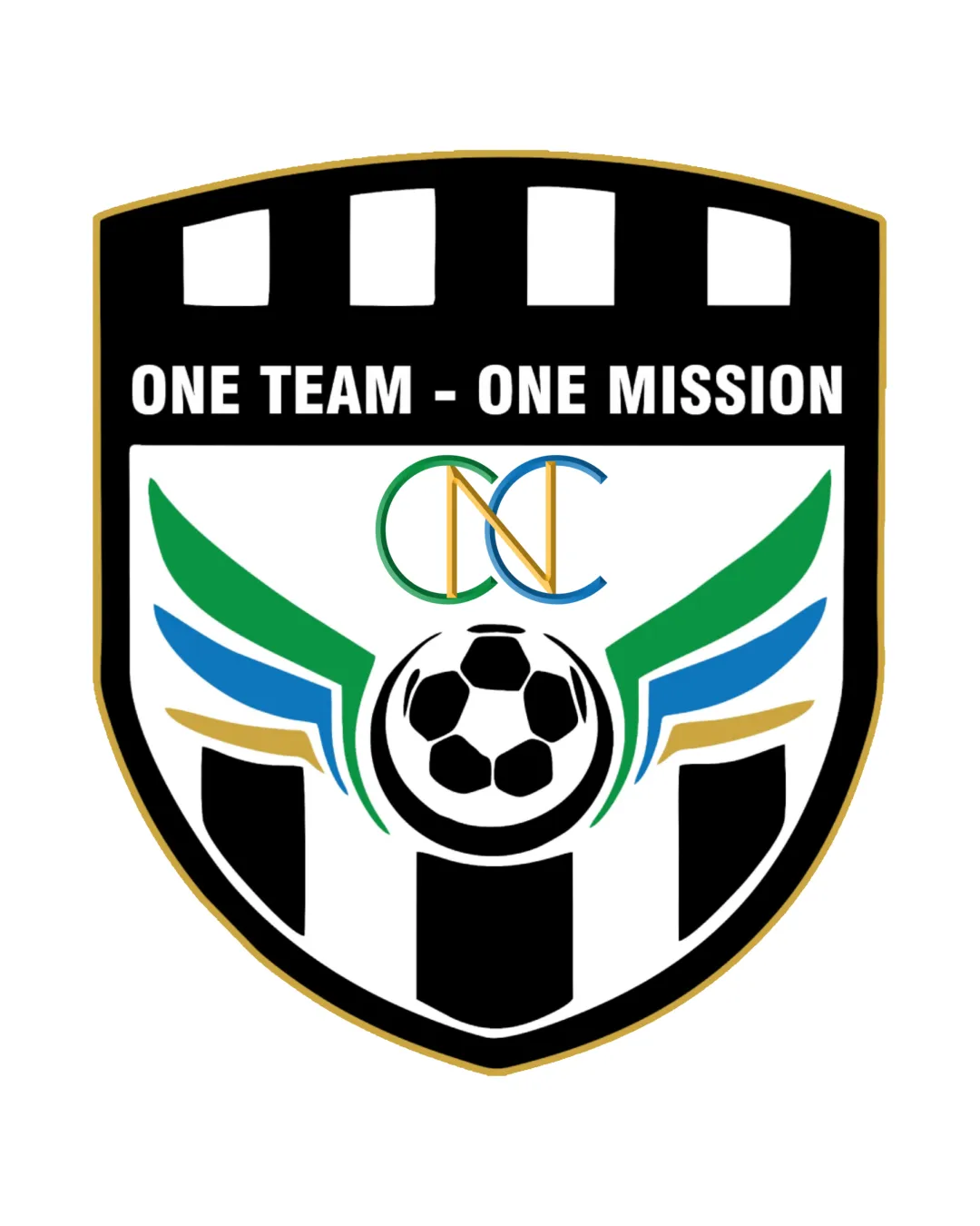
Try it Now!Logo review of ONE TEAM - ONE MISSION, CNC
 Logo analysis by AI
Logo type:
Style:
Detected symbol:
Detected text:
Business industry:
Review requested by Adhikko
**If AI can recognize or misinterpret it, so can people.
Structured logo review
Legibility
![]() Primary motto text is clear and easy to read due to high contrast and bold, sans-serif typeface
Primary motto text is clear and easy to read due to high contrast and bold, sans-serif typeface![]() CNC lettermark is legible despite overlapping design
CNC lettermark is legible despite overlapping design
![]() Overlapping CNC letters slightly reduce instantaneous recognition
Overlapping CNC letters slightly reduce instantaneous recognition![]() Upper badge pattern could create mild visual distraction
Upper badge pattern could create mild visual distraction
Scalability versatility
![]() Shield shape is adaptable to team merchandise and signage
Shield shape is adaptable to team merchandise and signage
![]() Excessive detail and small elements such as the colored lines, wing accents, and CNC overlap will lose clarity at small sizes (e.g. favicon, embroidery on hats/jerseys)
Excessive detail and small elements such as the colored lines, wing accents, and CNC overlap will lose clarity at small sizes (e.g. favicon, embroidery on hats/jerseys)![]() Motto text may become illegible when scaled down on small print goods
Motto text may become illegible when scaled down on small print goods
200x250 px
100×125 px
50×62 px
Balance alignment
![]() Central placement of soccer ball and wings provides a balanced focal point
Central placement of soccer ball and wings provides a balanced focal point![]() Symmetry in the wing designs aids visual equilibrium
Symmetry in the wing designs aids visual equilibrium
![]() Motto sits heavy at the top, making the upper part of the badge feel crowded
Motto sits heavy at the top, making the upper part of the badge feel crowded![]() CNC overlap position feels visually disconnected from the rest of the elements, disrupting vertical harmony
CNC overlap position feels visually disconnected from the rest of the elements, disrupting vertical harmony

Originality
![]() CNC overlapping lettermark introduces a small attempt at uniqueness
CNC overlapping lettermark introduces a small attempt at uniqueness
![]() Soccer ball with wings and a badge shield is an extremely generic sports logo trope
Soccer ball with wings and a badge shield is an extremely generic sports logo trope![]() Badge stripes and black/white motif are very typical for sports/football logos, lacking distinctive brand character
Badge stripes and black/white motif are very typical for sports/football logos, lacking distinctive brand character
Logomark wordmark fit
![]() Central logo and motto included together on badge format
Central logo and motto included together on badge format
![]() Slogan typeface lacks integration with the style of the logo elements
Slogan typeface lacks integration with the style of the logo elements![]() Lettermark CNC's style and color palette feel visually misaligned with bold, collegiate wordmark font
Lettermark CNC's style and color palette feel visually misaligned with bold, collegiate wordmark font
Aesthetic look
![]() Clean color separations and iconic sports shield
Clean color separations and iconic sports shield
![]() Logo is busy with numerous color segments and overlapping elements
Logo is busy with numerous color segments and overlapping elements![]() Generic visual language with no distinctive style—looks like many other football club badges
Generic visual language with no distinctive style—looks like many other football club badges![]() Wing and ball details create unnecessary clutter
Wing and ball details create unnecessary clutter
Dual meaning and misinterpretations
![]() No inappropriate or unintentional imagery detected; all forms are appropriate for sports context
No inappropriate or unintentional imagery detected; all forms are appropriate for sports context
Color harmony
![]() Palette is mechanically harmonious for a sports context, with green, blue, and gold sampling accent colors
Palette is mechanically harmonious for a sports context, with green, blue, and gold sampling accent colors
![]() Five dominant color areas make the logo too busy and visually cluttered for applications requiring simplicity
Five dominant color areas make the logo too busy and visually cluttered for applications requiring simplicity![]() Simultaneous use of multiple accent colors (gold, blue, green) slightly decreases facial impact and cohesion
Simultaneous use of multiple accent colors (gold, blue, green) slightly decreases facial impact and cohesion
Black
#000000
White
#FFFFFF
Green
#43B047
Blue
#1673B4
Gold
#D1B06B


