Wondering how your logo performs? 🧐
Get professional logo reviews in seconds and catch design issues in time.
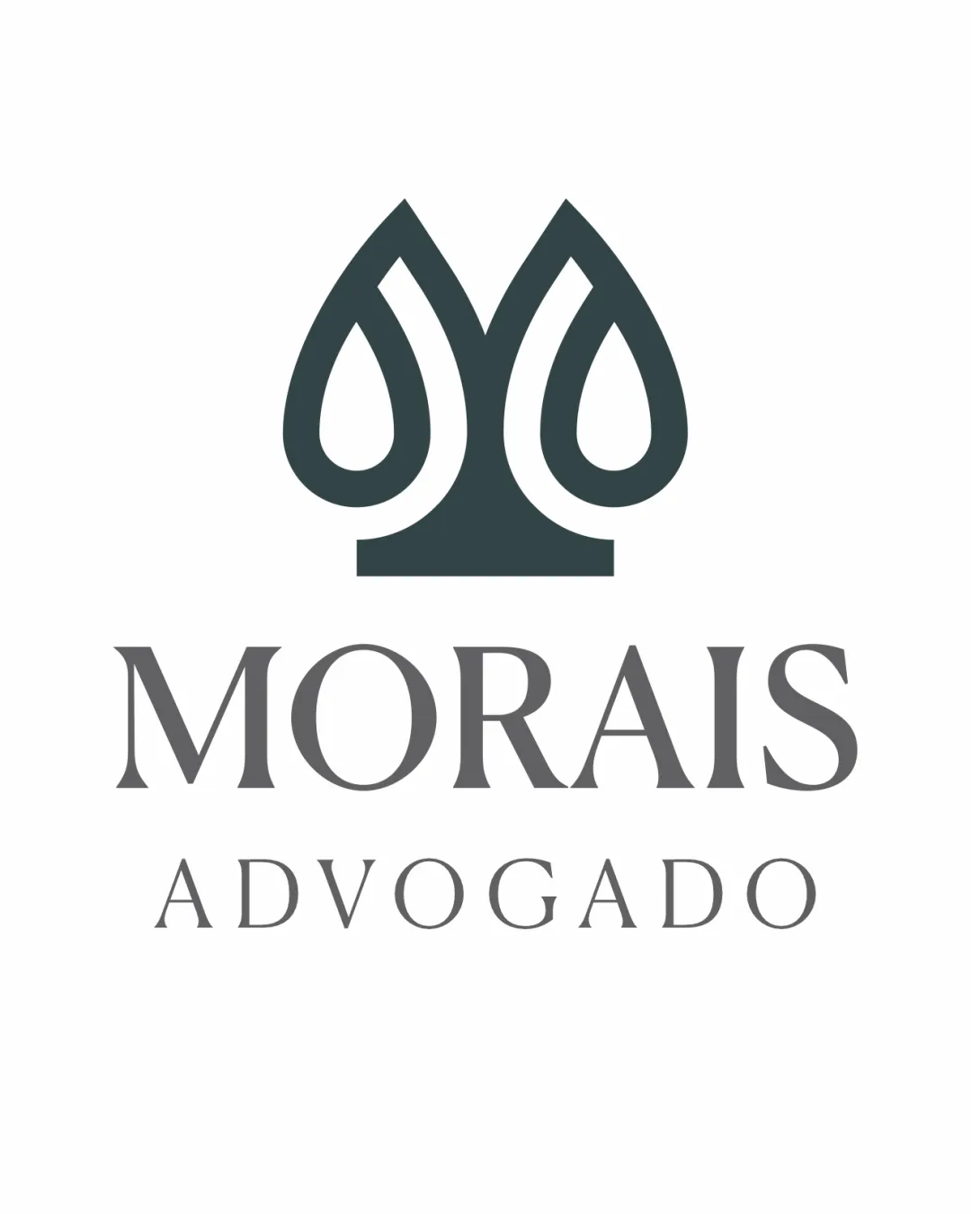
Try it Now!Logo review of MORAIS ADVOGADO
 Logo analysis by AI
Logo type:
Style:
Detected symbol:
Negative space:
Detected text:
Business industry:
Review requested by Leolads
**If AI can recognize or misinterpret it, so can people.
Structured logo review
Legibility
![]() Both 'MORAIS' and 'ADVOGADO' are highly readable.
Both 'MORAIS' and 'ADVOGADO' are highly readable.![]() Font choice conveys professionalism and seriousness appropriate for legal services.
Font choice conveys professionalism and seriousness appropriate for legal services.
Scalability versatility
![]() Logo mark is simple enough to scale well for use in various formats including business cards, letterheads, and signage.
Logo mark is simple enough to scale well for use in various formats including business cards, letterheads, and signage.![]() No excessive detail that would be lost at smaller sizes.
No excessive detail that would be lost at smaller sizes.
![]() The thin lines in the word 'ADVOGADO' may lose clarity in very small applications such as favicons or embroidery.
The thin lines in the word 'ADVOGADO' may lose clarity in very small applications such as favicons or embroidery.
200x250 px
100×125 px
50×62 px
Balance alignment
![]() Symmetrical, well-centered composition between symbol and wordmark.
Symmetrical, well-centered composition between symbol and wordmark.![]() Strong vertical alignment lends stability.
Strong vertical alignment lends stability.
![]() The visual weight between the mark and the text feels slightly top-heavy; the symbol could be resized or balanced further.
The visual weight between the mark and the text feels slightly top-heavy; the symbol could be resized or balanced further.

Originality
![]() The use of negative space to suggest justice scales through an abstract form is creative.
The use of negative space to suggest justice scales through an abstract form is creative.![]() Integration of the initial 'M' with balanced elements adds uniqueness.
Integration of the initial 'M' with balanced elements adds uniqueness.
![]() The overall form is elegant but bears some resemblance to common motifs in the legal sector; minor risk of blending in among competitors.
The overall form is elegant but bears some resemblance to common motifs in the legal sector; minor risk of blending in among competitors.
Logomark wordmark fit
![]() Excellent harmony between mark and type; both share a refined and professional aesthetic.
Excellent harmony between mark and type; both share a refined and professional aesthetic.![]() Sizing and spacing are very well managed.
Sizing and spacing are very well managed.
Aesthetic look
![]() Sophisticated, clean design with careful use of negative space.
Sophisticated, clean design with careful use of negative space.![]() Minimalist aesthetic effectively suits the industry.
Minimalist aesthetic effectively suits the industry.
Dual meaning and misinterpretations
![]() No inappropriate or unrelated imagery observed.
No inappropriate or unrelated imagery observed.![]() Abstract elements strengthen brand values without risk of misinterpretation.
Abstract elements strengthen brand values without risk of misinterpretation.
Color harmony
![]() Elegant and professional monochromatic palette.
Elegant and professional monochromatic palette.![]() Contrast between symbol and background is very strong and visually clear.
Contrast between symbol and background is very strong and visually clear.
Outer Space
#3B4446
Sonic Silver
#7A7A7A
White
#FFFFFF


