Wondering how your logo performs? 🧐
Get professional logo reviews in seconds and catch design issues in time.
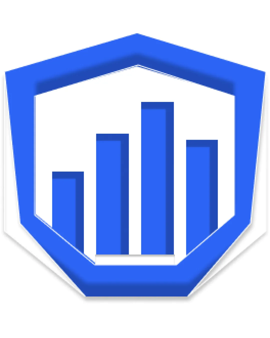
Try it Now!Logo review of bar chart inside a shield/hexagonal frame
 Logo analysis by AI
Logo type:
Style:
Detected symbol:
Business industry:
Review requested by Devi
**If AI can recognize or misinterpret it, so can people.
Structured logo review
Scalability versatility
Simple geometry generally supports small and large size applications.
Icon shape is distinguishable at a glance.
Drop shadow may become muddy or unrefined at smaller scales, especially as a favicon or embroidery.
Details on the shield edges may be lost on very small formats.

200x250 px

100×125 px

50×62 px
Balance alignment
The bar chart is generally well-centered within the shield.
The elements appear aligned and visually stable.
The uneven space at the base between the bars and border may make the logo feel slightly less grounded.


Originality
The shield plus bar chart motif instantly conveys trust and data-related concepts.
The combination of a shield and generic bar chart is extremely common in fintech and analytics branding.
No unique or creative twist differentiates it from competitors.
Aesthetic look
Bold blue and white palette gives a modern, trustworthy feel.
Design is relatively clean and uncluttered.
Drop shadow is somewhat dated and unnecessary; a flat version would be sleeker.
Overall appearance is generic and lacks strong character.
Dual meaning and misinterpretations
No inappropriate shapes or confusing secondary symbols are present.
Color harmony
Monochromatic blue works well with white for a clean, professional look.
Color contrast is strong and visually appealing.
The heavy use of blue may appear cold or impersonal in some contexts.
royal blue
#297BFB
white
#FFFFFF

