Be the MOVEMENT logo review
4/5
Logo score
Logo review of

Be The Movement

Logo conceptual, elegante y alineado con el propósito de marca; recomienda pequeños ajustes para continuidad visual.

Combination Moderno, Editorial, Tipográfico, Conceptual Desarrollo Personal / Coaching / Bienestar
4/5
Legibility
4/5
Originality
5/5
Misread
3/5
Balance
4/5
Scale
Your next steps

What to fix first

Focus on the changes that matter. Keep what makes the logo work.

1

wordmark

Ajustar leves proporciones/tamaño del símbolo 'O' para optimizar la continuidad tipográfica sin perder el concepto de espejo.

Optional refinement Medium priority Low effort
Area to inspectApproximate location

Las proporciones de la 'O' espejada y el semicírculo crean un foco visual fuerte pero disminuyen levemente la fluidez del flujo de lectura en 'MOVEMENT'.

How to check

Testar legibilidad lateral y ritmo visual en tamaño reducido.

See the category review
Detailed review

Logo performance breakdown

5/5

Brief & logo match

Based on your brief
Compared with

Identidad de marca que enfatiza auto-reflexión y movimiento con un símbolo reflejado; busca sofisticación, contemporaneidad y conexión emocional.

Logo altamente alineado al brief, comunicando introspección y progreso con una ejecución premium.

  • Concepto De Espejo/transición

    La 'O' intervenida refleja perfectamente el enfoque introspectivo y de cambio personal.

  • Estética Sofisticada Y Contemporánea

    La paleta de colores y la organización tipográfica mantienen el tono premium y moderno solicitado.

  • Conectar Propósito, Personas Y Progreso

    El símbolo central remite a auto-reflexión y avance, conectando con la filosofía de la marca.

4/5

Legibility

  • Tipografía clara y tamaño adecuado.
  • Buen contraste de colores.
4/5

Originality

  • Uso conceptual diferenciado de la 'O' como espejo.
  • Integración creativa con mensaje de marca.
4/5

Color harmony

  • Paleta sofisticada y sobria, alineada al posicionamiento premium.
Gold#B8995C
Olive Green#63654B

Estimated colors. Use the original design file for exact values.

Create a full color palette using these colors

Create new palette
3/5

Balance alignment

  • Composición centrada y con buen peso visual.
  • Las proporciones de la 'O' espejada y el semicírculo crean un foco visual fuerte pero disminuyen levemente la fluidez del flujo de lectura en 'MOVEMENT'.

    Optional refinement wordmark

    Try: Ajustar leves proporciones/tamaño del símbolo 'O' para optimizar la continuidad tipográfica sin perder el concepto de espejo.

    Check: Testar legibilidad lateral y ritmo visual en tamaño reducido.

    Area to inspectApproximate location
Uploaded logoAlignment guide overlay

Inspect spacing with the guide. Optical balance may differ from geometric centering.

4/5

Scalability

  • Elementos limpios y sin detalles excesivos.
Uploaded logo at 200 pixels wide
200 × 250 px
Uploaded logo at 100 pixels wide
100 × 125 px
Uploaded logo at 50 pixels wide
50 × 63 px

Compare the detail at different sizes. Labels show the full image dimensions.

5/5

Misinterpretations

  • No sugiere lecturas ambiguas ni interpretaciones no intencionadas.
4/5

Symbol & text fit

  • El símbolo está bien incorporado dentro del texto.

Black & white

Does the shape still work without color?

These tests are available only for logos uploaded in vector (SVG) format.

Background contrast

Find the surfaces where your logo stays clear.

These tests are available only for logos uploaded in vector (SVG) format.

Blur & silhouette

A 3px blur softens fine details so you can check whether the overall shape stays recognizable. If key gaps close or elements merge, the logo may rely too heavily on detail.

These tests are available only for logos uploaded in vector (SVG) format.

4/5
Market fit

Category positioning

Buen posicionamiento y riesgo de confusión bajo dentro de coaching premium y desarrollo personal.

La intervención de la 'O' distingue este logo de otros en su segmento, aunque la palabra MOVEMENT sea habitual en la industria.

1
Category Fit
Good fit

Encaja con referentes premium y de transformación personal.

Transmiten valores afines al sector.

2
Differentiation Risk
Some overlap

La 'O' espejada le otorga reconocimiento único aunque otras marcas usen la palabra MOVEMENT.

La palabra clave es usada ampliamente, pero la ejecución gráfica la separa.

3
Market Signal
Clear signal

El logo comunica introspección y evolución, lo que resuena positivamente con el público objetivo.

La simbología y paleta transmiten premium y confianza.

How to stand out more
  • Aprovechar el simbolismo central en aplicaciones digitales y físicas.
  • Desarrollar una versión solo con la 'O' para huella isotipo.
From design file to real use

Use-case readiness

How the logo may work in practice, and what to check before production.

  • 6 look suitable
  • 2 need adjustment

Website header

Looks suitable

Escala y legibilidad suficientes para entorno digital.

Before you use it

Verificar lectura en fondos claros y oscuros.

Social media avatar

Looks suitable

La 'O' espejada es distintiva también en formato cuadrado.

Before you use it

Testar reducción solo con símbolo o logo completo.

Favicon & app icon

Adjust first

La composición completa no es legible en formato favicon; sugerir versión solo con la 'O' intervenida.

Before you use it

Producir isotipo o favicon simplificado.

Business card

Looks suitable

Funciona bien en formato horizontal y respaldo premium.

Before you use it

Verificar contraste de impresión.

Signs & signage

Looks suitable

La tipografía sólida y el símbolo distintivo escalan bien a gran formato.

Before you use it

Evaluar legibilidad a distancia.

Packaging & labels

Looks suitable

Paleta y proporciones listas para aplicaciones premium.

Before you use it

Testar sobre varios soportes y materiales.

Embroidery

Adjust first

Optimizar grosores y simplificar detalles para bordado.

Before you use it

Revisar viabilidad según hilo y tamaño mínimo.

One-color printing

Looks suitable

La estructura simple y formas limpias permiten adaptación monocromática.

Before you use it

Probar versiones en positivo y negativo.

Delivery checklist

Logo suite verification

The logo versions to prepare before sending final files to a client or team.

Detected in this upload

Already included

Visible
Uploaded logo
Reviewed upload

Primary logo lockup

A mark and wordmark are both visible in the uploaded asset.

Before delivery

Versions to remember

Format templates

Standalone wordmark

High priority Recommended

Export the wordmark separately, without the symbol or tagline, for narrow placements and smaller sizes.

Standalone logomark or monogram

High priority Recommended

Export the existing symbol, mascot, or monogram on its own for avatars, favicons, and compact placements. Check its clarity at small sizes.

Wordmark with tagline

Low priority Optional

Only if the brand uses a tagline: prepare a wordmark with it for larger placements, alongside the tagline-free version.

One-color logo version

High priority Recommended

Prepare a monochrome version for restricted print and production methods.

Reversed light logo version

Medium priority Recommended

Prepare a light version for dark brand backgrounds.

Presentation kit

Finalize and present this logo

Put the design into words. Use these notes to build your client presentation.

Describe the logo

The elements that make up the identity.

Primary lockup

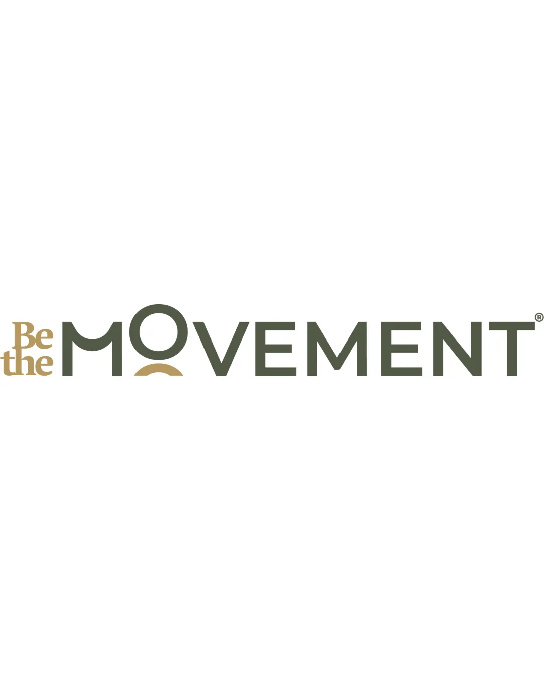
Wordmark 'Be the MOVEMENT' en estilo contemporáneo con la 'O' intervenida y un semicírculo dorado, reforzando el concepto de espejo y transición.

Explain the direction

The story and thinking behind the design.

Positioning statement

Un logo que traduce el crecimiento personal y el movimiento interior, fusionando sofisticación moderna y simbolismo introspectivo.

Design rationale

  1. La 'O' de MOVEMENT actúa como espejo, representando auto-observación y transformación.
  2. Las tipografías y colores transmiten elegancia y actualidad, conectando con un público exigente y consciente.

Tips for the logo presentation

Mockup ideas

  • Aplicación en tarjetas de presentación con acabado mate.
  • Versión minimalista para favicon y redes sociales destacando la 'O' espejada.
  • Bolsas o prendas con la marca centrada en embroidería simple.

Possible objections

  • ¿Se compromete la legibilidad con la 'O' intervenida a tamaños pequeños?
  • ¿El logo comunica suficientemente el concepto de movimiento y autoconocimiento?

Presentation tips

  • Enfatizar el simbolismo del espejo y la transición en la 'O'.
  • Mostrar aplicaciones a diferentes escalas para probar claridad y versatilidad.
Try your own review

Wondering how your logo performs?

Get a clear logo score, key risks, and priority fix ideas before your client or audience sees it.

Review my logo