Wondering how your logo performs? 🧐
Get professional logo reviews in seconds and catch design issues in time.
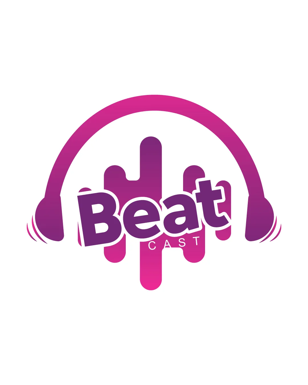
Try it Now!Logo review of Beat CAST
 Logo analysis by AI
Logo type:
Style:
Detected symbol:
Detected text:
Business industry:
Review requested by Mdekbalvect
**If AI can recognize or misinterpret it, so can people.
Structured logo review
Legibility
![]() 'Beat' is bold and easy to read in large sizes.
'Beat' is bold and easy to read in large sizes.![]() 'CAST' in smaller uppercase type provides hierarchy.
'CAST' in smaller uppercase type provides hierarchy.
![]() 'CAST' text is quite small and could lose legibility at smaller scales.
'CAST' text is quite small and could lose legibility at smaller scales.![]() Slight tilt of 'Beat' may hamper rapid legibility in some instances.
Slight tilt of 'Beat' may hamper rapid legibility in some instances.
Scalability versatility
![]() Simple shapes and bold lines help with medium-to-large applications such as podcast covers and social media.
Simple shapes and bold lines help with medium-to-large applications such as podcast covers and social media.
![]() Thin base on 'CAST' may vanish at small scales.
Thin base on 'CAST' may vanish at small scales.![]() Gradients may not print well or translate across all mediums, reducing versatility for items like embroidery or single-color stamp applications.
Gradients may not print well or translate across all mediums, reducing versatility for items like embroidery or single-color stamp applications.
200x250 px
100×125 px
50×62 px
Balance alignment
![]() Headphone arc generally frames the composition.
Headphone arc generally frames the composition.![]() Sound wave bars offer visual interest and a focal point.
Sound wave bars offer visual interest and a focal point.
![]() 'Beat' text crossing over wave bars feels slightly misaligned and off-balance.
'Beat' text crossing over wave bars feels slightly misaligned and off-balance.![]() 'CAST' feels spatially isolated and disconnected from the main visual weight.
'CAST' feels spatially isolated and disconnected from the main visual weight.

Originality
![]() Decent integration of headphones and sound waves, which is appropriate for audio-related brands.
Decent integration of headphones and sound waves, which is appropriate for audio-related brands.
![]() Both headphones and bars are common tropes in music/podcast logos.
Both headphones and bars are common tropes in music/podcast logos.![]() No unexpected or standout creative twist—execution is generic.
No unexpected or standout creative twist—execution is generic.
Logomark wordmark fit
![]() Wordmark closely integrates with the logomark using the shared color gradient and overlapping design.
Wordmark closely integrates with the logomark using the shared color gradient and overlapping design.
![]() The playful, distorted positioning of the wordmark might create slight visual tension with the clean curve of the headphones.
The playful, distorted positioning of the wordmark might create slight visual tension with the clean curve of the headphones.
Aesthetic look
![]() Energetic color scheme speaks to the theme of music and beats.
Energetic color scheme speaks to the theme of music and beats.![]() Gradient adds contemporary flair.
Gradient adds contemporary flair.
![]() Strong gradient risks becoming dated or hard to reproduce.
Strong gradient risks becoming dated or hard to reproduce.![]() Overall aesthetic is playful, but lacks refinement for more premium/stylish audio brands.
Overall aesthetic is playful, but lacks refinement for more premium/stylish audio brands.
Dual meaning and misinterpretations
![]() No inappropriate symbols or misleading imagery present.
No inappropriate symbols or misleading imagery present.
Color harmony
![]() Purple-pink gradient produces vibrancy and energy.
Purple-pink gradient produces vibrancy and energy.![]() Limited color palette keeps the look cohesive.
Limited color palette keeps the look cohesive.
![]() Gradient may not always reproduce accurately in all print or monochrome situations.
Gradient may not always reproduce accurately in all print or monochrome situations.
Purple
#B32BB1
Pink
#EC2D6D
White
#FFFFFF